我有一个像这样的 R 数据框(名为frequency):
word    author  proportion
a   Radicals    1.679437e-04
aa  Radicals    2.099297e-04
aaa Radicals    2.099297e-05
abbe    Radicals    NA
aboow   Radicals    NA
about   Radicals    NA
abraos  Radicals    NA
ytterst Conservatives   5.581042e-06
yttersta    Conservatives   5.581042e-06
yttra   Conservatives   2.232417e-05
yttrandefrihet  Conservatives   5.581042e-06
yttrar  Conservatives   2.232417e-05
我想使用 ggplot2 绘制文档差异。像这样的东西
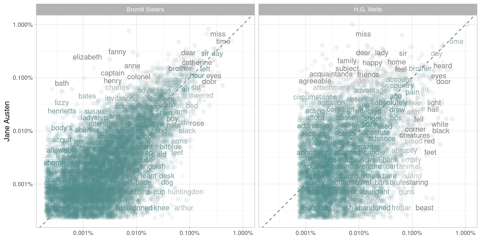
我有下面的代码,但我的情节最终是空的。
library(scales)
ggplot(frequency, aes(x = proportion, y = `Radicals`, color = abs(`Radicals` - proportion))) +
    geom_abline(color = "gray40", lty = 2) +
    geom_jitter(alpha = 0.1, size = 2.5, width = 0.3, height = 0.3) +
    geom_text(aes(label = word), check_overlap = TRUE, vjust = 1.5) +
  scale_x_log10(labels = percent_format()) +
  scale_y_log10(labels = percent_format()) +
  scale_color_gradient(limits = c(0, 0.001), low = "darkslategray4", high = "gray75") +
  facet_wrap(~author, ncol = 2) +
  theme(legend.position="none") +
  labs(y = "Radicals", x = NULL)