我经常需要制作堆叠的条形图来比较变量,而且因为我在 R 中完成所有统计数据,所以我更喜欢在 R 中使用 ggplot2 来完成我的所有图形。我想学习如何做两件事:
首先,我希望能够为每个变量添加适当的百分比刻度线,而不是按计数添加刻度线。计数会令人困惑,这就是我完全取出轴标签的原因。
其次,必须有一种更简单的方法来重组我的数据以实现这一点。这似乎是我应该能够在 ggplot2 中使用 plyR 本地做的事情,但是 plyR 的文档不是很清楚(我已经阅读了 ggplot2 书和在线 plyR 文档。
我最好的图表如下所示,创建它的代码如下:
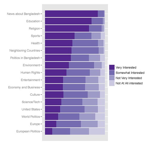
我用来获取它的 R 代码如下:
library(epicalc)

### recode the variables to factors ###
recode(c(int_newcoun, int_newneigh, int_neweur, int_newusa, int_neweco, int_newit, int_newen, int_newsp, int_newhr, int_newlit, int_newent, int_newrel, int_newhth, int_bapo, int_wopo, int_eupo, int_educ), c(1,2,3,4,5,6,7,8,9, NA),
c('Very Interested','Somewhat Interested','Not Very Interested','Not At All interested',NA,NA,NA,NA,NA,NA))

### Combine recoded variables to a common vector
Interest1<-c(int_newcoun, int_newneigh, int_neweur, int_newusa, int_neweco, int_newit, int_newen, int_newsp, int_newhr, int_newlit, int_newent, int_newrel, int_newhth, int_bapo, int_wopo, int_eupo, int_educ)


### Create a second vector to label the first vector by original variable ###
a1<-rep("News about Bangladesh", length(int_newcoun))
a2<-rep("Neighboring Countries", length(int_newneigh))
[...]
a17<-rep("Education", length(int_educ))


Interest2<-c(a1, a2, a3, a4, a5, a6, a7, a8, a9, a10, a11, a12, a13, a14, a15, a16, a17)

### Create a Weighting vector of the proper length ###
Interest.weight<-rep(weight, 17)

### Make and save a new data frame from the three vectors ###
Interest.df<-cbind(Interest1, Interest2, Interest.weight)
Interest.df<-as.data.frame(Interest.df)

write.csv(Interest.df, 'C:\\Documents and Settings\\[name]\\Desktop\\Sweave\\InterestBangladesh.csv')

### Sort the factor levels to display properly ###

Interest.df$Interest1<-relevel(Interest$Interest1, ref='Not Very Interested')
Interest.df$Interest1<-relevel(Interest$Interest1, ref='Somewhat Interested')
Interest.df$Interest1<-relevel(Interest$Interest1, ref='Very Interested')

Interest.df$Interest2<-relevel(Interest$Interest2, ref='News about Bangladesh')
Interest.df$Interest2<-relevel(Interest$Interest2, ref='Education')
[...]
Interest.df$Interest2<-relevel(Interest$Interest2, ref='European Politics')

detach(Interest)
attach(Interest)

### Finally create the graph in ggplot2 ###

library(ggplot2)
p<-ggplot(Interest, aes(Interest2, ..count..))
p<-p+geom_bar((aes(weight=Interest.weight, fill=Interest1)))
p<-p+coord_flip()
p<-p+scale_y_continuous("", breaks=NA)
p<-p+scale_fill_manual(value = rev(brewer.pal(5, "Purples")))
p
update_labels(p, list(fill='', x='', y=''))
我非常感谢任何提示、技巧或提示。