0

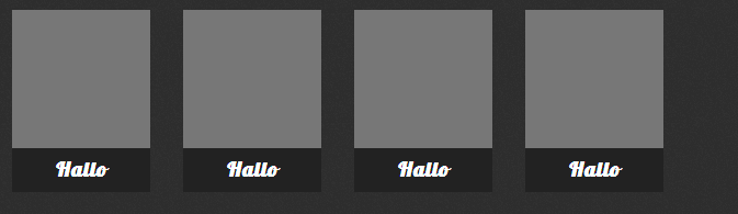
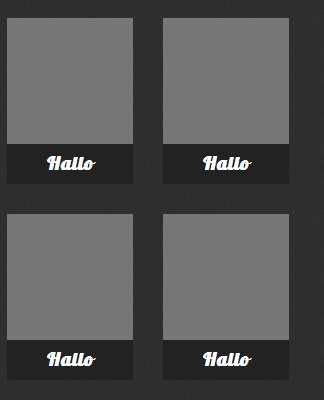
如果没有行中的最后一项,我如何获得此结果:

margin-right: 30px;

在 CSS 中,现在我使用:

margin-right:                                                   30px;
margin-bottom:                                                  30px;

它应该像 ios 主屏幕

http://www4.picturepush.com/photo/a/12640862/img/12640862.png http://www3.picturepush.com/photo/a/12640866/img/12640866.png

html:

<div class="home-main">
        <a href="t1home" class="item"><h1>Hallo</h1></a>
        <a href="t1home" class="item"><h1>Hallo</h1></a>
        <a href="t1home" class="item"><h1>Hallo</h1></a>
        <a href="t1home" class="item"><h1>Hallo</h1></a>
</div>

CSS:

 .home-main {
    width:                                                          90%;
    max-width:                                                      960px;
    min-height:                                                     100px;
    margin:                                                         0 auto;
    overflow:                                                       hidden;
    text-align: center;
}
.home-main a {
    width:                                                          126px;
    min-height:                                                     126px;
    max-height:                                                     166px;
    margin-right:                                                   30px;
    margin-bottom:                                                  30px;
    background-color:                                               #777;
    float:                                                          left;
    color:                                                          #fff;
    text-decoration:                                                none;
}
.home-main a:nth-last-child(1){
    margin-right:                                                   0;
}
.home-main a h1 {
    width:                                                          100%;
    height:                                                         33px;
    margin:                                                         0;
    margin-top:                                                     126px;
    padding-top:                                                    7px;
    font-size:                                                      19px;
    text-align:                                                     center;
    background-color:                                               #222;
}
@media screen and (width:320px){
    .home-main a:nth-child(even) {
        margin-right:                                               0;
    }
}
4

1 回答 1

0

我将演示使用 JavaScript 完成的一些事情,因为这是 iOS 上的默认设置。我只使用 jQuery 来切换文档的就绪状态,但您也可以将其添加到 body-tag 中。之后,您将不需要 jQuery 本身。

我对 JavaScript 所做的是left-padding基于对仍然打开的剩余空间的划分添加额外的内容,因此它将浮动推到水平中间。

如果 JavaScript 有问题,我会删除答案。

这是JSfiddle

HTML

<div id="wrapper">
    <div class="block"></div>
    <div class="block"></div>
    <div class="block"></div>
    <div class="block"></div>
    <div class="block"></div>
    <div class="block"></div>
    <div class="block"></div>
    <div class="block"></div>
    <div class="block"></div>
    <div class="block"></div>
    <div class="floatClear"></div>
</div>

CSS

* {
    box-sizing: border-box;
}

#wrapper {
    width: 90%;
    border: 1px solid red;
    padding: 5px;
}

.block {
    width: 130px;
    height: 170px;
    background-color: grey;
    float: left;
    margin: 5px 5px 5px 5px;
}

.floatClear {
    clear: both;
}

JavaScript

$(document).ready(function () {
    var wrapper = document.getElementById('wrapper');

    var wrap_w = wrapper.offsetWidth - (5*2); // minus padding
    var block_w = wrapper.getElementsByTagName('div')[0].offsetWidth + (5*2); // plus margin

    var remainder = wrap_w % block_w;
    var left_add = Math.floor(remainder / 2); // what to add left

    wrapper.style.paddingLeft = (left_add + 5) + 'px';

    //console.log(remainder);
});

祝你好运!

于 2013-04-08T16:59:22.170 回答