我有一个div带有两个图像和一个h1. 所有这些都需要在 div 内垂直对齐,彼此相邻。
其中一张图像需要absolute定位在div.
在所有常见浏览器上工作所需的 CSS 是什么?
<div id="header">
  <img src=".." ></img>
  <h1>testing...</h1>
  <img src="..."></img>
</div>
我有一个div带有两个图像和一个h1. 所有这些都需要在 div 内垂直对齐,彼此相邻。
其中一张图像需要absolute定位在div.
在所有常见浏览器上工作所需的 CSS 是什么?
<div id="header">
<img src=".." ></img>
<h1>testing...</h1>
<img src="..."></img>
</div>
哇,这个问题很流行。这是基于对vertical-align财产的误解。这篇优秀的文章解释了它:
理解vertical-align,或 Gavin Kistner 的“如何(不)垂直居中内容”。
“如何在 CSS 中居中”</a>是一个很棒的网络工具,可以帮助找到不同情况下必要的 CSS 居中属性。
简而言之(并防止链接腐烂):
vertical-align: middle. 但是,“上下文”不是整个父容器的高度,而是它们所在的文本行的高度。jsfiddle 示例absolute并指定它的height,margin-top和top位置。jsfiddle 示例line-height以填充其高度。根据我的经验,这种方法非常通用。jsfiddle 示例现在 Flexbox 支持正在增加,这个应用于包含元素的 CSS 将垂直居中包含的项目:
.container {
    display: flex;
    align-items: center;
}
如果您还需要针对Internet Explorer 10和更早的 (< 4.4 (KitKat)) Android 浏览器,请使用前缀版本:
.container {
    display: -ms-flexbox;
      display: -webkit-flex;
    display: flex;

       -ms-flex-align: center;
    -webkit-align-items: center;
       -webkit-box-align: center;

       align-items: center;
}
我使用了这个非常简单的代码:
HTML:
<div class="ext-box">
    <div class="int-box">
        <h2>Some txt</h2>
        <p>bla bla bla</p>
    </div>
</div>
CSS:
div.ext-box { display: table; width:100%;}
div.int-box { display: table-cell; vertical-align: middle; }
显然,无论您使用 a.class还是 an #id,结果都不会改变。
 .outer {
   display: flex;
   align-items: center;
   justify-content: center;
 }
它对我有用:
.vcontainer {
    min-height: 10em;
    display: table-cell;
    vertical-align: middle;
}
使用其中任何一个。结果将是相同的:

对于垂直对齐:d-flex align-items-center
对于水平对齐:d-flex justify-content-center
对于垂直和水平对齐:d-flex align-items-center justify-content-center
.container {
    height: 180px;
    width:100%;
    background-color: blueviolet;
}

.container > div {
  background-color: white;
  padding: 1rem;
}
<link href="https://stackpath.bootstrapcdn.com/bootstrap/4.3.1/css/bootstrap.min.css"
rel="stylesheet"/>
<div class="d-flex align-items-center justify-content-center container">
<div>I am in Center</div>
</div>.container {
height: 180px;
width:100%;
background-color: blueviolet;
}
.container > div {
background-color: white;
padding: 1rem;
}
.center {
display: flex;
align-items: center;
justify-content: center;
}<div class="container center">
<div>I am in Center</div>
</div>我朋友的一个技巧:
HTML:
<div style="height:100px; border:1px solid;">
    <p style="border:1px dotted;">I'm vertically centered.</p>
</div>
CSS:
div:before {content:" "; display:inline-block; height:100%; vertical-align:middle;}
div p {display:inline-block;}
演示在这里
要将块元素定位到中心(适用于Internet Explorer 9及更高版本),它需要一个包装器div:
.vcontainer {
  position: relative;
  top: 50%;
  transform: translateY(-50%);
  -webkit-transform: translateY(-50%);
}
所有这些都需要在 div 内垂直对齐
怎么对齐?图像的顶部与文本的顶部对齐?
其中一张图像需要绝对定位在 div 内。
相对于 DIV 绝对定位?也许你可以勾勒出你正在寻找的东西......?
fd 描述了绝对定位的步骤,以及调整H1元素的显示以使图像与其内联显示。为此,我将补充一点,您可以使用以下vertical-align样式对齐图像:
#header h1 { display: inline; }
#header img { vertical-align: middle; }
...这会将标题和图像放在一起,顶部边缘对齐。存在其他对齐选项;请参阅文档。您可能还会发现删除 DIV 并将图像移动到H1元素内是有益的——这为容器提供了语义价值,并且无需调整H1:
<h1 id=header">
   <img src=".." ></img>
   testing...
   <img src="..."></img>
</h1>
使用这个公式,它会一直工作而不会出现裂缝:
#outer {height: 400px; overflow: hidden; position: relative;}
#outer[id] {display: table; position: static;}

#middle {position: absolute; top: 50%;} /* For explorer only*/
#middle[id] {display: table-cell; vertical-align: middle; width: 100%;}

#inner {position: relative; top: -50%} /* For explorer only */
/* Optional: #inner[id] {position: static;} */
<div id="outer">
<div id="middle">
<div id="inner">
any text
any height
any content, for example generated from DB
everything is vertically centered
</div>
</div>
</div>几乎所有方法都需要指定高度,但通常我们没有任何高度。
所以这是一个不需要知道高度的 CSS 3 三行技巧。
.element {
    position: relative;
    top: 50%;
    transform: translateY(-50%);
}
它甚至在 IE9 中也受支持。
及其供应商前缀:
.element {
    position: relative;
    top: 50%;
    -webkit-transform: translateY(-50%);
    -ms-transform: translateY(-50%);
    transform: translateY(-50%);
}
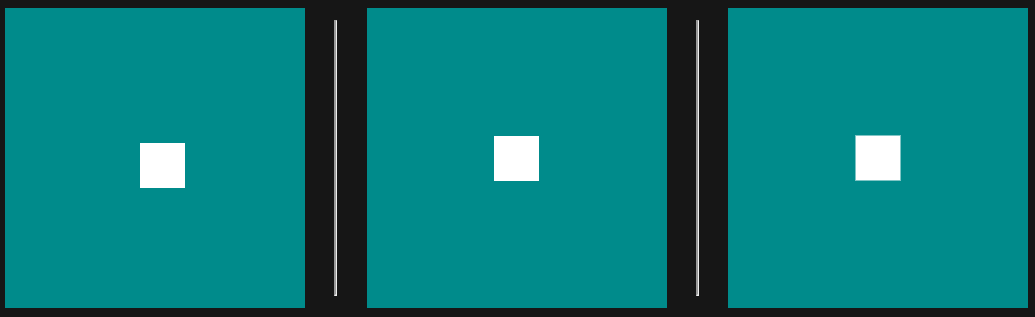
/* Absolute Positioning Method */
.parent1 {
  background: darkcyan;
   width: 200px;
   height: 200px;
   position: relative;
}
.child1 {
  background: white;
  height: 30px;
  width: 30px;
  position: absolute;
  top: 50%;
  left: 50%;
  margin: -15px;
}

/* Flexbox Method */
.parent2 {
  display: flex;
  justify-content: center;
  align-items: center;
  background: darkcyan;
  height: 200px;
  width: 200px;
}
.child2 {
  background: white;
  height: 30px;
  width: 30px;
}

/* Transform/Translate Method */
.parent3 {
  position: relative;
  height: 200px;
  width: 200px;
  background: darkcyan;
}
.child3 {
  background: white;
  height: 30px;
  width: 30px;
  position: absolute;
  top: 50%;
  left: 50%;
  transform: translate(-50%, -50%);
}
<div class="parent1">
<div class="child1"></div>
</div>
<hr />
<div class="parent2">
<div class="child2"></div>
</div>
<hr />
<div class="parent3">
<div class="child3"></div>
</div>我的诀窍是在 div 中放置一个表格,其中包含一行和一列,设置 100% 的宽度和高度,以及属性vertical-align:middle:
<div>

    <table style="width:100%; height:100%;">
        <tr>
            <td style="vertical-align:middle;">
                BUTTON TEXT
            </td>
        </tr>
    </table>

</div>
小提琴: http: //jsfiddle.net/joan16v/sbqjnn9q /
使用 display flex,首先你需要包装你想要对齐的项目的容器:
<div class="outdiv">
    <div class="indiv">
        <span>test1</span>
        <span>test2</span>
    </div>
</div>
然后在我的示例中应用以下 CSS 内容来包装div或outdiv:
.outdiv {
    display: flex;
    justify-content: center;
    align-items: center;
}
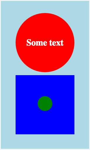
使用 CSS 垂直居中,您可以让外部容器像表格一样,而内容像表格单元格一样。在这种格式中,您的对象将保持居中。:)
我以在 JSFiddle 中嵌套多个对象为例,但核心思想是这样的:
HTML
<div class="circle">
  <div class="content">
    Some text
  </div>
</div>
CSS
.circle {
  /* Act as a table so we can center vertically its child */
  display: table;
  /* Set dimensions */
  height: 200px;
  width: 200px;
  /* Horizontal center text */
  text-align: center;
  /* Create a red circle */
  border-radius: 100%;
  background: red;
}

.content {
  /* Act as a table cell */
  display: table-cell;
  /* And now we can vertically center! */
  vertical-align: middle;
  /* Some basic markup */
  font-size: 30px;
  font-weight: bold;
  color: white;
}
多对象示例:
HTML
<div class="container">
  <div class="content">

    <div class="centerhoriz">

      <div class="circle">
        <div class="content">
          Some text
        </div><!-- content -->
      </div><!-- circle -->

      <div class="square">
        <div class="content">
          <div id="smallcircle"></div>
        </div><!-- content -->
      </div><!-- square -->

    </div><!-- center-horiz -->

  </div><!-- content -->
</div><!-- container -->
CSS
.container {
  display: table;
  height: 500px;
  width: 300px;
  text-align: center;
  background: lightblue;
}

.centerhoriz {
  display: inline-block;
}

.circle {
  display: table;
  height: 200px;
  width: 200px;
  text-align: center;
  background: red;
  border-radius: 100%;
  margin: 10px;
}

.square {
  display: table;
  height: 200px;
  width: 200px;
  text-align: center;
  background: blue;
  margin: 10px;
}

.content {
  display: table-cell;
  vertical-align: middle;
  font-size: 30px;
  font-weight: bold;
  color: white;
}

#smallcircle {
  display: inline-block;
  height: 50px;
  width: 50px;
  background: green;
  border-radius: 100%;
}
结果
我找到了一种新的解决方法,可以使用 CSS 3 垂直对齐 div 中的多个文本行(我还使用 bootstrap v3 网格系统来美化 UI),如下所示:
.immediate-parent-of-text-containing-div {
    height: 50px;         /* Or any fixed height that suits you. */
}

.text-containing-div {
    display: inline-grid;
    align-items: center;
    text-align: center;
    height: 100%;
}
根据我的理解,包含元素的文本的直接父级必须有一定的高度。
默认情况下,h1 是一个块元素,将在第一个 img 之后的行上渲染,并将导致第二个 img 出现在该块之后的行上。
要阻止这种情况发生,您可以将 h1 设置为具有内联流行为:
#header > h1 { display: inline; }
至于将 img 绝对定位在div 内,您需要将包含的 div 设置为“已知大小”,然后才能正常工作。根据我的经验,您还需要将 position 属性从默认值更改 - position: relative 对我有用:
#header { position: relative; width: 20em; height: 20em; }
#img-for-abs-positioning { position: absolute; top: 0; left: 0; }
如果你可以让它工作,你可能想尝试从 div.header 逐步删除高度、宽度、位置属性,以获得所需的最少属性来获得你想要的效果。
更新:
这是一个适用于 Firefox 3 的完整示例:
<!DOCTYPE html PUBLIC "-//W3C//DTD XHTML 1.0 Strict//EN"
          "http://www.w3.org/TR/xhtml1/DTD/xhtml1-strict.dtd">
<html>
    <head>
        <title>Example of vertical positioning inside a div</title>
        <style type="text/css">
            #header > h1 { display: inline; }
            #header { border: solid 1px red;
                      position: relative; }
            #img-for-abs-positioning { position: absolute;
                                       bottom: -1em; right: 2em; }
        </style>
    </head>

    <body>
        <div id="header">
            <img src="#" alt="Image 1" width="40" height="40" />
            <h1>Header</h1>
            <img src="#" alt="Image 2" width="40" height="40"
                 id="img-for-abs-positioning" />
        </div>
    </body>
</html>
我们可以使用 CSS 函数计算来计算元素的大小,然后相应地定位子元素。
示例 HTML:
<div class="box">
    <span><a href="#">Some Text</a></span>
</div>
和 CSS:
.box {
    display: block;
    background: #60D3E8;
    position: relative;
    width: 300px;
    height: 200px;
    text-align: center;
}

.box span {
    font: bold 20px/20px 'source code pro', sans-serif;
    position: absolute;
    left: 0;
    right: 0;
    top: calc(50% - 10px);
}

a {
    color: white;
    text-decoration: none;
}
此处创建的演示:https ://jsfiddle.net/xnjq1t22/
该解决方案适用于响应式div height和响应width式。
注意:calc函数未测试与旧浏览器的兼容性。
我最喜欢的新方法是使用 CSS 网格:
/* technique */

.wrapper {
  display: inline-grid;
  grid-auto-flow: column;
  align-items: center;
  justify-content: center;
}

/* visual emphasis */

.wrapper {
  border: 1px solid red;
  height: 180px;
  width: 400px;
}

img {
  width: 100px;
  height: 80px;
  background: #fafafa;
}

img:nth-child(2) {
  height: 120px;
}
<div class="wrapper">
<img src="https://source.unsplash.com/random/100x80/?bear">
<img src="https://source.unsplash.com/random/100x120/?lion">
<img src="https://source.unsplash.com/random/100x80/?tiger">
</div>仅使用 Bootstrap 类:
class="container d-flex"class="m-auto"<link rel="stylesheet" href="https://cdnjs.cloudflare.com/ajax/libs/twitter-bootstrap/4.5.3/css/bootstrap.min.css" crossorigin="anonymous">
<div class="container d-flex mt-5" style="height:110px; background-color: #333;">
<h2 class="m-auto"><a href="https://hovermind.com/">H➲VER➾M⇡ND</a></h2>
</div>只需在 div 中使用一个单元格表格!只需将单元格和表格高度设置为 100%,您就可以使用垂直对齐。
div 内的一个单元格表处理垂直对齐,并且向后兼容回石器时代!
一年多以来,我一直在使用以下解决方案(没有定位和行高),它也适用于Internet Explorer 7和Internet Explorer 8。
<style>
.outer {
    font-size: 0;
    width: 400px;
    height: 400px;
    background: orange;
    text-align: center;
    display: inline-block;
}

.outer .emptyDiv {
    height: 100%;
    background: orange;
    visibility: collapse;
}

.outer .inner {
    padding: 10px;
    background: red;
    font: bold 12px Arial;
}

.verticalCenter {
    display: inline-block;
    *display: inline;
    zoom: 1;
    vertical-align: middle;
}
</style>

<div class="outer">
    <div class="emptyDiv verticalCenter"></div>
    <div class="inner verticalCenter">
        <p>Line 1</p>
        <p>Line 2</p>
    </div>
</div>
i这是我对 a 中元素的个人解决方案div。
<div class="circle">
    <i class="fa fa-plus icon">
</i></div>
.circle {
   border-radius: 50%;
   color: blue;
   background-color: red;
   height:100px;
   width:100px;
   text-align: center;
   line-height: 100px;
}

.icon {
  font-size: 50px;
  vertical-align: middle;
}
对我来说,它是这样工作的:
<div style="width:70px; height:68px; float:right; display: table-cell; line-height: 68px">
    <a href="javascript:void(0)" style="margin-left: 4px; line-height: 2" class="btn btn-primary">Login</a>
</div>
使用 Bootstrap 类将“a”元素转换为按钮,现在它在外部“div”内垂直居中。
只是这个:
<div>
    <table style="width: 100%; height: 100%">
        <tr>
            <td style="width: 100%; height: 100%; vertical-align: middle;">
               What ever you want vertically-aligned
            </td>
        </tr>
    </table>
</div>
div 内的一个单元格表处理垂直对齐,并且向后兼容回石器时代!
<!DOCTYPE HTML PUBLIC "-//W3C//DTD HTML 4.01//EN">
<html>
    <head>
        <style type="text/css">
            #style_center { position:relative; top:50%; left:50%; }
            #style_center_absolute { position:absolute; top:50px; left:50px; }
            <!--#style_center { position:relative; top:50%; left:50%; height:50px; margin-top:-25px; }-->
        </style>
    </head>

    <body>
        <div style="height:200px; width:200px; background:#00FF00">
            <div id="style_center">+</div>
        </div>
    </body>
</html>
这只是另一种(响应式)方法:
html,
    body {
        height: 100%;
    }
    body {
        margin: 0;
    }

    .table {
        display: table;
        width:  auto;
        table-layout:auto;
        height: 100%;
    }
        .table:nth-child(even) {
            background: #a9edc3;
        }
        .table:nth-child(odd) {
            background: #eda9ce;
        }

    .tr {
        display: table-row;
    }
    .td {
        display: table-cell;
        width: 50%;
        vertical-align: middle;
    }
<div id="header" style="display: table-cell; vertical-align:middle;">
...
或 CSS
.someClass
{
   display: table-cell;
   vertical-align:middle;
}