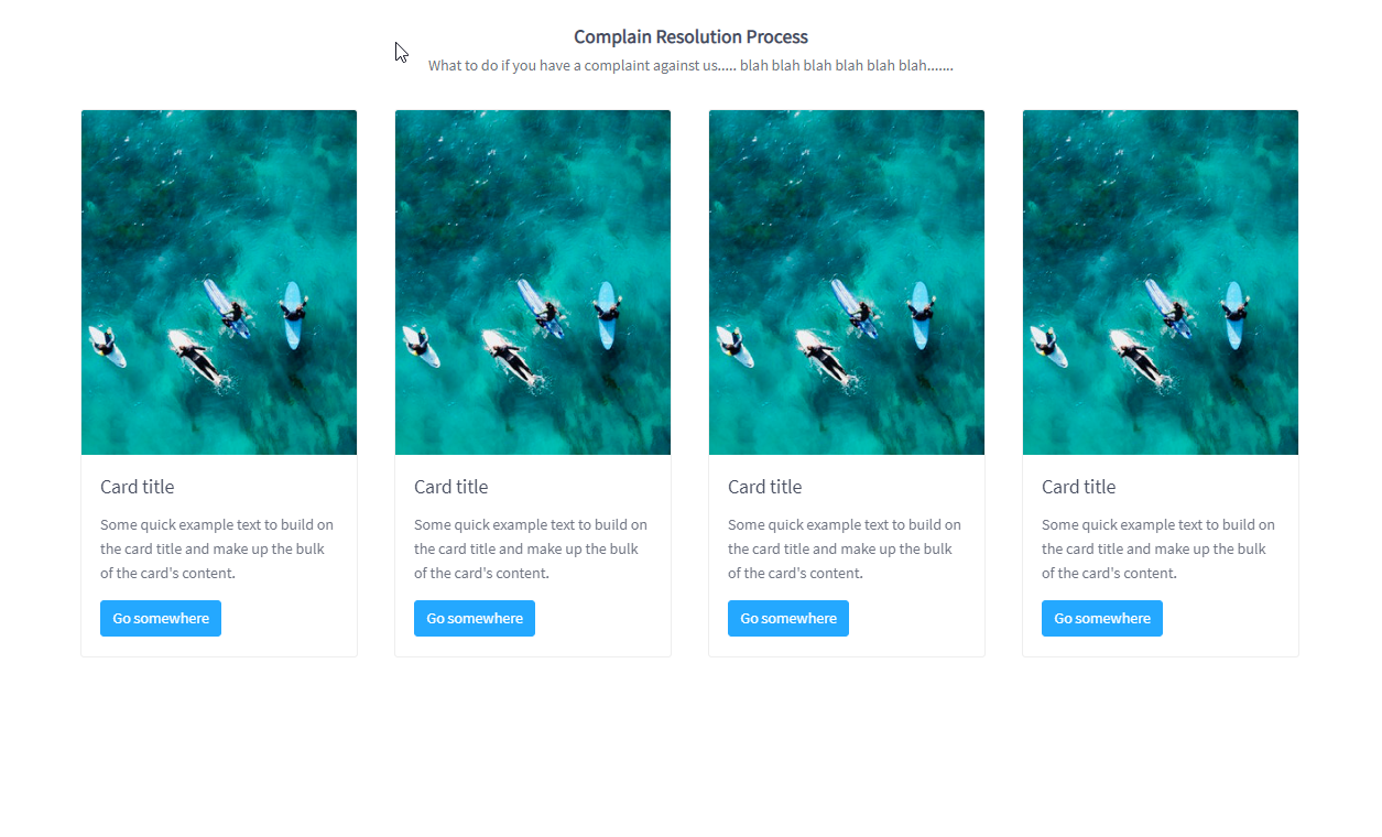
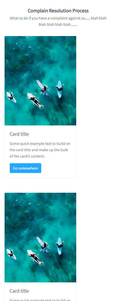
我对此进行了广泛的研究,但无济于事。我正在使用以下代码输出其下方的屏幕截图,但在移动设备上查看时,它会向左移动。
谁能帮我解决这个问题?提前致谢!
<div class="container">
    <div class="row g-mb-20">
      <div class="col-md-6 col-lg-3 g-mb-50 justify-content-center">
        <div class="card" style="width: 18rem;">
        <img src="assets/img/calisurf1.jpg" class="card-img-top" alt="...">
          <div class="card-body">
          <h5 class="card-title">Card title</h5>
          <p class="card-text">Some quick example text to build on the card title and make up the bulk of the card's content.</p>
          <a href="#" class="btn btn-primary">Go somewhere</a>
          </div>
        </div>
      </div>
    </div>
  </div>