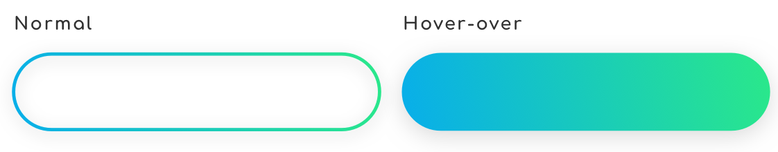
6

这是我会得到的结果: 渐变边框/悬停时的渐变背景

所以默认按钮具有透明背景的渐变边框(因为我想通过它查看父级的背景)。当用户将鼠标悬停在按钮上时,我想用相同的渐变填充它有边框。

所以首先我尝试使用border-image 属性和我的边框的.svg 图像:

button {
  background: transparent;
  background-repeat: no-repeat;
  border: 3px;
  border-style: solid;
  border-color: transparent;
  border-image-source: url(assets/images/icons/border.svg);
  border-image-repeat: stretch stretch;
  border-image-slice: 49;
  border-image-width: 100px;
  border-image-outset: 6px;
  padding: 16px 28px;
  border-radius: 100px;
}

所以我或多或少得到了我正在等待的结果: 结果

现在,如何管理悬停动画并在不改变大小的情况下填充背景!?

也许边界图像不是最好的方法吗?

感谢您的帮助,干杯!

4

3 回答 3

2

一个想法是依靠,background-attachement:fixed因为您使用的是背景图像,我们可以模拟透明效果,但您将在背景上有滚动效果:

.container {
  padding:100px 0;
  background:
    url(https://picsum.photos/800/300?image=1069) fixed;
}
.button {
  width:200px;
  height:50px;
  cursor:pointer;
  color:#fff;
  margin: auto;
  border:3px solid transparent;
  border-radius:50px;
  text-align:center;
  font-size:30px;
  background:
    url(https://picsum.photos/800/300?image=1069) padding-box fixed,
    linear-gradient(-45deg, #2ae88a 0%, #08aeea 100%) border-box;
}
.button:hover {
  background:
    linear-gradient(-45deg, #2ae88a 0%, #08aeea 100%) border-box;
}
<div class="container">
  <div class="button">Some text</div>
</div>

于 2018-08-16T11:53:32.663 回答
2

解决方案

好的,最后我找到了一种解决方法来实现我的愿望,它几乎都来自 SVG 文件。我稍微调整了我的 SVG,以便获得两条不同的路径,渐变描边但未填充,另一条渐变填充但没有描边。一个在另一个上,不透明度是万能钥匙:)

<a type="button" href="#">
<svg class="icon" viewBox="0 0 250 100" version="1.1" xmlns="http://www.w3.org/2000/svg" xmlns:xlink="http://www.w3.org/1999/xlink">
  <defs>
      <linearGradient x1="0%" y1="100%" x2="100%" y2="0%" id="linearGradient-1">
          <stop stop-color="#08AEEA" offset="0%"></stop>
          <stop stop-color="#2AE88A" offset="100%"></stop>
      </linearGradient>
  </defs>
  <path fill="none" d='M50,95 a45,45 0 0,1 0,-90 h150 a45,45 0 1,1 0,90 h-150' />
  <path class="icon--plain" fill="url(#linearGradient-1)" d='M50,95 a45,45 0 0,1 0,-90 h150 a45,45 0 1,1 0,90 h-150' />
</svg>
Invest now

这是CSS(我正在使用SCSS btw):

a[type="button"] {
  position: relative;
  padding: 1rem 1.75rem;
  z-index: 0;

  .icon {
    position: absolute;
    top: 0px;
    left: 0px;
    height: 100%;
    width: 100%;
    z-index: -1;

    path {
      transition: opacity 0.4s ease;

      &:first-of-type {
        fill: transparent;
        stroke: url(#linearGradient-1);
        stroke-width: 3;
        opacity: 1;
      }

      &.icon--plain {
        opacity: 0;
        stroke: none;
        stroke-width: 0;
      }
    }    
  }

  &:hover {
    path {
      &:first-of-type {
        opacity: 0;
      }

      &.icon--plain {
        opacity: 1;
      }
    }
  }
}
于 2018-08-17T14:40:29.497 回答
0

这可以通过 CSS 渐变来实现。看看我下面的解决方案:

.box {
  width: 250px;
  height: 100px;
  background: transparent;
  border: 5px solid transparent;
  -moz-border-image: -moz-linear-gradient(top, #3acfd5 0%, #3a4ed5 100%);
  -webkit-border-image: -webkit-linear-gradient(top, #3acfd5 0%, #3a4ed5 100%);
  border-image: linear-gradient(to bottom, #3acfd5 0%, #3a4ed5 100%);
  border-image-slice: 1;
  color: white;
}

.box:hover {
  background: linear-gradient(to bottom, #3acfd5 0%, #3a4ed5 100%);
}

请注意,您需要将自己的渐变添加到....btn下的类中background-image: linear-gradient

在这里玩我的解决方案: https ://codepen.io/lachiekimber/pen/mjYNeN

于 2018-08-16T00:37:34.397 回答