它需要官方MaterialCardView(扩展了androidx.cardview.widget.CardView)和至少1.1.0版本的Material components library。
在您的布局中添加MaterialCardView:
    <com.google.android.material.card.MaterialCardView
        style="@style/CustomCardViewStyle"
        ...>

    </com.google.android.material.card.MaterialCardView>
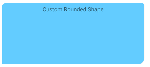
定义继承材料卡样式的自定义样式(例如Widget.MaterialComponents.CardView)并使用shapeAppearanceOverlay属性:
  <style name="CustomCardViewStyle" parent="@style/Widget.MaterialComponents.CardView">
     <item name="shapeAppearanceOverlay">@style/ShapeAppearanceOverlay_card_custom_corners</item>
  </style>


  <style name="ShapeAppearanceOverlay_card_custom_corners" parent="">
    <item name="cornerFamily">rounded</item>
    <item name="cornerSizeTopRight">4dp</item>
    <item name="cornerSizeTopLeft">8dp</item>
    <item name="cornerSizeBottomRight">16dp</item>
    <item name="cornerSizeBottomLeft">0dp</item>
  </style>
您也可以通过编程方式实现它。
只需将自定义应用ShapeAppearanceModel到卡片的角落即可。
就像是:
float radius = getResources().getDimension(R.dimen.my_corner_radius);
cardView.setShapeAppearanceModel(
  cardView.getShapeAppearanceModel()
      .toBuilder()
      .setTopLeftCorner(CornerFamily.ROUNDED,..)
      .setTopRightCorner(CornerFamily.ROUNDED,..)
      .setBottomRightCorner(CornerFamily.ROUNDED,radius)
      .setBottomLeftCornerSize(0)
      .build());
注意:它需要库的 1.1.0 版本。
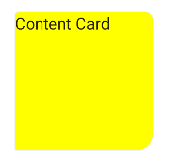
使用Jetpack composeshape,您可以使用Card.
就像是:
    Card(
        shape = RoundedCornerShape(
           4.dp,
           8.dp,
           16.dp,
           2.dp)
    ){
        Text("Content Card")
    }