29

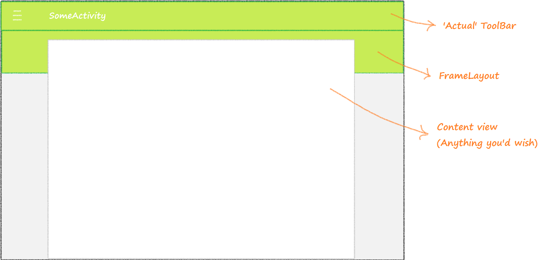
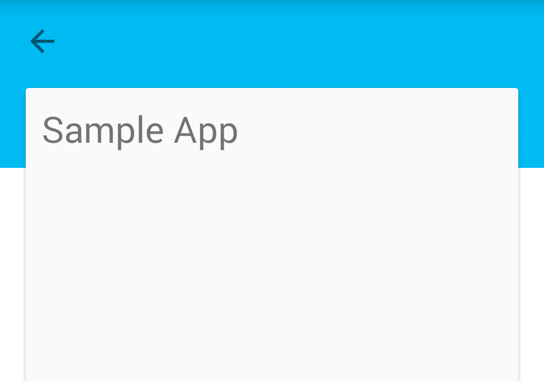
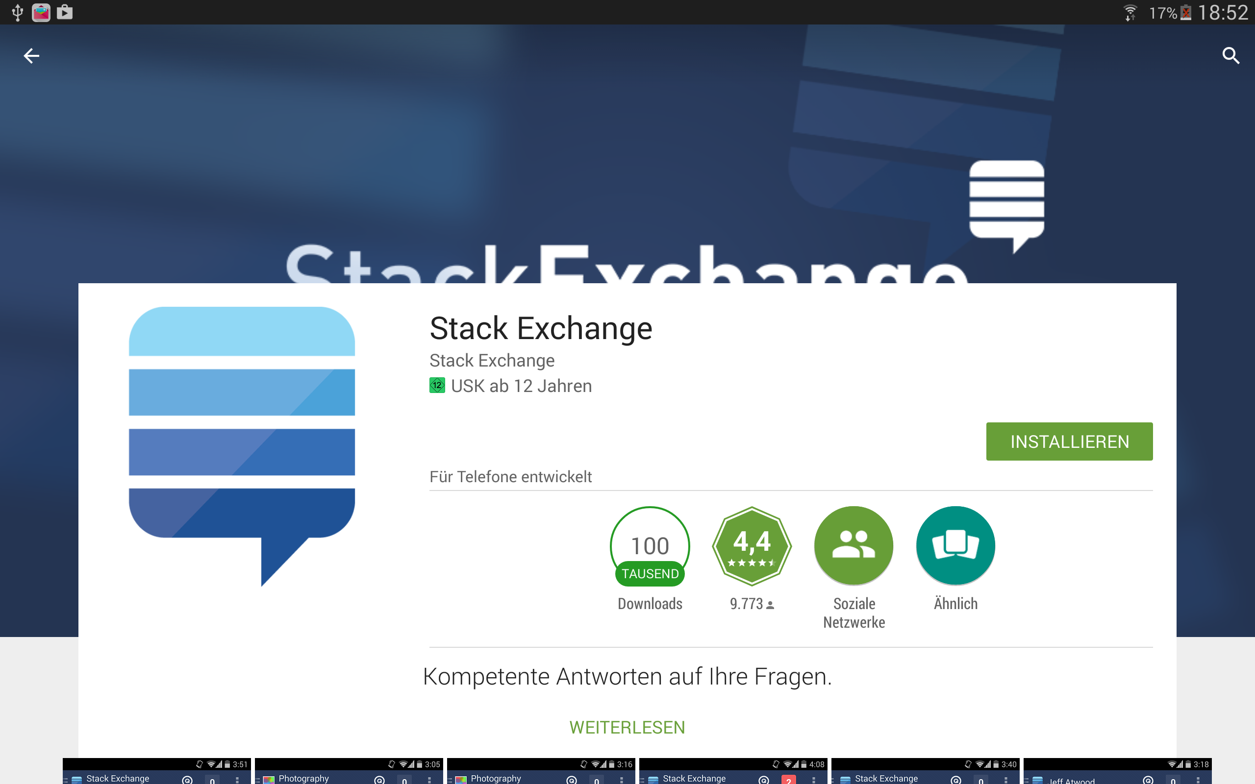
我想实现这样的目标。(不是 FAB 或 Snackbar)。如何创建布局,覆盖 AppBarLayout?像这样!(例如)

具有覆盖内容的 AppBarLayout

喜欢 Play 商店:

就像在 Play 商店中一样

我的带有 CoordinatorLayout 的 AppBarLayout 和带有 RelativeLayout 的 NestedScrollView 作为内容如下所示:

<android.support.design.widget.CoordinatorLayout xmlns:android="http://schemas.android.com/apk/res/android"
xmlns:app="http://schemas.android.com/apk/res-auto"
xmlns:tools="http://schemas.android.com/tools"
android:id="@+id/rootLayout"
android:layout_width="match_parent"
android:layout_height="match_parent">

<android.support.design.widget.AppBarLayout
    android:layout_width="match_parent"
    android:layout_height="@dimen/_118sdp"
    android:theme="@style/ThemeOverlay.AppCompat.Dark.ActionBar">

    <android.support.design.widget.CollapsingToolbarLayout
        android:id="@+id/collapsingToolbarLayout"
        android:layout_width="match_parent"
        android:layout_height="match_parent"
        app:contentScrim="@color/mpc_pink"
        app:expandedTitleMarginStart="@dimen/_40sdp"
        app:layout_scrollFlags="scroll|exitUntilCollapsed">

        <de.mypostcardstore.widgets.ItemImageView
            android:id="@+id/header"
            android:layout_width="match_parent"
            android:layout_height="match_parent"
            android:scaleType="centerCrop"
            android:src="@color/mpc_pink"
            app:layout_collapseMode="parallax"
            app:layout_collapseParallaxMultiplier="0.7" />

        <android.support.v7.widget.Toolbar
            android:id="@+id/article_toolbar"
            android:layout_width="match_parent"
            android:layout_height="?attr/actionBarSize"
            android:minHeight="?attr/actionBarSize"
            app:contentScrim="@color/mpc_pink"
            app:layout_collapseMode="pin"
            app:layout_scrollFlags="scroll|enterAlways"
            app:popupTheme="@style/ThemeOverlay.AppCompat.Light"
            app:theme="@style/ThemeOverlay.AppCompat.Dark.ActionBar" />


    </android.support.design.widget.CollapsingToolbarLayout>

</android.support.design.widget.AppBarLayout>

<android.support.v4.widget.NestedScrollView
    android:layout_width="match_parent"
    android:layout_height="match_parent"
    android:background="?android:colorBackground"
    android:fillViewport="true"
    app:layout_behavior="@string/appbar_scrolling_view_behavior">

    <RelativeLayout
        android:layout_width="match_parent".....>

如果有人可以帮助我,那就太棒了。我在互联网上找不到任何东西......

提前致谢!

4

4 回答 4

48

只需添加类似

app:behavior_overlapTop="64dp"

到您的NestedScrollView,它将被放置在展开的工具栏上方。

此外,您应该添加类似

app:expandedTitleMarginBottom="70dp"

到您的CollapsingToolbarLayout以便标题不会出现在您的覆盖滚动内容下方。

于 2015-07-03T09:33:16.803 回答
15

这很简单,真的。您可以通过使用 、 和您的内容视图的组合来实现这一点ToolBarFrameLayout可能ListView像您的第一个示例或任何内容)。

这个想法是让你FrameLayout拥有和你一样的颜色,给人一种比它大得多ToolBar的错觉。ToolBar然后剩下要做的就是使您的内容视图成为最后一个(或在 API 21 及更高版本中:拥有最高elevation属性),以便它看起来好像漂浮在上述FrameLayout.

请参阅下面的插图:

在此处输入图像描述

既然您有了大主意,下面是一些用于执行此类操作的真实 XML 片段。(我实际上在我的一个应用程序中使用了这种布局):

<!-- Somewhere in your layout.xml -->

....

    <android.support.v7.widget.Toolbar
        android:id="@+id/tb_toolbar"
        android:layout_width="match_parent"
        android:layout_height="@dimen/abc_action_bar_default_height_material"
        android:background="?attr/colorPrimary"
        android:minHeight="?attr/actionBarSize"
        app:contentInsetStart="72dp"
        app:popupTheme="@style/ThemeOverlay.AppCompat.Light"
        app:theme="@style/ThemeOverlay.AppCompat.Dark.ActionBar"/>

    <!-- This is the 'faux' ToolBar I've been telling you about. This is the part that will be overlaid by the content view below. -->
    <FrameLayout
        android:id="@+id/v_toolbar_extension"
        android:layout_width="match_parent"
        android:layout_height="64dp"
        android:layout_below="@+id/tb_toolbar"
        android:background="?attr/colorPrimary"
        android:elevation="2dp"/>

    <!-- Normally, I use this FrameLayout as a base for inflating my fragments. You could just use put your content view here. -->
    <FrameLayout
        android:id="@+id/ly_content"
        android:layout_width="match_parent"
        android:layout_height="match_parent"
        android:layout_below="@+id/tb_toolbar"
        android:elevation="3dp"/>

....

请注意, myly_content的海拔值高于v_toolbar_extension. 这将为您提供所需的“叠加工具栏”效果。

最后但并非最不重要的一点是,您可能希望在活动的某处添加此行onCreate()

/* Assuming mToolbar exists as a reference to your ToolBar in XML. */
setSupportActionBar(mTbToolbar);
getSupportActionBar().setElevation(0);

代码要做的就是将您的ToolBar海拔设置为零;删除作为默认设置给工具栏的预设阴影。如果你不这样做,所说的影子会在你ToolBar和你的之间形成一个“接缝” FrameLayout,从而打破两者相同的错觉。

ps,为您的内容视图在每一侧提供填充也很重要。这样做,您的内容视图将不会覆盖屏幕的整个宽度(这会使此效果无用)。


注意:我在这里看到一些很好的答案,其中提到了没有,FrameLayout而是使ToolBar更高。虽然理论上它可能和我提出的解决方案一样有效,但在尝试操纵滚动时可能会遇到问题;通过这样做,您将无法分离ToolBar及其扩展。您将被迫制作Toolbar静态或ToolBar完全滚动(使滚动有点奇怪)。

除此之外,您无法轻松地将自定义可绘制对象分配到Toolbar. 因此,很难遵循您在上面给出的 Google Play 示例。如果您使用我的解决方案,您需要做的就是使您的Toolbar透明并将可绘制对象分配给FrameLayout

于 2015-06-29T16:57:55.577 回答
1

我有类似的要求,我实现了如下。

您的活动主题应扩展 Theme.AppCompat.Light.NoActionBar。我创建了一个布局 XML 文件:

<android.support.v7.widget.Toolbar
    android:id="@+id/toolbar_main"
    android:layout_width="match_parent"
    android:layout_height="@dimen/action_bar_size_x2"
    android:background="@color/colorPrimary"
    android:minHeight="?attr/actionBarSize" />

<LinearLayout
    android:layout_width="match_parent"
    android:layout_height="match_parent"
    android:layout_marginLeft="15dp"
    android:layout_marginRight="15dp"
    android:layout_marginTop="@dimen/action_bar_size"
    android:orientation="vertical" >

    <android.support.v7.widget.CardView
        android:layout_width="match_parent"
        android:layout_height="match_parent" >

        <LinearLayout
            android:layout_width="match_parent"
            android:layout_height="match_parent"
            android:orientation="vertical" >

            <TextView
                android:layout_width="match_parent"
                android:layout_height="wrap_content"
                android:layout_margin="10dp"
                android:text="@string/app_name"
                android:textSize="24sp" />
        </LinearLayout>
    </android.support.v7.widget.CardView>
</LinearLayout>

活动应该是这样的:

public class MainActivity extends ActionBarActivity {

    @Override
    protected void onCreate(Bundle savedInstanceState) {
        super.onCreate(savedInstanceState);
        setContentView(R.layout.activity_main);

        Toolbar maintoolbar = (Toolbar) findViewById(R.id.toolbar_main);
        setSupportActionBar(maintoolbar);
        getSupportActionBar().setDisplayHomeAsUpEnabled(true);
    }
}

我有这样的看法: 在此处输入图像描述

于 2015-07-02T04:28:47.507 回答
0

我确实尝试实现你提到的效果,它被称为Card Toolbar in Android,它确实按预期工作。这是我的布局,看看它:

<FrameLayout xmlns:android="http://schemas.android.com/apk/res/android"
xmlns:app="http://schemas.android.com/apk/res-auto"
android:layout_width="match_parent"
android:layout_height="match_parent"
android:background="@color/background_material_light" >
<android.support.v7.widget.Toolbar
    android:layout_width="match_parent"
    android:layout_height="@dimen/toolbar_double_height"
    android:background="?attr/colorPrimary" />
<android.support.v7.widget.CardView
    android:layout_width="match_parent"
    android:layout_height="match_parent"
    android:layout_marginLeft="@dimen/cardview_toolbar_spacer"
    android:layout_marginRight="@dimen/cardview_toolbar_spacer"
    android:layout_marginTop="?attr/actionBarSize"
    app:cardBackgroundColor="@android:color/white">
    <LinearLayout
        android:layout_width="match_parent"
        android:layout_height="match_parent"
        android:orientation="vertical">
        <android.support.v7.widget.Toolbar
            android:layout_width="match_parent"
            android:layout_height="?attr/actionBarSize" />
        <View
            android:layout_width="match_parent"
            android:layout_height="1dp"
            android:alpha="0.12"
            android:background="@android:color/black" />
    </LinearLayout>
</android.support.v7.widget.CardView>
</FrameLayout>

希望你会受到启发。

于 2015-07-02T03:19:05.400 回答