我曾多次使用 Bootstrap,并且仅在缺少元视口标记时才看到此问题。但是,它已加载,我仍然遇到移动设备上的 Bootstrap 问题。可能有人知道还有什么可能导致这种情况吗?
问题:
- 按钮路线显示
- 样式显示不正确
- CSS 显示在视图中
- 手机导航不见了
- 格式/对齐已关闭
头:
<!DOCTYPE html>
<html lang="en">
  <head>
    <meta charset="utf-8">
    <meta http-equiv="X-UA-Compatible" content="IE=edge">
    <meta name="viewport" content="width=device-width, initial-scale=1, maximum-scale=1">

    <title>Training Portal</title>
    <!-- bootstrap/jquery -->
    <link href="http://netdna.bootstrapcdn.com/bootstrap/3.1.1/css/bootstrap.min.css" rel="stylesheet">

    <!-- custom stylesheet -->
    <link href="<?= base_url("stylesheets/cust.css"); ?>" rel="stylesheet" type="text/css" media="screen">

  </head>
结尾处的脚本<body>:
    <!-- scripts -->
    <script src="http://code.jquery.com/jquery.js"></script>
    <script src="<?= base_url("assets/script.js"); ?>"></script>

    <!-- Bootstrap JavaScript -->
    <script src="http://netdna.bootstrapcdn.com/bootstrap/3.1.1/js/bootstrap.min.js"></script>
  </body>
视口数据也添加到 CSS 中:
@viewport{
    zoom: 1.0;
    width: extend-to-zoom;
}
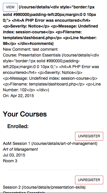
手机问题示例:
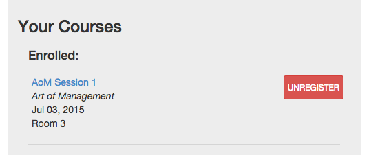
这是在桌面上的样子: