我需要让用户能够在 QML 应用程序中选择日期和时间。对于选择日期Calendar,QtQuick 控件中有。我还没有找到一个类似的控件来让用户选择一天中的时间。
在互联网上有几个例子,比如Grog或Harmattan。然而,我假设它们不像其他 QtQuick 控件那样与本机外观和感觉集成。
是否有我不知道的标准方法,我没有遇到的好的替代方案或关于选择的建议?
从 Qt 5.5 开始,所谓的Qt Quick Enterprise Controls也将在 Qt 的社区版中以Qt Quick Extras的名义提供。其中,这Tumbler似乎是满足您要求的可行解决方案:您可以轻松设置两列,一列用于小时,另一列用于分钟。
如果您仍然对循环选择感兴趣(或想要实现自己的 tumbler),您可以采取不同的方式,例如创建自己的组件,继承自QQuickItem或QQuickPaintedItem利用自定义视图PathView。后者是我将在此答案中介绍的情况。有关自定义组件创建的示例,请参阅提供的链接。
引用以下文档PathView:
视图有一个模型,它定义了要显示的数据,还有一个委托,它定义了数据应该如何显示。为路径上的每个项目实例化委托。可以轻弹这些项目以沿路径移动它们。
因此,路径定义了项目在屏幕上的布局方式,即使是以圆形方式。路径可以通过一种Path类型来构造,即不同种类的路径段序列。PathArc是我们感兴趣的,因为它提供了所需的圆形。
以下示例使用这些元素来定义循环时间选择器。每条路径都是通过利用currentIndex委托来构造的:一个整数用作PathViews 的模型 -分别12用于小时视图和6分钟视图。通过利用index附加属性并对其进行操作以生成小时和 10 分钟间隔值来生成代表的文本(请参阅代表Text项)。最后,当前元素的文本(即currentItem)被绑定到窗口中心的时间标签:随着时间的currentIndex变化currentItem,标签也得到更新。
整个组件如下所示:
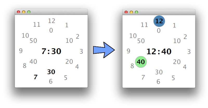
highlight组件(蓝色和绿色圆圈)用于以图形方式表示时间的编辑:当可见时可以编辑时间,即Item可以选择另一个路径。单击中心的时间标签可在正常模式和编辑模式之间切换。
在编辑模式下,用户可以简单地悬停不同的小时/分钟值来选择它们。如果单击新选择的小时/分钟,PathView则禁用该特定的编辑,并且相应的突出显示圆圈消失。
这段代码显然只是一个玩具示例,让您了解PathView可用于什么。可以进行一些改进,例如动画、更好的数字定位、详细的分钟表示、漂亮的背景等等。但是,它们超出了问题的范围,没有被考虑。
import QtQuick 2.4
import QtQuick.Window 2.2
import QtQuick.Controls.Styles 1.3
import QtQuick.Layouts 1.1

Window {
    visible: true
    width: 280; height: 280

    RowLayout {             // centre time label
        anchors.centerIn: parent
        Text {
            id: h
            font.pixelSize: 30
            font.bold: true
            text: outer.currentItem.text
        }
        Text {
            id: div
            font.pixelSize: 30
            font.bold: true
            text: qsTr(":")
        }
        Text {
            id: m
            font.pixelSize: 30
            font.bold: true
            text: inner.currentItem.text
        }

        MouseArea {
            anchors.fill: parent
            onClicked: outer.choiceActive = inner.choiceActive = !outer.choiceActive
        }
    }


    PathView {          // hours path
        id: outer
        property bool pressed: false
        model: 12

        interactive: false
        highlightRangeMode:  PathView.NoHighlightRange
        property bool choiceActive: false

        highlight: Rectangle {
            id: rect
            width: 30 * 1.5
            height: width
            radius: width / 2
            border.color: "darkgray"
            color: "steelblue"
            visible: outer.choiceActive
        }

        delegate: Item {
            id: del
            width: 30
            height: 30
            property bool currentItem: PathView.view.currentIndex == index
            property alias text : textHou.text
            Text {
                id: textHou
                anchors.centerIn: parent
                font.pixelSize: 24
                font.bold: currentItem
                text: index + 1
                color: currentItem ? "black" : "gray"
            }

            MouseArea {
                anchors.fill: parent
                enabled: outer.choiceActive
                onClicked: outer.choiceActive = false
                hoverEnabled: true
                onEntered: outer.currentIndex = index
            }
        }

        path: Path {
            startX: 200; startY: 40
            PathArc {
                x: 80; y: 240
                radiusX: 110; radiusY: 110
                useLargeArc: false
            }
            PathArc {
                x: 200; y: 40
                radiusX: 110; radiusY: 110
                useLargeArc: false
            }
        }
    }

    PathView {          // minutes path
        id: inner
        property bool pressed: false
        model: 6
        interactive: false
        highlightRangeMode:  PathView.NoHighlightRange
        property bool choiceActive: false

        highlight: Rectangle {
            width: 30 * 1.5
            height: width
            radius: width / 2
            border.color: "darkgray"
            color: "lightgreen"
            visible: inner.choiceActive
        }

        delegate: Item {
            width: 30
            height: 30
            property bool currentItem: PathView.view.currentIndex == index
            property alias text : textMin.text
            Text {
                id: textMin
                anchors.centerIn: parent
                font.pixelSize: 24
                font.bold: currentItem
                text: index * 10
                color: currentItem ? "black" : "gray"
            }

            MouseArea {
                anchors.fill: parent
                enabled: inner.choiceActive
                onClicked: inner.choiceActive = false
                hoverEnabled: true
                onEntered: inner.currentIndex = index
            }
        }

        path: Path {
            startX: 140; startY: 60
            PathArc {
                x: 140; y: 220
                radiusX: 40; radiusY: 40
                useLargeArc: false
            }
            PathArc {
                x: 140; y: 60
                radiusX: 40; radiusY: 40
                useLargeArc: false
            }
        }
    }

    // to set current time!
    onVisibleChanged: {
        var d = new Date();
        outer.currentIndex = d.getUTCHours() % 12
        inner.currentIndex = d.getMinutes() / 10
    }
}
我认为我自己的时间选择器很好,您可以根据需要在波斯语方向上扩展它,您需要稍微交换一些东西或使用一些布局镜像:
UButton.qml
import QtQuick 2.4
import QtQuick.Controls 2.4
import QtQuick.Controls.Universal 2.4
Button {
    id:root
    Universal.accent: Universal.Cobalt
    Universal.foreground: "white"
    highlighted: true
    font.family: "B Nazanin"
    font.pointSize: 12
}
UCard.qml
import QtQuick 2.4
import QtQuick.Controls 2.4
import QtQuick.Controls.Universal 2.4
import QtGraphicalEffects 1.0
Item{
    property alias radius : morakhasiRect.radius
    property alias color : morakhasiRect.color
    implicitWidth: 150
    implicitHeight: 150

    Rectangle{
        anchors.rightMargin: 1
        anchors.leftMargin: 1
        anchors.bottomMargin: 1
        anchors.topMargin: 1
        id:morakhasiRect
        anchors.fill: parent
        color: "#f5f5f5"
    }
    DropShadow {
        anchors.fill: morakhasiRect
        radius: 9.0
        samples: 17
        color: "#80000000"
        source: morakhasiRect
    }
}
URect.qml
Rectangle{
    color: "transparent"
    border.color: Universal.color(Universal.Cobalt)
    border.width: 1
}
UTumbler.qml
import QtQuick 2.0
import QtQuick.Controls.Universal 2.4
import QtQuick.Controls 2.4
Tumbler{
    id:hourSpin
    wrap: false
    delegate: Text{

        font.pointSize: 12
        text: modelData
        horizontalAlignment: Text.AlignHCenter
        verticalAlignment: Text.AlignVCenter
        opacity: 1.0 - Math.abs(Tumbler.displacement) / (hourSpin.visibleItemCount / 2)
    }
    Rectangle {
        anchors.horizontalCenter: hourSpin.horizontalCenter
        y: hourSpin.height * 0.4
        width: 40
        height: 1
        color: Universal.color(Universal.Cobalt)
    }

    Rectangle {
        anchors.horizontalCenter: hourSpin.horizontalCenter
        y: hourSpin.height * 0.6
        width: 40
        height: 1
        color: Universal.color(Universal.Cobalt)
    }
}
UTimeDialog
import QtQuick 2.0
import QtQuick.Controls 2.4
import QtQuick.Controls.Universal 2.4
Item{
    id:root
    property alias hour : hourSpin.currentIndex
    property alias minute : minuteSpin.currentIndex
    signal open
    signal close
    signal accepted
    signal rejected
    visible: element.opened
    onOpen: element.open()
    onClose: element.close()
    implicitWidth: 200
    implicitHeight: 200
    Dialog {
        id: element
        modal: true
        width: parent.width
        height: parent.height
        padding: 5
        margins: 5
        background: Item{

        }

        onAccepted: {
            root.accepted()
        }
        onRejected: {
            root.rejected()
        }
        contentItem: UCard{
            anchors.fill: parent
            radius: 10
        }

        Column{
            id: column
            spacing: 30
            anchors.centerIn: parent
            Row{
                id: row
                spacing: 20
                anchors.horizontalCenter: parent.horizontalCenter
                Column{
                    id: column1
                    spacing: 15
                    height: 80
                    width: 50
                    clip:true

                    UTumbler{
                        id:hourSpin
                        anchors.horizontalCenter: parent.horizontalCenter
                        anchors.verticalCenter: parent.verticalCenter
                        model: 24
                    }

                }
                Text{
                    text: ":"
                    font.pointSize: 12
                    anchors.verticalCenter: parent.verticalCenter
                    font.family: "B Nazanin"
                }
                Column{
                    id: column2
                    spacing: 15
                    height: 80
                    width: 50
                    clip:true

                    UTumbler{
                        id:minuteSpin
                        anchors.horizontalCenter: parent.horizontalCenter
                        anchors.verticalCenter: parent.verticalCenter
                        model: 60
                    }

                }

            }
            Row{
                anchors.horizontalCenter: parent.horizontalCenter
                spacing: 40
                UButton{
                    text:"select"

                    onClicked: {
                        element.reject()
                    }
                }
                UButton{
                    text: "cancel"
                    onClicked: {
                        element.accept()
                    }
                }
            }
        }

    }
}
UIcoButton.qml
import QtQuick 2.4
import QtQuick.Controls 2.4
import QtQuick.Controls.Universal 2.4
import QtGraphicalEffects 1.0
FocusScope{
    id:focusScope
    signal clicked
    property alias font : icoText.font.family
    property alias icon : icoText.text
    property alias size : icoText.font.pixelSize
    property alias caption : captionTxt.text
    property alias spacing : row.spacing
    property string colorEnter :Universal.color(Universal.Cobalt)
    property string colorExit :"#00171f"
    property alias state: root.state
    implicitWidth: captionTxt.text!= "" ? 100 : 35
    implicitHeight: 40
    Rectangle {
        id: root
        radius: 0
        anchors.fill: parent
        color: colorExit
        state: "default"
        focus: true

        onFocusChanged: {
            if(focus){
                root.border.width = 1
                root.border.color = Universal.color( Universal.Cobalt)
            }
            else{
                root.border.width = 0
                root.border.color = "transparent"
            }
        }

        Row{
            id: row
            anchors.rightMargin: 5
            anchors.leftMargin: 5
            anchors.bottomMargin: 5
            anchors.topMargin: 5
            anchors.fill: parent
            layoutDirection: Qt.RightToLeft
            spacing: 15
            Text {
                id: icoText
                text: ""
                anchors.verticalCenter: parent.verticalCenter
                font.pixelSize: 25
                font.family: "fontawesome"
                color: "white"
            }
            Text{
                id:captionTxt
                text: ""
                anchors.verticalCenter: parent.verticalCenter
                font.pixelSize: icoText.font.pixelSize * 55 /100
                font.family: "B Nazanin"
                color: "white"
                visible: text!= ""
            }

        }
        InnerShadow {
            id:shadow
            anchors.fill: row
            radius: 1.0
            samples: 17
            horizontalOffset: 1
            color: colorExit
            source: row
            visible: false
        }
        //    Glow {
        //        id:shadow
        //        anchors.fill: row
        //        radius: 6
        //        samples: 25
        //        color: "white"
        //        source: row
        //        visible: false
        //    }

        MouseArea{
            id: mouseArea
            anchors.fill: parent
            hoverEnabled: true
            onEntered: {
                if(root.state == "default")
                    root.color = colorEnter
                else{
                    icoText.color = colorEnter
                    captionTxt.color = colorEnter
                }
            }

            onExited: {
                if(root.state == "default")
                    root.color = colorExit
                else{
                    icoText.color = colorExit
                    captionTxt.color = colorExit
                }
            }

            onPressed: {
                shadow.visible = true
            }

            onReleased: {
                shadow.visible = false
            }

            onClicked: {
                focusScope.clicked()
            }
        }
        states: [
            State {
                name: "transparent"
                PropertyChanges {
                    target: root
                    color:"transparent"
                }
                PropertyChanges {
                    target: icoText
                    color:colorExit
                }
                PropertyChanges {
                    target: captionTxt
                    color:colorExit
                }
            },
            State{
                name: "default"
                PropertyChanges {
                    target: root
                    color:"#00171f"
                }
                PropertyChanges {
                    target: icoText
                    color:"white"
                }
                PropertyChanges {
                    target: captionTxt
                    color:"white"
                }
            }

        ]
    }
}
UTimePicker
import QtQuick 2.4
import QtQuick.Controls 2.4
import QtQuick.Controls.Universal 2.4
Item {
    id: scope
    clip: true
    QtObject{
        id:variables
        property var time: ({hour: 0, minute: 0})
        onTimeChanged: {
            refreshDialogTime()

        }
    }
    signal changed
    property alias caption : captionTxt.text
    property size size : Qt.size(30,70)
    property string splitter : ":"
    property alias spacing : row.spacing
    Component.onCompleted: {
        var q = new Date()
        var curtime = q.toLocaleTimeString().substring(0,5);
        if(splitter != ":"){
            curtime.replace(':',splitter)
        }
        var vars = curtime.split(':')
        setTime(vars[0],vars[1])
        refreshDialogTime()
    }
    function refreshDialogTime(){
        dialog.hour = variables.time.hour
        dialog.minute = variables.time.minute
    }

    function getTime(){
        return variables.time;
    }

    function setTimeString(time){
        textArea.text= time
    }

    function setTime(hour,minute){
        var _hour = hour
        if(_hour<10){
            _hour = "0"+hour.toString()
        }
        else{
            _hour = hour.toString()
        }
        var _minute = minute
        if(_minute <10){
            _minute = "0"+minute.toString()
        }
        else{
            _minute = minute.toString()
        }

        var time = _hour+":"+_minute
        textArea.text = time
    }
    implicitHeight: 50
    implicitWidth: 200
    Row{
        id: row
        width: parent.width
        height: parent.height
        spacing: 25
        layoutDirection: Qt.RightToLeft
        Text{
            font.bold: true
            id: captionTxt
            font.pointSize: 12
            horizontalAlignment: Text.AlignRight
            anchors.verticalCenter: parent.verticalCenter
            width: scope.size.width * scope.width /100 - scope.spacing/2
            verticalAlignment: Text.AlignVCenter
            font.family: "B Nazanin"

        }
        Item{
            id: element
            anchors.verticalCenter: parent.verticalCenter
            height: parent.height
            width: scope.size.height * scope.width /100 - scope.spacing/2
            Rectangle{
                id:backrec
                height: parent.height
                anchors.verticalCenter: parent.verticalCenter
                width: parent.width
                border.width: 1
                border.color: "black"
                TextField{
                    id:textArea
                    selectByMouse: true

                    anchors.verticalCenter: parent.verticalCenter

                    height: parent.height
                    rightPadding: 5
                    bottomPadding: 5
                    topPadding: 5
                    padding: 5
                    verticalAlignment: Text.AlignVCenter
                    onFocusChanged: {
                        if(focus){
                            captionTxt.color = Universal.color( Universal.Cobalt)
                            backrec.border.color = Universal.color( Universal.Cobalt)

                        }
                        else{
                            captionTxt.color = "black"
                            backrec.border.color = "black"
                        }
                    }
                    background: URect{

                        color: "transparent"
                        border.color: "black"
                        border.width: 0
                    }
                    onTextChanged: {
                        var _temp = text.split(splitter)
                        if(_temp.length>0){

                            variables.time.hour =_temp[0]==""?0:  _temp[0]
                            variables.time.minute = _temp[1]==""?0:_temp[1]
                        }
                        changed()
                    }


                    placeholderText : "HH:mm"
                    anchors.right: parent.right
                    anchors.left: iconBtn.right
                    font.family: "B Nazanin"
                    font.pointSize: 12
                    inputMask:  "99:99"
                    validator: RegExpValidator { regExp: /^([0-1\s]?[0-9\s]|2[0-3\s]):([0-5\s][0-9\s])$ / }
                }
                IcoButton{
                    anchors.verticalCenter: parent.verticalCenter
                    anchors.left: parent.left
                    anchors.leftMargin: 2
                    id:iconBtn
                    caption: ""
                    size: 30
                    icon: "\uf017"
                    state: "transparent"
                    onClicked: {
                        textArea.focus = true
                        dialog.open()
                    }
                }
            }


        }
    }
    UTimeDialog{
        id:dialog
        x:iconBtn.x
        y:iconBtn.y+ scope.height
        onAccepted: {
            setTime(hour,minute)
        }
    }
}
例子
UTimePicker{
    x: 285
    width: 200
    spacing: 15
    size: Qt.size(35,65)
    caption: "time"
    onChanged: {
        var i =  getTime()
        console.log(i.hour)
        console.log(i.minute)
    }
}
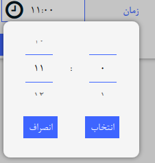
看起来像这样:
对于镜像:
    LayoutMirroring.enabled: true
    LayoutMirroring.childrenInherit: true
如果有人感兴趣,我可以为此共享库
这是时间挑选的iphone风格
   Rectangle {
    id:clockid
    width: frame.implicitWidth + 10
    height: frame.implicitHeight + 10
    anchors.centerIn: parent
    color: "cornsilk"
    function formatText(count, modelData) {
        var data = count === 12 ? modelData + 1 : modelData;
        return data.toString().length < 2 ? "0" + data : data;
    }
    FontMetrics {
        id: fontMetrics
        font.pixelSize: 10
    }

    Component {
        id: delegateComponent

        Label {
            text: clockid.formatText(Tumbler.tumbler.count, modelData)
            opacity: 1.0 - Math.abs(Tumbler.displacement) / (Tumbler.tumbler.visibleItemCount / 2)
            horizontalAlignment: Text.AlignHCenter
            verticalAlignment: Text.AlignVCenter
            font.pixelSize: fontMetrics.font.pixelSize * 1.25
        }

    }

    Frame {
        id: frame
        padding: 0
        anchors.centerIn: parent


        Row {
            id: row_clock

            Tumbler {
                id: hoursTumbler
                model: 12
                delegate: delegateComponent
                visibleItemCount: 5
            }

            Tumbler {
                id: minutesTumbler
                model: 60
                delegate: delegateComponent
                visibleItemCount: 5
            }

            Tumbler {
                id: amPmTumbler
                model: ["AM", "PM"]
                delegate: delegateComponent
            }
        }
    }
}