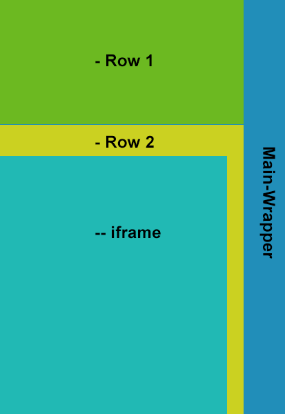
我有一个包含两行容器的容器(包装器),并且我将两行的高度值都设为自动,以便可以根据其中的内容动态调整其大小(而不是为每行提供特定高度,例如行顶高度 46 % 和行底 54%)。我正在尝试获取底行容器的高度以使用 CSS 自动填充屏幕(*不使用 JavaScript)。请检查下面附加的图像以获得预期的结果。请指教,谢谢。
HTML
<div id="content-wrapper">
    <div id="row-top">
        Lorem Ipsum is simply dummy text of the printing and typesetting industry.Lorem Ipsum is simply dummy text of the printing and typesetting industry.Lorem Ipsum is simply dummy text of the printing and typesetting industry.Lorem Ipsum is simply dummy text of the printing and typesetting industry.
    </div>
    <div id="row-bottom">
        <iframe id="gmap"></iframe>
    </div>
</div>
CSS
#content-wrapper {
    display:block;
    height:100%;
    overflow-y: scroll;
    width:600px;
    float:left;
    background-color:yellow;
}

#row-top {
    color:#fff;
    display:block;
    position:relative;
    width:100%;
    height:auto;
    background-color:blue;
}

#row-bottom {
    display:block;
    width:100%;
    height:auto;
}

iframe#gmap {
    overflow: hidden;
    height:100%;
    width: 100%
}
预期结果: