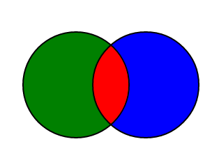
有谁知道如何在css3中制作上面的蓝色形状?
使用 css 边框半径和框阴影
<div class=social></div>
演示:http: //jsfiddle.net/vS7bS/4/
.social{
    margin: 100px;
width: 150px;
height: 150px;
position: relative;
background: green;
border-radius: 100%;
border: 2px solid black;
    overflow:hidden;
box-shadow: 100px 0 0 -2px blue, 100px 0 0px 0px black;
}
.social:after{
    content: '';
position: absolute;
left: 100px;
top: 0;
width: 100%;
height: 100%;
border-radius: 100%;
background: red;
box-shadow: 0 0 0 2px black;

}
演示 2:http: //jsfiddle.net/vS7bS/5/
演示:hover http://jsfiddle.net/vS7bS/6/
<div class=social>
    <section>
    <div></div>
    <div></div>
    </section>
    <div></div>
</div>
css
section{
    position:relative;
    width:150px;
    height:150px;
    overflow:hidden;
    border-radius:100%;
    box-shadow: 0 0 0 2px black;
    z-index: 10;
}

section div{
    width: 170px;
    height: 170px;
    border-radius:100%;
    border:2px solid black;
    position:absolute;
}
section div:nth-child(1):hover{
    background:orange;
}
section div:nth-child(2):hover{
    background:#333;
}
section div:nth-child(1){
    left: -8px;
top: -3px;
background: blue;
}
section div:nth-child(2){
    width: 150px;
height: 150px;
border-radius: 100%;
border: 2px solid black;
background: red;
right: -76px;
position: absolute;
}

.social{
    position:relative;
    width: 156px;
    height: 156px;

    margin:100px;
}

.social >div{
    width: 150px;
height: 150px;
border-radius: 100%;
border: 2px solid black;
background: yellow;
right: -70px;
top: 0;
position: absolute;
z-index: 1;
}

.social >div:hover{
    background:skyblue;
}
尝试这个
结果
#shape {
    position:absolute;
    top:100px;
    left:100px;
    width: 80px;
    height: 80px;
    background: blue;
    margin: 3px 0 0 30px;
    /* Rotate */
    -webkit-transform: rotate(-45deg);
    -moz-transform: rotate(-45deg);
    -ms-transform: rotate(-45deg);
    -o-transform: rotate(-45deg);
    transform: rotate(-45deg);
    /* Rotate Origin */
    -webkit-transform-origin: 0 100%;
    -moz-transform-origin: 0 100%;
    -ms-transform-origin: 0 100%;
    -o-transform-origin: 0 100%;
    transform-origin: 0 100%;
    -moz-border-radius: 60px 0px;
    -webkit-border-radius: 60px 0px;
    border-radius: 80px 0px;
}