我有以下 HTML 文档:
<!DOCTYPE HTML>
<html>
<head>
<meta charset="utf-8">
<title>Тег DIV</title>
<style type="text/css">
.block1 {
width: 200px;
background: #ccc;
padding: 5px;
padding-right: 20px;
border: solid 1px black;
float: left;
}
</style>
</head>
<body>
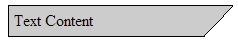
<div class="block1">Text Content</div>
</body>
</html>
我如何描述风格以获得以下内容?