我在stackoverflow上找到了这个例子:
这是伟大的。但我想知道如何修改该示例,以便我可以在圆圈中间包含文本?
我还发现了这个: 在 CSS 中垂直和水平居中文本(如 iphone 通知徽章)
但由于某种原因,它对我不起作用。当我创建以下测试代码时:
<div class="badge">1</div>
我得到的是椭圆形,而不是圆形。我正在尝试使用代码,看看如何让它工作。
我在stackoverflow上找到了这个例子:
这是伟大的。但我想知道如何修改该示例,以便我可以在圆圈中间包含文本?
我还发现了这个: 在 CSS 中垂直和水平居中文本(如 iphone 通知徽章)
但由于某种原因,它对我不起作用。当我创建以下测试代码时:
<div class="badge">1</div>
我得到的是椭圆形,而不是圆形。我正在尝试使用代码,看看如何让它工作。
设置line-height与 div 高度相同的值将显示垂直居中的一行文本。在此示例中,高度和行高为 500 像素。
.circle {
  width: 500px;
  height: 500px;
  line-height: 500px;
  border-radius: 50%;
  font-size: 50px;
  color: #fff;
  text-align: center;
  background: #000
}
<div class="circle">Hello I am A Circle</div>如果您的内容要包装并且高度未知,那么这是您最好的选择:
http://cssdeck.com/labs/aplvrmue
.badge {
  height: 100px;
  width: 100px;
  display: table-cell;
  text-align: center;
  vertical-align: middle;
  border-radius: 50%; /* may require vendor prefixes */
  background: yellow;
}
.badge {
  height: 100px;
  width: 100px;
  display: table-cell;
  text-align: center;
  vertical-align: middle;
  border-radius: 50%;
  background: yellow;
}
<div class="badge">1</div>您可以使用 css3 flexbox。
HTML:
<div class="circle-with-text">
    Here is some text in circle
</div>
CSS:
.circle-with-text {
  justify-content: center;
  align-items: center;
  border-radius: 100%;
  text-align: center;
  display: flex;
}
这将允许您拥有垂直和水平中间对齐的单行和多行文本。
body {
  margin: 0;
}
.circles {
  display: flex;
}
.circle-with-text {
  background: linear-gradient(orange, red);
  justify-content: center;
  align-items: center;
  border-radius: 100%;
  text-align: center;
  margin: 5px 20px;
  font-size: 15px;
  padding: 15px;
  display: flex;
  height: 180px;
  width: 180px;
  color: #fff;
}
.multi-line-text {
  font-size: 20px;
}
<div class="circles">
<div class="circle-with-text">
Here is some text in circle
</div>
<div class="circle-with-text multi-line-text">
Here is some multi-line text in circle
</div>
</div>对于我最近得到的网页设计,我必须解决固定圆圈问题中的居中和未知数量的文本,我想我会在这里为其他研究圆圈/文本组合的人分享解决方案。
我遇到的主要问题是文本经常会打破圆圈的界限。为了解决这个问题,我最终使用了 4 个 div。一个指定圆的最大(固定)边界的矩形容器。里面将是绘制圆的 div,其宽度和高度设置为 100%,因此更改父级的大小会更改实际圆的大小。里面是另一个矩形 div,它使用 %'s 将创建一个文本边界区域,防止任何文本离开圆圈(大部分)然后最后是文本的实际 div 和垂直居中。
作为代码更有意义:
/* Main Container -  this controls the size of the circle */
.circle_container
{
	width : 128px;
	height : 128px;
	margin : 0;
	padding : 0;
/*	border : 1px solid red; */
}

/* Circle Main draws the actual circle */
.circle_main
{
	width : 100%;
	height : 100%;
	border-radius : 50%;
	border : 2px solid black;	/* can alter thickness and colour of circle on this line */
	margin : 0;
	padding : 0;
}

/* Circle Text Container - constrains text area to within the circle */
.circle_text_container
{
	/* area constraints */
	width : 70%;
	height : 70%;
	max-width : 70%;
	max-height : 70%;
	margin : 0;
	padding : 0;

	/* some position nudging to center the text area */
	position : relative;
	left : 15%;
	top : 15%;

	/* preserve 3d prevents blurring sometimes caused by the text centering in the next class */
	transform-style : preserve-3d;

	/*border : 1px solid green;*/
}

/* Circle Text - the appearance of the text within the circle plus vertical centering */
.circle_text
{
	/* change font/size/etc here */
	font: 11px "Tahoma", Arial, Serif;
	text-align : center;

	/* vertical centering technique */
	position : relative;
	top : 50%;
	transform : translateY(-50%);
}
<div class="circle_container">
<div class="circle_main">
<div class="circle_text_container">
<div class = "circle_text">
Here is an example of some text in my circle.
</div>
</div>
</div>
</div> 您可以取消注释容器 div 上的边框颜色以查看它是如何约束的。
需要注意的事项:如果您放入太多文字或使用太长的单词/完整文字,您仍然可以打破圆圈的界限。它仍然不适合完全未知的文本(例如用户输入),但是当您模糊地知道您需要存储的最大文本量是多少并相应地设置您的圆圈大小和字体大小时,它的效果最好。当然,您可以将文本容器 div 设置为隐藏任何溢出,但这可能只是看起来“损坏”并且不能替代在您的设计中正确考虑最大尺寸。
希望这对某人有用!HTML/CSS 不是我的主要学科,所以我相信它可以改进!
用 HTML 标签和没有 CSS 画一个中间有文本的圆圈
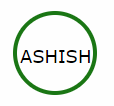
带有 SVG 标签的 HTML。如果您不想使用 CSS,则可以遵循此标准方法。
 <svg width="100" height="100">
   <circle cx="50" cy="50" r="40" stroke="green" stroke-width="4" fill="white" />
     Sorry, your browser does not support inline SVG.
   <text fill="#000000" font-size="18" font-family="Verdana"
     x="15" y="60">ASHISH</text>
 </svg>
我想你想用椭圆形或圆形写文字?为什么不是这个?
<span style="border-radius:50%; border:solid black 1px;padding:5px">Hello</span>当然,你必须使用 to 标签来做到这一点。一个用于创建圆圈,另一个用于文本。
这里有一些代码可以帮助你
#circle {
    background: #f00;
    width: 200px;
    height: 200px;
    border-radius: 50%;
    color:black;

}
.innerTEXT{
    position:absolute;
    top:80px;
    left:60px;
}

<div id="circle">
    <span class="innerTEXT"> Here a text</span>
</div>
现场示例http://jsbin.com/apumik/1/edit
更新
这里更小,有一些变化
如果它只有一行文本,您可以使用 line-height 属性,其值与元素高度相同:
height:100px;
line-height:100px;
如果文本有多行,或者内容是可变的,则可以使用 padding-top:
padding-top:30px;
height:70px;
示例:http: //jsfiddle.net/2GUFL/
如果你使用的是 Foundation 5 和 Compass 框架,你可以试试这个。
.sass 输入
$circle-width: rem-calc(25) !default;
$circle-height: $circle-width !default;
$circle-bg: #fff !default;
$circle-radius: 50% !default;
$circle-line-height: $circle-width !default;
$circle-text-align: center !default;

@mixin circle($cw:$circle-width, $ch:$circle-height, $cb:$circle-bg, $clh:$circle-line-height, $cta:$circle-text-align, $cr:$circle-radius) {
    width: $cw;
    height: $ch;
    background: $cb;
    line-height: $clh;
    text-align: $cta;
    @include inline-block;
    @include border-radius($cr);
}

.circle-default {
    @include circle;
}
.css 输出
.circle-default {
  width: 1.78571rem;
  height: 1.78571rem;
  background: white;
  line-height: 1.78571rem;
  text-align: center;
  display: -moz-inline-stack;
  display: inline-block;
  vertical-align: middle;
  *vertical-align: auto;
  zoom: 1;
  *display: inline;
  -webkit-border-radius: 50%;
  -moz-border-radius: 50%;
  -ms-border-radius: 50%;
  -o-border-radius: 50%;
  border-radius: 50%;
}
对我来说,只有这个解决方案适用于多行文本:
.circle-multiline {
    display: table-cell;
    height: 200px;
    width: 200px;
    text-align: center;
    vertical-align: middle;
    border-radius: 50%;
    background: yellow;
}
从 YouTube 页面得到这个,它有一个非常简单的设置。绝对可维护和可重复使用。
.circle {
    position: absolute;
    top: 4px;
    color: white;
    background-color: red;
    width: 18px;
    height: 18px;
    border-radius: 50%;
    line-height: 18px;
    font-size: 10px;
    text-align: center;
    cursor: pointer;
    z-index: 999;
}
<div class="circle">2</div>这里的一些解决方案在小圈子上对我来说效果不佳。所以我使用ol绝对位置制作了这个解决方案。
使用 SASS 将如下所示:
.circle-text {
    position: relative;
    display: block;
    text-align: center;
    border-radius: 50%;
    > .inner-text {
        display: block;
        @extend .center-align;
    }
}

.center-align {
    position: absolute;
    top: 50%;
    left: 50%;
    margin: auto;
    -webkit-transform: translateX(-50%) translateY(-50%);
    -ms-transform: translateX(-50%) translateY(-50%);
    transform: translateX(-50%) translateY(-50%);
}

@mixin circle-text($size) {
    width: $size;
    height: $size;
    @extend .circle-text;
}
并且可以像这样使用
#red-circle {
    background-color: red;
    border: 1px solid black;
    @include circle-text(50px);
}

#green-circle {
    background-color: green;
    border: 1px solid black;
    @include circle-text(150px);
}
请参阅https://codepen.io/matheusrufca/project/editor/DnYPMK上的演示
查看代码段以查看输出 CSS
.circle-text {
  position: relative;
  display: block;
  border-radius: 50%;
  text-align: center;
  min-width: 50px;
  min-height: 50px;
}

.center-align {
  position: absolute;
  top: 50%;
  left: 50%;
  margin: auto;
  -webkit-transform: translateX(-50%) translateY(-50%);
  -ms-transform: translateX(-50%) translateY(-50%);
  transform: translateX(-50%) translateY(-50%);
}
<div id="red-circle" class="circle-text">
<span class="inner-text center-align">Hey</span>
</div>
<div id="green-circle" class="circle-text">
<span class="inner-text center-align">Big size circle</span>
<div>
<style>
#red-circle {
background-color: red;
border: 1px solid black;
width: 60px;
height: 60px;
}
#green-circle {
background-color: green;
border: 1px solid black;
width: 150px;
height: 150px;
}
</style>HTML:
<div class="circle">
        <p class="inner">HELLO</p>
    </div>
CSS:
.circle {
background-color: darkgoldenrod;
height: 500px; width: 500px;
border-radius: 50%;}

.inner {
    position: relative;
    top: 50%;
    text-align: center;
    line-height: 0px;

}
第一个 div 类表示正在绘制的圆,您可以更改高度和宽度以适合您的使用。
内部类表示文本的位置,使用 position relative 允许文本留在圆圈中。
前 50% 将其垂直居中,而 text-align 将其水平居中。0 处的行高只会让它更清晰或更准确。
做这个方法你可以让文字在一个圆圈内
.cir {
  width: 400px;
  height: 400px;
  background: linear-gradient(to right, blue, orange);/*important*/
  border-radius: 50%;
  display: flex;
  justify-content: center;
  align-items: center;
  font-size: 50px;/*no need*/
  color: white;/*no need*/
  font-family: Arial;/*no need*/
  border: 15px solid red;/*no need*/
  user-select: none;/*no need*/
}
<div class="cir">hello world</div>.circle {
width: 500px;
height: 500px;
border-radius: 50%;
font-size: 50px;
color: #fff;
line-height: 500px;
text-align: center;
background: #000
}<div class="circle">Hello I am A CircleHello I am A CircleHello I am A CircleHello I am A CircleHello I am A CircleHello I am A CircleHello I am A CircleHello I am A CircleHello I am A Circle</div>我正在结合其他人的一些答案,float它relative给了我需要的结果。
在 HTML 中,我使用 div。我在 ali中使用它作为导航栏。
.large-list-style {
    float: left;
    position: relative;
    top: -8px;

    border-radius: 50%;

    margin-right: 8px;

    background-color: rgb(34, 198, 200);

    font-size: 18px;
    color: white;
}
    .large-list-style:before,
    .large-list-style:after {
        content: '\200B';
        display:inline-block;
        line-height:0;

        padding-top: 50%;
        padding-bottom: 50%;
    }
    .large-list-style:before {
        padding-left: 16px;
    }
    .large-list-style:after {
        padding-right: 16px;
    }
使用 CSS 可以轻松地在数字周围添加一个圆圈。这可以使用border-radius 属性来完成。
在这里,我们还使用了设置为“inline-block”的显示属性来将元素表示为内联级块容器。
  span.circle {
  background: #010101;
  border-radius: 50%;
  -moz-border-radius: 50%;
  -webkit-border-radius: 50%;
  color: #f1f1f1;
  display: inline-block;
  font-weight: bold;
  line-height: 40px;
  margin-right: 5px;
  text-align: center;
  width: 40px;
}
<span class="circle">1</span>
一种方法是使用 flexbox 来对齐中间的文本。我发现这样做的方法如下:
HTML:
<div class="circle-without-text">
  <div class="text-inside-circle">
    The text
  </div>
</div>
CSS:
.circle-without-text {
    border-radius: 50%;
    width: 70vh;
    height: 70vh;
    background-color: red;
    position: relative;
 }

.text-inside-circle {
    position: absolute;
    top: 0;
    bottom: 0;
    width: 100%;
    display: flex;
    align-items: center;
    justify-content: center;
 }
这里是 plnkr:https ://plnkr.co/edit/EvWYLNfTb1B7igoc3TZx?p=preview
使用此代码它也会响应。
<div class="circle">ICON</div>

.circle {
  position: relative;
  display: inline-block;
  width: 100%;
  height: 0;
  padding: 50% 0;
  border-radius: 50%;
  /* Just making it pretty */
  -webkit-box-shadow: 0 4px 0 0 rgba(0, 0, 0, 0.1);
  box-shadow: 0 4px 0 0 rgba(0, 0, 0, 0.1);
  text-shadow: 0 4px 0 rgba(0, 0, 0, 0.1);
  background: #38a9e4;
  color: white;
  font-family: Helvetica, Arial Black, sans;
  font-size: 48px;
  text-align: center;
}