1

我试着环顾四周,但我真的想不出任何有用的东西。

正如标题所说,我需要将两个 div 对齐并并排居中。

<div id="wrapper">

<div id="dashboard" style="width: 70%;">

    <h3 id="dash" style="color:#99FF00; font-family:monospace;">

        <table style="color:#99FF00; font-family:monospace;" cellpadding="7">
            <tr>
                <td>generation</td>
                <td>1</td>
            </tr>
            <tr>
                <td>currently living</td>
                <td><p id="initial_current"></p></td>
            </tr>
            <tr>
                <td>recently newborn</td>
                <td>0</td>
            </tr>
            <tr>
                <td>recently died</td>
                <td>0</td>
            </tr>
            <tr>
                <td>recently surviving</td>
                <td>n/a</td>
            </tr>
        </table>


        <table style="color:#99FF00; font-family:monospace;" cellpadding="7">
            <tr>
                <td>total living</td>
                <td><p id="initial_total"></p></td>
            </tr>
            <tr>
                <td>total newborns</td>
                <td>0</td>
            </tr>
            <tr>
                <td>total deaths</td>
                <td>0</td>
            </tr>
            <tr>
                <td>total survived</td>
                <td>n/a</td>
            </tr>
            <tr>
                <td>the answer to life</td>
                <td>?</td>
            </tr>
        </table>
    </h3>
</div>

<div id="board" style="color:#99FF00; font-size:15pt; font-family:monospace;">
</div>

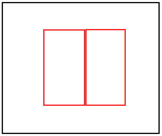
基本上,“包装器”是父 div。我想将“仪表板”和“板”居中。我有 javascript 在“板”中生成文本。

我大致希望它看起来像这样:

在此处输入图像描述

4

3 回答 3

3

使用绝对位置并声明边距如下,你很高兴

演示

<style>
.container {
   width: 300px;
   height: 100px;
   position: absolute;
   left: 50%;
   top: 50%;
   margin-left: -150px; /* Half of width */
   margin-top: -50px;    /* Half of height */
}

.left {
   float: left;
   width: 150px;
}

.right {
   float: right;
   width: 150px;
}
</style>

<div class="container">
    <div class="left"></div>
    <div class="right"></div>
</div>

注意:不要忘记在容器 div 上使用clear: both;else清除浮动,目前正在使用,所以这里没有问题overflow: hidden;height: 100%;

于 2013-03-22T15:58:00.767 回答
2

没有浮动的解决方案:http: //jsfiddle.net/GzvJH/

<div class="container">
   <div class="child"></div>
   <div class="child"></div>
 </div>

和CSS:

.container{
   width: 500px;
   height: 500px;
   line-height: 500px;
   text-align:center;
   border:1px solid red;
}

.child{

   width:100px;
   height:100px;
   border:1px solid black;
   display:inline-block;
}
于 2013-03-22T15:59:31.170 回答
0
<style>
    .container {
        text-align:center;
    }
    .twocolumns {
        width:50%
        display:inline-block;
    }
</style>
<div class="container">

    <div class="twocolumns">
          <p>Look at me im in column 1</p>
    </div>

    <div class="twocolumns">
          <p>Look at me im in column 2</p>
    </div>
</div>

我希望这会有所帮助!

于 2013-03-22T16:03:26.087 回答