19

使用 CSSborder-radius属性,我可以在末尾有一个弯曲的圆角边框。

.boxLeft{
    border-right: 1px dashed #333;
    border-bottom: 1px dashed #333;
    border-radius: 0 0 10px 0;
}

.boxRight{
    border-left: 1px dashed #333;
    border-bottom: 1px dashed #333;
    border-radius: 0 0 0 10px;
}

但我想要一个像下图这样的边框。如果我有两个盒子(黄色和粉红色)相互交汇,我想在底部交汇点(虚线角)有一个粗糙的角落,我应该怎么做?

在此处输入图像描述

这可能使用CSS吗?

4

8 回答 8

14

CSS3 渐变可以做到这一点:

试试这个,这是一个小提琴

div {
  background: #c00;
  /* fallback */
  background: -moz-linear-gradient(45deg, transparent 10px, #c00 10px), -moz-linear-gradient(135deg, transparent 10px, #c00 10px), -moz-linear-gradient(225deg, transparent 10px, #c00 10px), -moz-linear-gradient(315deg, transparent 10px, #c00 10px);
  background: -o-linear-gradient(45deg, transparent 10px, #c00 10px), -o-linear-gradient(135deg, transparent 10px, #c00 10px), -o-linear-gradient(225deg, transparent 10px, #c00 10px), -o-linear-gradient(315deg, transparent 10px, #c00 10px);
  background: -webkit-linear-gradient(45deg, transparent 10px, #c00 10px), -webkit-linear-gradient(135deg, transparent 10px, #c00 10px), -webkit-linear-gradient(225deg, transparent 10px, #c00 10px), -webkit-linear-gradient(315deg, transparent 10px, #c00 10px);
}

div {
  background-position: bottom left, bottom right, top right, top left;
  -moz-background-size: 50% 50%;
  -webkit-background-size: 50% 50%;
  background-size: 50% 50%;
  background-repeat: no-repeat;
}


/* Ignore the CSS from this point, it's just to make the demo more presentable */

div {
  float: left;
  width: 50px;
  margin: 15px auto;
  padding: 15px;
  color: white;
  line-height: 1.5;
}
<div>Div 1</div>
<div>Div 2</div>

于 2013-02-08T10:36:31.860 回答
11

这是一种方法,虽然它确实有一些缺点,比如没有边框并且不透明:

.left,
.right {
  width: 100px;
  height: 100px;
  float: left;
  position: relative;
}

.left {
  background: lightpink;
}

.right {
  background: lightblue;
}

.right::after,
.left::after {
  width: 0px;
  height: 0px;
  background: #fff;
  content: '';
  position: absolute;
  bottom: 0;
}

.right::after {
  left: 0;
  border-top: 10px solid lightblue;
  border-right: 10px solid lightblue;
  border-left: 10px solid white;
  border-bottom: 10px solid white;
}

.left::after {
  right: 0;
  border-top: 10px solid lightpink;
  border-right: 10px solid white;
  border-left: 10px solid lightpink;
  border-bottom: 10px solid white;
}
<div class="left"></div>
<div class="right"></div>

结果:

在此处输入图像描述

这是一个小提琴。

于 2013-02-08T10:43:07.653 回答
10

这也可以使用“剪辑路径”。

-webkit-clip-path: polygon(20% 0%, 80% 0%, 100% 20%, 100% 80%, 80% 100%, 20% 100%, 0% 80%, 0% 20%);
clip-path: polygon(20% 0%, 80% 0%, 100% 20%, 100% 80%, 80% 100%, 20% 100%, 0% 80%, 0% 20%);

div {
  width: 200px;
  height: 200px;
  background: red;
  -webkit-clip-path: polygon(20% 0%, 80% 0%, 100% 20%, 100% 80%, 80% 100%, 20% 100%, 0% 80%, 0% 20%);
  clip-path: polygon(20% 0%, 80% 0%, 100% 20%, 100% 80%, 80% 100%, 20% 100%, 0% 80%, 0% 20%);
}
<div></div>

源代码笔

可以在这里找到对剪辑路径的支持... http://caniuse.com/#search=clip-path

于 2016-04-06T18:13:41.953 回答
3

这就是你所需要的,透明度和一切

.left,
.right {
  width: 100px;
  height: 100px;
  float: left;
  position: relative;
  overflow: hidden;
}

.right::after,
.left::after {
  content: '';
  width: 200px;
  height: 200px;
  position: absolute;
  -moz-transform: rotate(45deg);
  -webkit-transform: rotate(45deg);
  -o-transform: rotate(45deg);
  -ms-transform: rotate(45deg);
  transform: rotate(45deg);
}

.right::after {
  background: lightblue;
  left: -40px;
  top: -100px;
}

.left::after {
  background: lightpink;
  left: -60px;
  top: -100px;
}
<div class="left"></div>
<div class="right"></div>

于 2013-08-20T15:45:29.863 回答
2

一个很好存档方式:border-images。结合.svg一个好的解决方案......

于 2013-02-08T10:25:29.650 回答
2

我首先使用position: 'absolute'.

position: 'absolute',
top: '2.9rem',
left: '2.6rem',
borderLeft: '1rem solid #6CAEC6',
borderBottom: '0.7rem solid white',

这在大多数设备上都可以正常工作,如第一张图片所示,但在 iPhone 或平板电脑上使用时,奇怪的线条开始出现:

在此处输入图像描述

在此处输入图像描述

在此处输入图像描述

正如@Collins 的回答,我随后开始使用clip-path: polygon,但我很难获得正确的形状。然后我找到了一个真正帮助我的网站:

https://bennettfeely.com/clippy/

它们提供现成的形状,然后可以拖动到所需的形状。

在此处输入图像描述

对于我需要的角落,我可以从网站上复制正确的值。

在此处输入图像描述

对我们的要求是 35° 角,为了做到这一点,我使用了该网站:

https://www.ginifab.com/feeds/angle_measurement/

在此处输入图像描述

我与任何网站都没有从属关系,它们只是真的帮助我得到了我想要的东西。它适用于我们要求的所有设备和浏览器clip-path: polygon-webkit-clip-path: polygon

兼容性检查:

https://caniuse.com/#feat=css-clip-path

于 2020-05-13T08:42:49.757 回答
0

++ 在 CSS 中包含 Westworld 风格的 UI ++

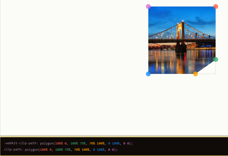
我已经按照最初的要求更新了 AlphaMale 破解倒角边框的绝妙答案。它基本上使用一个倒角的 div,里面有一个稍微小一点的 div。当外部 div 的其余部分被具有匹配倒角的内部 div 覆盖时,外部 div 的背景颜色成为边框颜色。

在 Edge、Chrome 和 Firefox 中测试。

我在寻找复制类似Westworld 用户界面的东西时发现了这个页面,它有不等的倒角。请参阅 JS fiddle,了解我如何将其与来自 Westworld 语音链接场景的配色方案和示例框拼凑在一起。

JSFiddle 上的代码(CSS 下面):http: //jsfiddle.net/S2nqK/345/

西部世界用户界面图片:https ://qph.ec.quoracdn.net/main-qimg-44c9f03b2abfe9f3833763eece1b0cc4?convert_to_webp=true

body {background-color: #353535;
font-family: 'Open Sans';}
.div-outer {

 /* Chrome / Safari */
    background:
        -webkit-linear-gradient(45deg,  transparent 0px, #6ea1a1 0px), /* bottom left */
        -webkit-linear-gradient(135deg, transparent 14px, #6ea1a1 14px), /* bottom right */
        -webkit-linear-gradient(225deg, transparent 0px, #6ea1a1 0px), /* top right */
        -webkit-linear-gradient(315deg, transparent 5px, #6ea1a1 5px); /* top left */

    /* Firefox */
        background:
        -moz-linear-gradient(45deg,  transparent 0px, #6ea1a1 0px), /* bottom left */
        -moz-linear-gradient(135deg, transparent 14px, #6ea1a1 14px), /* bottom right */
        -moz-linear-gradient(225deg, transparent 0px, #6ea1a1 0px), /* top right */
        -moz-linear-gradient(315deg, transparent 5px, #6ea1a1 5px); /* top left */

     /* Opera */
        background:
        -o-linear-gradient(45deg,  transparent 0px, #6ea1a1 0px), /* bottom left */
        -o-linear-gradient(135deg, transparent 14px, #6ea1a1 14px), /* bottom right */
        -o-linear-gradient(225deg, transparent 0px, #6ea1a1 0px), /* top right */
        -o-linear-gradient(315deg, transparent 5px, #6ea1a1 5px); /* top left */


   padding: 2px;
   color: #fff;

}

.div-inner {


    background:
        -webkit-linear-gradient(45deg,  transparent 0px, #000 0px),
        -webkit-linear-gradient(135deg, transparent 14px, #000 14px),
        -webkit-linear-gradient(225deg, transparent 0px, #000 0px),
        -webkit-linear-gradient(315deg, transparent 5px, #000 5px);

         background:
        -moz-linear-gradient(45deg,  transparent 0px, #000 0px),
        -moz-linear-gradient(135deg, transparent 14px, #000 14px),
        -moz-linear-gradient(225deg, transparent 0px, #000 0px),
        -moz-linear-gradient(315deg, transparent 5px, #000 5px);

         background:
        -o-linear-gradient(45deg,  transparent 0px, #000 0px),
        -o-linear-gradient(135deg, transparent 14px, #000 14px),
       -o-linear-gradient(225deg, transparent 0px, #000 0px),
        -o-linear-gradient(315deg, transparent 5px, #000 5px);


   padding: 10px;

   height: 92px;
   text-align: center;
}


.div-outer, .div-inner {
    background-position: bottom left, bottom right, top right, top left;
    -moz-background-size: 50% 50%;
    -webkit-background-size: 50% 50%;
    background-size: 50% 50%;
    background-repeat: no-repeat;
}

.contain {
   width: 180px;
}
.title {background-color: #76ffff; 
  padding: 6px;
  color: #000;
  border-radius: 2px;
  font-weight: bold;
 text-align-last: justify;
 text-align: justify;
  }
.font-large {font-size: 34pt;}
.font-tiny {font-size: 10pt;}
.cyan {color: #76ffff;}
/* Ignore the CSS from this point, it's just to make the demo more presentable */

.arrow-right {
  width: 0; 
  height: 0; 
  border-top: 8px solid transparent;
  border-bottom: 8px solid transparent;
  border-left: 8px solid #fff;
  display: inline-block;
  vertical-align: middle;
}


p:first-of-type { margin-top: 0 }
p:last-of-type { margin-bottom: 0}
于 2017-03-01T15:18:05.003 回答
0

好的,所以我制作了一个JS 库来自动创建倒角边框。它有两种创建倒角的方法:

方法一:使用Canvas API创建倒角background-image背景,并将其设置为元素的CSS。

方法2:它在目标周围附加4个基于CSS的三角形DOM元素,制作倒角。

当您可以让库设置时,您将坚持使用方法 1 background-image,而当您的目标已经有背景时,您将需要方法 2,例如在 <img> 中。

用法很简单,直接调用ChamferBg使用方法一,或者ChamferEnvelop使用方法二:

var el = document.getElementById('box');
ChamferBg(el, {
    size: 20,
    sw: 6,
    sc: '#447aec',
    fc: '#21ceff',
    tl: false,
    br: false,
    resize_observe: true
});

选项及其默认值是:

{
    size: 5,    // chamfer size
    sw: 1,      // stroke width
    sc: 'black',    // stroke color,
    fc: undefined,  // fill color
    fp: undefined,  // URL of an image to use as fill pattern

    tl: true,   // chamfer top-left corner?
    tr: true,   // chamfer top-right corner?
    bl: true,   // chamfer bottom-left corner?
    br: true,   // chamfer bottom-right corner?

    resize_observe: false
    // turn on resize_observe observer?
    // this will observer whenever the element
    // resizes and will refresh the background
}

resize_observe如果使用方法 1 ,则需要设置为 true,并且元素可能会在运行时更改其大小,因为这样每次调整大小时都需要重新创建倒角背景。

于 2018-01-17T17:59:59.990 回答