3

我的问题很简单。假设我有两个矩形图像。第一个是 200px 宽和 100px 高,第二个是 100px 宽和 200px 高。

我想以恒定的宽度/高度显示图像,例如 150 像素 x 150 像素而不拉伸图像以适应:

在此处输入图像描述

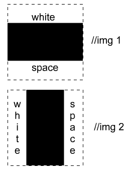
我不介意图像周围有空白/填充。问题是图像可以是任何宽度和高度,我想将它们限制在一个方形盒子而不拉伸它们。

以下 CSS 将图像拉伸到 150 x 150 像素:

img {
    width: 150px;
    height: 150px;
}

最可取的解决方案是 CSS,即使我需要更多的标记。JS/jQuery 也可以。

4

3 回答 3

6

关于什么:

img {
    max-height:150px;
    max-width:150px
}

要解决关于使较小图像变大的第二个问题,您可以使用 jQuery。如果您事先知道照片方向并向这些图像应用不同的 css 类,CSS 就可以工作……但这会起作用,然后您就不再需要 CSS 最大宽度的东西了。

<div class="container"><img src="images/DSC_0470.JPG" alt="Rad Image" /></div>

<script>
    $(document).ready(
        function () {
            $('.container img').each(
            function () {
                var theWidth = $(this).width();
                var theHeight = $(this).height();
                if (theWidth < theHeight) {
                    $(this).height(150);
                }
                else {
                    $(this).width(150);
                }

            });
        });</script>
于 2012-11-11T17:50:48.983 回答
3

您应该能够使用max-widthandmax-height属性,如下所示:

img {
    max-width: 150px;
    max-height: 150px;
}

这应该将其约束到该框而不拉伸它。

如果要确保每个图像都出现在大小为 的方形框中150px,则150px可以将每个图像包含在容器 div 中,并强制它们完全是该大小:

<div class="container">
  <img>
</div>

使用以下 CSS:

img {
    max-width: 150px;
    max-height: 150px;
}
.container {
    width: 150px;
    height: 150px;
}
于 2012-11-11T17:54:27.193 回答
-4

试试这个格式...

<img src="image.jpg" style="border:none;position:absolute; top:20px; left:50px; width:100px; height:200px;">
于 2012-11-11T17:51:03.017 回答