我知道如何使用 psedo 类在 div 外创建箭头,但我需要在 div 内创建一个箭头,如下所示

我怎样才能得到这个?
无需使用额外的元素,这可以完全使用 CSS3 完成:
background-color: gray;
background-image:
   linear-gradient(135deg, transparent 75%, #000 75%), /*right side of triangle*/
   linear-gradient(45deg, transparent 75%, #000 75%)   /*left side of triangle*/;
background-position: 30px 0, 0 0;
background-repeat: no-repeat;
background-size: 30px 30px;
演示(带有供应商前缀:http: //jsfiddle.net/rLZkf/1/)。
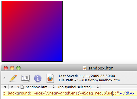
如下图所示,CSS使用简单的语法支持线性颜色渐变。
稍加想象,您可以在上图中看到一个三角形。虽然颜色在对角线上混合。因此,我们设置了明确的颜色停止位置。当这些位置相等时,不再有视觉混合,你会得到一个实心三角形。
是时候介绍一个三角形了:
background-image: linear-gradient(45deg, transparent 50%, black 50%);
由于 45° 角,渐变从左下角开始,到右上角结束。颜色停止位置定义为50%,所以三角形的左下部分是透明的,另一半是黑色的。要获得不同的三角形,请使用 135° 的角度。这是两个角度的图像:

至此,我们知道如何创建一个矩形三角形。为了更进一步,我们需要能够创建一个三角形,其中斜边垂直或水平放置。为了实现这一点,我们连接了两个三角形。CSS3 引入了对多种背景的支持。该特征用于构造三角形。
/* Create triangles */
background-image:
   linear-gradient(135deg, transparent 75%, #000 75%), /*right side of triangle*/
   linear-gradient(45deg, transparent 75%, #000 75%)   /*left side of triangle*/;
/* Move one of the triangles to the right */
background-position: 30px 0, 0 0;
/* Don't repeat the background image (remove this to see what would happen) */
background-repeat: no-repeat;
/* Define the size of the triangle */
background-size: 30px 30px;
在前面的 CSS 代码中,可以看到我使用75%的是颜色停止位置(而不是50%)。这个选择无关紧要,三角形的最终形状由渐变的颜色停止位置的值background-position和决定background-size。
**注意:我在解释中省略了供应商前缀。要使用此技术,您必须添加供应商前缀(如演示中所示)。
…………………………………………………………………………………………
现在习惯了
after: pseudo-class
像这样
.some{
width:100px;
  height:100px;
  background:red;
position:relative;
  overflow:hidden;
}

.some:after{
content:'';
  position:absolute;
  left:10px;
  top:-11px;
z-index:0;
  width:25px;
  height:25px;
  background:green;
  transform:rotate(45deg);
  -ms-transform:rotate(45deg); /* IE 9 */
-moz-transform:rotate(45deg); /* Firefox */
-webkit-transform:rotate(45deg); /* Safari and Chrome */
-o-transform:rotate(45deg); /* Opera */
}
最短且最兼容浏览器的解决方案:
CSS:
div{
position:relative;
height: 200px;
width: 200px;
background-color: gray;
}
div::after{
content: '';
border: solid 15px transparent;
border-top-color:black;
position:absolute;
top:0;
left: 30px;
}
演示:http:
//jsfiddle.net/7bP9q/