class="row"如何使用 twitter 引导框架向元素添加边距顶部?
782056 次
20 回答
825
在 Twitter 引导程序中编辑或覆盖行是一个坏主意,因为这是页面脚手架的核心部分,您将需要没有上边距的行。
为了解决这个问题,创建一个新的类“top-buffer”来添加你需要的标准边距。
.top-buffer { margin-top:20px; }
然后在需要上边距的行 div 上使用它。
<div class="row top-buffer"> ...
于 2013-01-20T22:05:49.470 回答
185
好的,只是为了让您知道当时发生了什么,我修复了使用 Acyra 上面所说的一些新类:
.top5 { margin-top:5px; }
.top7 { margin-top:7px; }
.top10 { margin-top:10px; }
.top15 { margin-top:15px; }
.top17 { margin-top:17px; }
.top30 { margin-top:30px; }
每当我想做的时候<div class="row top7"></div>
为了获得更好的响应,您可以添加margin-top:7%而不是5px例如:D
于 2013-11-20T12:39:01.233 回答
170
引导程序 3
如果您需要在引导程序中分隔行,您可以简单地使用.form-group. 这会在行的底部增加 15px 的边距。
在您的情况下,要获得最高边距,您可以将此类添加到上一个.row元素
<div class="row form-group">

/* From bootstrap.css */
.form-group {
        margin-bottom: 15px;
}
引导程序 4
您可以使用内置的间距类
<div class="row mt-3"></div>
类名中的“t”使其仅适用于“顶部”侧,底部、左侧、右侧有类似的类。数字定义空间大小。
于 2017-02-08T14:29:21.303 回答
92
对于Bootstrap 4间距,应使用
速记实用程序类
采用以下格式:
{属性}{边}-{大小}
财产是以下之一:
- m - 对于设置边距的类
- p - 用于设置填充的类
其中边是以下之一:
- t - 用于设置 margin-top 或 padding-top 的类
- b - 对于设置 margin-bottom 或 padding-bottom 的类
- l - 对于设置 margin-left 或 padding-left 的类
- r - 用于设置 margin-right 或 padding-right 的类
- x - 对于同时设置 *-left 和 *-right 的类
- y - 对于同时设置 *-top 和 *-bottom 的类
- 空白 - 用于在元素的所有 4 个边上设置边距或填充的类
其中size是以下之一:
- 0 - 对于通过将其设置为 0 来消除边距或填充的类
- 1 - (默认情况下)用于将边距或填充设置为 $spacer * .25 的类
- 2 - (默认情况下)用于将边距或填充设置为 $spacer * .5 的类
- 3 - (默认情况下)用于将边距或填充设置为 $spacer 的类
- 4 - (默认情况下)用于将边距或填充设置为 $spacer * 1.5 的类
- 5 - (默认情况下)用于将边距或填充设置为 $spacer * 3 的类
- auto - 对于将边距设置为 auto 的类
所以你应该做这些:
<div class="row mt-1">
<div class="row mt-2">
          ...
<div class="row mt-5">
于 2017-01-05T15:19:30.960 回答
45
Sometimes margin-top can causes design problems:
http://www.w3.org/TR/CSS2/box.html#collapsing-margins
So, i recommend create "margin-bottom classes" instead of "margin-top classes" and apply them to the previous item.
If you are using Bootstrap importing LESS Bootstrap files try to define the margin-bottom classes with proportional Bootstrap Theme spaces:
.margin-bottom-xs {margin-bottom: ceil(@line-height-computed / 4);}
.margin-bottom-sm {margin-bottom: ceil(@line-height-computed / 2);}
.margin-bottom-md {margin-bottom: @line-height-computed;}
.margin-bottom-lg {margin-bottom: ceil(@line-height-computed * 2);}
于 2014-07-30T06:58:38.603 回答
33
我将这些类添加到我的引导样式表中
.voffset  { margin-top: 2px; }
.voffset1 { margin-top: 5px; }
.voffset2 { margin-top: 10px; }
.voffset3 { margin-top: 15px; }
.voffset4 { margin-top: 30px; }
.voffset5 { margin-top: 40px; }
.voffset6 { margin-top: 60px; }
.voffset7 { margin-top: 80px; }
.voffset8 { margin-top: 100px; }
.voffset9 { margin-top: 150px; }
例子
<div class="container">
  <div class="row voffset2">
    <div class="col-lg-12">
      <p>
        Vertically offset text.
      </p>
    </div>
  </div>
</div>
于 2014-07-02T19:42:57.813 回答
27
我正在使用这些类来改变上边距:
.margin-top-05 { margin-top: 0.5em; }
.margin-top-10 { margin-top: 1.0em; }
.margin-top-15 { margin-top: 1.5em; }
.margin-top-20 { margin-top: 2.0em; }
.margin-top-25 { margin-top: 2.5em; }
.margin-top-30 { margin-top: 3.0em; }
当我需要一个元素与上面的元素有 2em 间距时,我会这样使用它:
<div class="row margin-top-20">Something here</div>
如果您更喜欢像素,请将 em 更改为 px 以按照自己的方式使用。
于 2014-08-09T18:14:02.270 回答
10
您可以将以下类用于引导程序 4:
mt-0
mt-1
mt-2
mt-3
mt-4
...
于 2017-06-16T08:18:30.320 回答
5
Bootstrap 4 alpha,用于 margin-top:速记 CSS 类名 mt-1、mt-2(mt-lg-5、mt-sm-2)对于底部、右侧、左侧相同,并且您还有 auto 类 ml-汽车
<div class="mt-lg-1" ...>
单位是 from 1to 5: 在 variables.scss 中,这意味着如果您设置 mt-1 它会给出 0.25rem 的边距顶部。
$spacers: (
  0: (
    x: 0,
    y: 0
  ),
  1: (
    x: ($spacer-x * .25),
    y: ($spacer-y * .25)
  ),
  2: (
    x: ($spacer-x * .5),
    y: ($spacer-y * .5)
  ),
  3: (
    x: $spacer-x,
    y: $spacer-y
  ),
  4: (
    x: ($spacer-x * 1.5),
    y: ($spacer-y * 1.5)
  ),
  5: (
    x: ($spacer-x * 3),
    y: ($spacer-y * 3)
  )
) !default;
在这里阅读更多
https://v4-alpha.getbootstrap.com/utilities/spacing/#horizontal-centering
于 2017-02-20T16:40:51.207 回答
3
Add to this class in the .css file:
.row {
    margin-left: -20px;
    *zoom: 1;
    margin-top: 50px;
}
or make a new class and add it to the element
.rowSpecificFormName td {
    margin-top: 50px;
}
于 2012-04-10T09:03:45.420 回答
2
如果您只想在一页上进行更改,请添加以下样式规则:
 #myCustomDivID .row {
     margin-top:20px;
 }
于 2016-02-11T00:40:51.380 回答
2
<div class="row row-padding">
简单的代码
于 2019-08-09T11:04:10.407 回答
2
在 Bootstrap 4 alpha+ 中,您可以使用它
class margin-bottom-5
这些类使用以下格式命名:{property}-{sides}-{size}
于 2017-04-26T13:09:24.180 回答
2
just take a new class beside every row and apply css of margin-top: 20px;
here is the code below
<style>
  .small-top
   {
     margin-top: 25px;
   }
</style>
<div class="row small-top">
   <div class="col-md-12">
   </div>
 </div>
于 2017-07-07T05:55:47.880 回答
2
引导程序3
CSS(仅限装订线,周围没有边距):
.row.row-gutter {
  margin-bottom: -15px;
  overflow: hidden;
}
.row.row-gutter > *[class^="col"] {
  margin-bottom: 15px;
}
CSS(等边距,15px/2):
.row.row-margins {
  padding-top: 7px; /* or margin-top: 7px; */
  padding-bottom: 7px; /* or margin-bottom: 7px; */
}
.row.row-margins > *[class^="col"] {
  margin-top: 8px;
  margin-bottom: 8px;
}
用法:
<div class="row row-gutter">
    <div class="col col-sm-9">first</div>
    <div class="col col-sm-3">second</div>
    <div class="col col-sm-12">third</div>
</div>
(使用 SASS 或 LESS 15px 可能是引导程序中的变量)
于 2017-08-15T17:26:17.370 回答
1
有一个技巧可以只为容器中的第 2+ 行自动添加边距。
.container-row-margin .row + .row {
    margin-top: 1rem;
}
添加.container-row-margin到容器中,结果是:
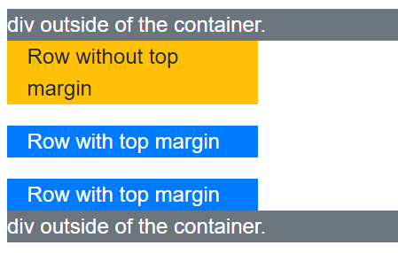
完整的 HTML:
<div class="bg-secondary text-white">
    div outside of the container.
</div>
<div class="container container-row-margin">
    <div class="row">
        <div class="col col-4 bg-warning">
            Row without top margin
        </div>
    </div>
    <div class="row">
        <div class="col col-4 bg-primary text-white">
            Row with top margin
        </div>
    </div>
    <div class="row">
        <div class="col col-4 bg-primary text-white">
            Row with top margin
        </div>
    </div>
</div>
<div class="bg-secondary text-white">
    div outside of the container.
</div>
取自官方样品。
于 2020-12-03T06:16:12.990 回答
0
如果您使用的是 BootStrap 3.3.7,则可以通过 NPM 使用开源库 bootstrap-spacer
npm install bootstrap-spacer
或者你可以访问 github 页面:
https://github.com/chigozieorunta/bootstrap-spacer
这是一个如何使用 .row-spacer 类来分隔行的示例:
<div class="row row-spacer">
    <div class="col-md-4">
    </div>
    <div class="col-md-4">
    </div>
    <div class="col-md-4">
    </div>
</div>

<div class="row row-spacer">
    <div class="col-md-4">
    </div>
    <div class="col-md-4">
    </div>
    <div class="col-md-4">
    </div>
</div>
如果您需要列之间的空格,您还可以添加 .row-col-spacer 类:
<div class="row row-col-spacer">
    <div class="col-md-4">
    </div>
    <div class="col-md-4">
    </div>
    <div class="col-md-4">
    </div>
</div>
您还可以将各种 .row-spacer 和 .row-col-spacer 类组合在一起:
<div class="row row-spacer row-col-spacer">
    <div class="col-md-4">
    </div>
    <div class="col-md-4">
    </div>
    <div class="col-md-4">
    </div>
</div>
于 2019-02-09T03:19:03.327 回答
0
只需简单地使用这个bs3-upgrade助手来进行间距和文本对齐......
于 2018-03-21T07:22:27.667 回答
0
您可以添加此代码:
[class*="col-"] {
    padding-top: 1rem;
    padding-bottom: 1rem;
}
于 2017-11-21T21:06:03.737 回答
-4
我的把戏。不是很干净,但对我来说效果很好
<p> </p>
于 2017-02-04T03:18:57.933 回答