我正在尝试复制 Material Design 的涟漪效应,因为我正在开发的当前应用程序将摆脱 Quasar;所以我正在从头开始构建所有元素。
这个效果: 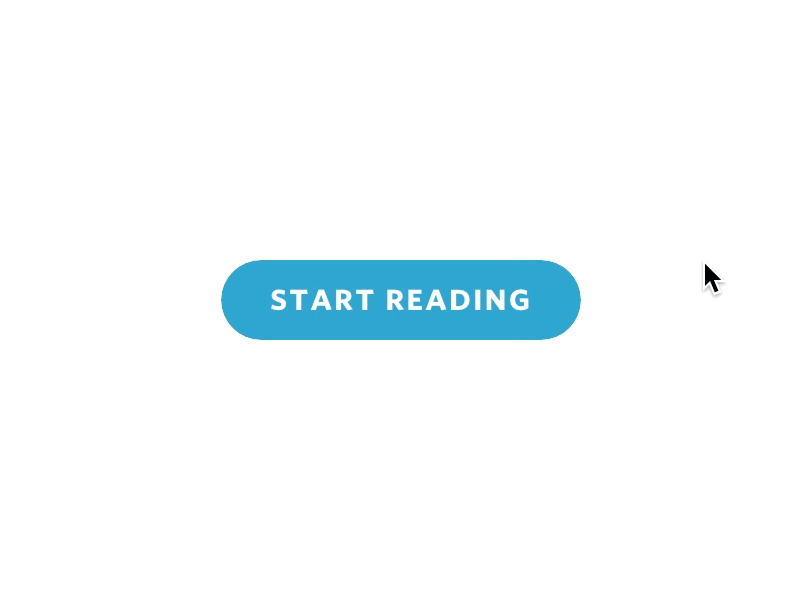
我看过一些纯 CSS 和 JS 的视频,我试图将其转换为我的项目,但我在某个地方被赶上了。我有正确的悬停效果和鼠标位置记录,但是涟漪效应没有触发,我不知道为什么。
任何帮助将不胜感激!干杯!
CButton.vue
<template>
  <button
    @click="onClick"
    :class="[
      'c-btn',
      `c-btn--${kind}`,
      disabled ? `_disabled` : '',
      kind === 'icon-round' ? 'shadow-5' : '',
    ]"
  >
    <transition
      name="ripple"
      @enter="rippleEnter"
      @after-enter="afterRippleEnter"
    >
      <span v-if="ripple" ref="ripple" class="ripple" />
    </transition>
    <div class="_inner">
      <div class="_text">
        <slot>{{ btnText }}</slot>
      </div>
    </div>
  </button>
</template>

<script>
export default {
  name: "CcBtn",
  components: {},
  props: {
    btnText: { type: String },
    kind: { type: String, default: "main" },
    isBusy: { type: Boolean, default: false },
    /**
     * HTML5 attribute
     * @category state
     */
    disabled: { type: Boolean, default: false },
    color: { type: String, default: "" },
  },
  data() {
    return {
      ripple: false,
      x: 0,
      y: 0,
    };
  },
  methods: {
    onClick(e) {
      this.x = e.layerX;
      this.y = e.layerY;
      this.ripple = !this.ripple;
      console.log(`x`, this.x);
      console.log(`y`, this.y);
      console.log(`ripple`, this.ripple);
    },
    rippleEnter() {
      this.$refs.ripple.style.top = `${this.y}px`;
      this.$refs.ripple.style.left = `${this.x}px`;
    },
    afterRippleEnter() {
      this.ripple = false;
    },
  },
};
</script>

<style lang="sass" scoped>
.c-btn
  color: white
  padding: 10px 16px
  border-radius: 4px
  line-height: 1em
  min-height: 2em
  font-weight: bold
  font-size: 16px
  color: White
  cursor: pointer
  border: 1px solid transparent
  transition: background-color 0.5s
  ._inner
    display: flex
    align-items: center
    justify-content: center
  &--main
    background: #9759ff
    min-width: 228px
    border-radius: 100px
    &:hover
      background-color: lighten(#9759ff, 10%)

  &--sub
    background: #f3eefe
    min-width: 228px
    border-radius: 100px
    color: black
    &:hover
      background-color: darken(#f3eefe, 5%)

.ripple
  display: block
  width: 20px
  height: 20px
  border-radius: 10px
  position: absolute
  top: 0
  left: 0
  pointer-events: none
  background-color: rgba(lighten(#9759ff, 20%), 0.8)
  opacity: 0
  transform: translate(-50%, -50%) scale(10)
  transition: opacity 0.4s ease-in-out, transform 0.4s ease-in-out
  &-enter
    opacity: 1
    transform: translate(-50%, -50%) scale(0)
</style>
应用程序.vue
<template>
  <CButton :btnText="'Button'" kind="main" />
  <br />
  <br />
  <br />
  <CButton :btnText="'Button'" kind="sub" />
</template>

<script>
import CButton from "./components/CButton.vue";
export default {
  name: "App",
  components: {
    CButton,
  },
};
</script>