我正在尝试构建一个 React.Js SharePoint 现代 Web 部件,它具有以下功能:-
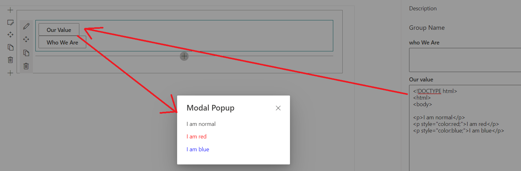
在 Web 部件设置页面内 >> 有 2 个字段名为“我们是谁”和“我们的价值”,允许用户输入 HTML。
Web 部件将呈现 2 个按钮“我们是谁”和“我们的价值”>>,当用户单击任何按钮 >> 将显示一个弹出窗口,其中包含在步骤 1 中输入的 HTML 代码
如下:-
但是为了能够在我的 Web 部件中将 HTML 代码呈现为富文本,我必须使用dangerouslySetInnerHTML.tsx 文件中的属性,如下所示:-
import * as React from 'react';
import { useId, useBoolean } from '@fluentui/react-hooks';
import {
  getTheme,
  mergeStyleSets,
  FontWeights,
  Modal,
  IIconProps,
  IStackProps,
} from '@fluentui/react';
import { IconButton, IButtonStyles } from '@fluentui/react/lib/Button';
export const MYModal2 = (myprops) => {
  const [isModalOpen, { setTrue: showModal, setFalse: hideModal }] = useBoolean(false);
  const [isPopup, setisPopup] = React.useState(true);
  const titleId = useId('title');
  React.useEffect(() => {
      showModal();
  }, [isPopup]);
  function ExitHandler() {
    hideModal();
    setisPopup(current => !current)
    myprops.handler();
  }

  return (
    <div>
      <Modal
        titleAriaId={titleId}
        isOpen={isModalOpen}
        onDismiss={ExitHandler}
        isBlocking={true}
        containerClassName={contentStyles.container}
      >
        <div className={contentStyles.header}>
          <span id={titleId}>Modal Popup</span>
          <IconButton
            styles={iconButtonStyles}
            iconProps={cancelIcon}
            ariaLabel="Close popup modal"
            onClick={ExitHandler}
          />
        </div>
        <div  className={contentStyles.body}>
        <p dangerouslySetInnerHTML={{__html:myprops.OurValue}}>
   </p>

        </div>
      </Modal>

    </div>

  );
};

const cancelIcon: IIconProps = { iconName: 'Cancel' };

const theme = getTheme();
const contentStyles = mergeStyleSets({
  container: {
    display: 'flex',
    flexFlow: 'column nowrap',
    alignItems: 'stretch',
  },
  header: [
    // eslint-disable-next-line deprecation/deprecation
    theme.fonts.xLarge,
    {
      flex: '1 1 auto',
      borderTop: '4px solid ${theme.palette.themePrimary}',
      color: theme.palette.neutralPrimary,
      display: 'flex',
      alignItems: 'center',
      fontWeight: FontWeights.semibold,
      padding: '12px 12px 14px 24px',
    },
  ],
  body: {
    flex: '4 4 auto',
    padding: '0 24px 24px 24px',
    overflowY: 'hidden',
    selectors: {
      p: { margin: '14px 0' },
      'p:first-child': { marginTop: 0 },
      'p:last-child': { marginBottom: 0 },
    },
  },
});
const stackProps: Partial<IStackProps> = {
  horizontal: true,
  tokens: { childrenGap: 40 },
  styles: { root: { marginBottom: 20 } },
};
const iconButtonStyles: Partial<IButtonStyles> = {
  root: {
    color: theme.palette.neutralPrimary,
    marginLeft: 'auto',
    marginTop: '4px',
    marginRight: '2px',
  },
  rootHovered: {
    color: theme.palette.neutralDark,
  },
};
所以我的问题是;如果使用
<p dangerouslySetInnerHTML={{__html:myprops.OurValue}}></p>
在 react.js sharepoint webpart 中呈现 HTMLCode 会带来任何安全问题吗?如果是这样,我可以消除这个安全问题吗?如果不是,那么我可以使用更安全的方法在弹出窗口中将 HTML 代码呈现为富文本吗?
谢谢
这是我的完整网络部件代码:-
在 MyModalPopupWebPart.ts 中:-
import * as React from 'react';
import * as ReactDom from 'react-dom';
import { Version } from '@microsoft/sp-core-library';
import {
  IPropertyPaneConfiguration,
  PropertyPaneTextField
} from '@microsoft/sp-property-pane';
import { BaseClientSideWebPart } from '@microsoft/sp-webpart-base';

import * as strings from 'MyModalPopupWebPartStrings';
import MyModalPopup from './components/MyModalPopup';
import { IMyModalPopupProps } from './components/IMyModalPopupProps';

export interface IMyModalPopupWebPartProps {
  description: string;
  WhoWeAre: string;
  OurValue:string;
}

export default class MyModalPopupWebPart extends BaseClientSideWebPart<IMyModalPopupWebPartProps> {

  public render(): void {
    const element: React.ReactElement<IMyModalPopupProps> = React.createElement(
      MyModalPopup,
      {
        description: this.properties.description,
        WhoWeAre: this.properties.WhoWeAre,
        OurValue: this.properties.OurValue
      }
    );

    ReactDom.render(element, this.domElement);
  }

  protected onDispose(): void {
    ReactDom.unmountComponentAtNode(this.domElement);
  }

  protected get dataVersion(): Version {
    return Version.parse('1.0');
  }

  protected getPropertyPaneConfiguration(): IPropertyPaneConfiguration {
    return {
      pages: [
        {
          header: {
            description: strings.PropertyPaneDescription
          },
          groups: [
            {
              groupName: strings.BasicGroupName,
              groupFields: [
                PropertyPaneTextField('WhoWeAre', {
                  label: "who We Are",
    multiline: true
                }),
                PropertyPaneTextField('OurValue', {
                  label: "Our value"
                }), PropertyPaneTextField('description', {
                  label: "Description",
    multiline: true
                }),
              ]
            }
          ]
        }
      ]
    };
  }
}
在 MyModalPopup.tsx 中:-
import * as React from 'react';
import { IMyModalPopupProps } from './IMyModalPopupProps';
import { DefaultButton } from '@fluentui/react/lib/Button';
import { MYModal } from './MYModal';
import { MYModal2 } from './MYModal2';

interface IPopupState {
  showModal: string;
}

export default class MyModalPopup extends React.Component<IMyModalPopupProps, IPopupState> {
  constructor(props: IMyModalPopupProps, state: IPopupState) {
    super(props);
    this.state = {
      showModal: ''
    };
    this.handler = this.handler.bind(this);
    this.Buttonclick = this.Buttonclick.bind(this);
  }
  handler() {
    this.setState({
      showModal: ''
    })
  }
  private Buttonclick(e, whichModal) {
    e.preventDefault();

    this.setState({ showModal: whichModal });
  }
  public render(): React.ReactElement<IMyModalPopupProps> {

    const { showModal } = this.state;

    return (
      <div>

        <DefaultButton onClick={(e) => this.Buttonclick(e, 'our-value')} text="Our Value" />
        { showModal === 'our-value' && <MYModal2 OurValue={this.props.OurValue} myprops={this.state} handler={this.handler} />}

        <DefaultButton onClick={(e) => this.Buttonclick(e, 'who-we-are')} text="Who We Are" />
        { showModal === 'who-we-are' && <MYModal WhoWeAre={this.props.WhoWeAre} myprops={this.state} handler={this.handler} />}
      </div>
    );
  }
}