StackOverflow 上有很多答案解释了如何在小部件周围绘制边框。但是,我正在寻找类似 TextFormField 的东西。
普通的 DropdownButton 只有一个underline属性,但我正在寻找类似以下设计的东西:
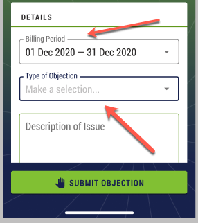
正如您在此处看到的,下拉列表有一个边框和一个标题。我可以underline从 DropdownButton 小部件中删除该属性,但是否有任何自定义小部件可用于包装 DropdownButton?
StackOverflow 上有很多答案解释了如何在小部件周围绘制边框。但是,我正在寻找类似 TextFormField 的东西。
普通的 DropdownButton 只有一个underline属性,但我正在寻找类似以下设计的东西:
正如您在此处看到的,下拉列表有一个边框和一个标题。我可以underline从 DropdownButton 小部件中删除该属性,但是否有任何自定义小部件可用于包装 DropdownButton?
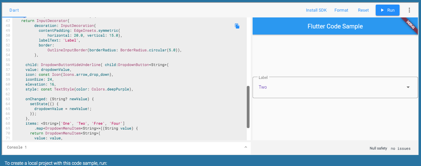
您可以复制它PopupMenuButton或将其包裹在下面,InputDecorator然后隐藏下划线DropdownButtonHideUnderline
/// Flutter code sample for DropdownButton
// This sample shows a `DropdownButton` with a large arrow icon,
// purple text style, and bold purple underline, whose value is one of "One",
// "Two", "Free", or "Four".
//
// 
import 'package:flutter/material.dart';
void main() => runApp(const MyApp());
/// This is the main application widget.
class MyApp extends StatelessWidget {
const MyApp({Key? key}) : super(key: key);
static const String _title = 'Flutter Code Sample';
@override
Widget build(BuildContext context) {
return MaterialApp(
title: _title,
home: Scaffold(
appBar: AppBar(title: const Text(_title)),
body: const Center(
child: MyStatefulWidget(),
),
),
);
}
}
/// This is the stateful widget that the main application instantiates.
class MyStatefulWidget extends StatefulWidget {
const MyStatefulWidget({Key? key}) : super(key: key);
@override
_MyStatefulWidgetState createState() => _MyStatefulWidgetState();
}
/// This is the private State class that goes with MyStatefulWidget.
class _MyStatefulWidgetState extends State<MyStatefulWidget> {
String dropdownValue = 'One';
@override
Widget build(BuildContext context) {
return InputDecorator(
decoration: InputDecoration(
contentPadding: EdgeInsets.symmetric(
horizontal: 20.0, vertical: 15.0),
labelText: 'Label',
border:
OutlineInputBorder(borderRadius: BorderRadius.circular(5.0)),
),
child: DropdownButtonHideUnderline( child:DropdownButton<String>(
value: dropdownValue,
icon: const Icon(Icons.arrow_drop_down),
iconSize: 24,
elevation: 16,
style: const TextStyle(color: Colors.deepPurple),
onChanged: (String? newValue) {
setState(() {
dropdownValue = newValue!;
});
},
items: <String>['One', 'Two', 'Free', 'Four']
.map<DropdownMenuItem<String>>((String value) {
return DropdownMenuItem<String>(
value: value,
child: Text(value),
);
}).toList(),
), ),
);
}
}
我不知道还有另一个专门创建用于表单的小部件。DropdownButtonFormField是小部件,它不需要@flakerimi 提到的所有额外行。
这是我给那些想看的人的示例代码。
DropdownButtonFormField<String>(
      validator: (value) =>
          dropdownValue == null ? S.of(context).general_make_selection : null,
      autovalidateMode: AutovalidateMode.onUserInteraction,
      value: dropdownValue,
      decoration: InputDecoration(
        labelText: S.of(context).bill_obj_type,
        filled: true,
      ),
      icon: const Icon(Icons.arrow_drop_down),
      iconSize: 24,
      elevation: 16,
      isExpanded: true,
      style: Theme.of(context)
          .textTheme
          .subtitle1
          .copyWith(color: AppColors.neutral1),
      onChanged: (String newValue) {
        setState(() {
          dropdownValue = newValue;
          vm.objectionType = newValue;
        });
      },
      items: _getDropdownMenuItems(),
    );
