您可以在下面添加子组件Toolbar:
    <com.google.android.material.appbar.AppBarLayout
      android:layout_width="match_parent"
      android:layout_height="wrap_content">
      <androidx.appcompat.widget.Toolbar
        android:id="@+id/toolbar"
        android:layout_width="match_parent"
        android:layout_height="?attr/actionBarSize"
        android:background="#F45465"
        app:popupTheme="@style/TextAppearance.AppCompat.Widget.ActionBar.Title.Inverse">
        <LinearLayout
            android:layout_width="match_parent"
            android:layout_height="match_parent"
            android:orientation="vertical">
            <TextView
                android:layout_width="match_parent"
                android:layout_height="wrap_content"
                android:layout_weight="1"
                android:textColor="#000000"
                android:text="Title"
                android:textStyle="bold"/>

            <TextView
                android:layout_width="match_parent"
                android:layout_height="wrap_content"
                android:layout_weight="1"
                android:textColor="#000000"
                android:text="Subtitle"
                android:textStyle="bold"/>
        </LinearLayout>
    </androidx.appcompat.widget.Toolbar>
</com.google.android.material.appbar.AppBarLayout>

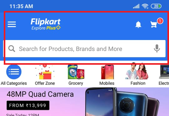
有很多方法可以像您的示例一样存档视图,通常我只使用 Cardview 和一些 TextView 来自定义我的工具栏。
编辑
对于折叠工具栏,您需要 CoordinatorLayout 和 CollapsingToolbarLayout,因此您需要执行以下操作:
 <?xml version="1.0" encoding="utf-8"?>
 <androidx.coordinatorlayout.widget.CoordinatorLayout
    xmlns:android="http://schemas.android.com/apk/res/android"
    xmlns:app="http://schemas.android.com/apk/res-auto"
    xmlns:tools="http://schemas.android.com/tools"
    android:layout_width="match_parent"
    android:layout_height="match_parent"
    android:background="@color/colorPrimary">
    <com.google.android.material.appbar.AppBarLayout
       android:layout_width="match_parent"
       android:layout_height="wrap_content"
       android:theme="@style/ThemeOverlay.AppCompat.Dark.ActionBar">
       <com.google.android.material.appbar.CollapsingToolbarLayout
          android:layout_width="match_parent"
          android:layout_height="match_parent"
          app:contentScrim="?attr/colorPrimary"
          app:expandedTitleTextAppearance="@android:color/transparent"
          app:layout_scrollFlags="scroll|exitUntilCollapsed">
          <ImageView
            android:layout_width="match_parent"
            android:layout_height="250dp"
            android:scaleType="fitXY"
            android:contentDescription="@string/image_desc_movie_detail"
            app:layout_collapseMode="parallax"
            android:layout_marginBottom="1dp"/>

          <androidx.appcompat.widget.Toolbar
            android:layout_width="match_parent"
            android:layout_height="?attr/actionBarSize"
            app:layout_collapseMode="pin"
            app:popupTheme="@style/ThemeOverlay.AppCompat.Light" />
        </com.google.android.material.appbar.CollapsingToolbarLayout>
    </com.google.android.material.appbar.AppBarLayout>

   <androidx.core.widget.NestedScrollView
      android:layout_width="match_parent"
      android:layout_height="match_parent"
      android:clipToPadding="false"
      app:layout_behavior="@string/appbar_scrolling_view_behavior">

      Your content here ...

    </androidx.core.widget.NestedScrollView>
</androidx.coordinatorlayout.widget.CoordinatorLayout>
简短的解释,CollapsingToolbarLayout里面有ImageView和Toolbar。当您的内容滚动时,ImageView 将隐藏/显示。谷歌上有很多很长的解释,你会找到一个。
 2
2