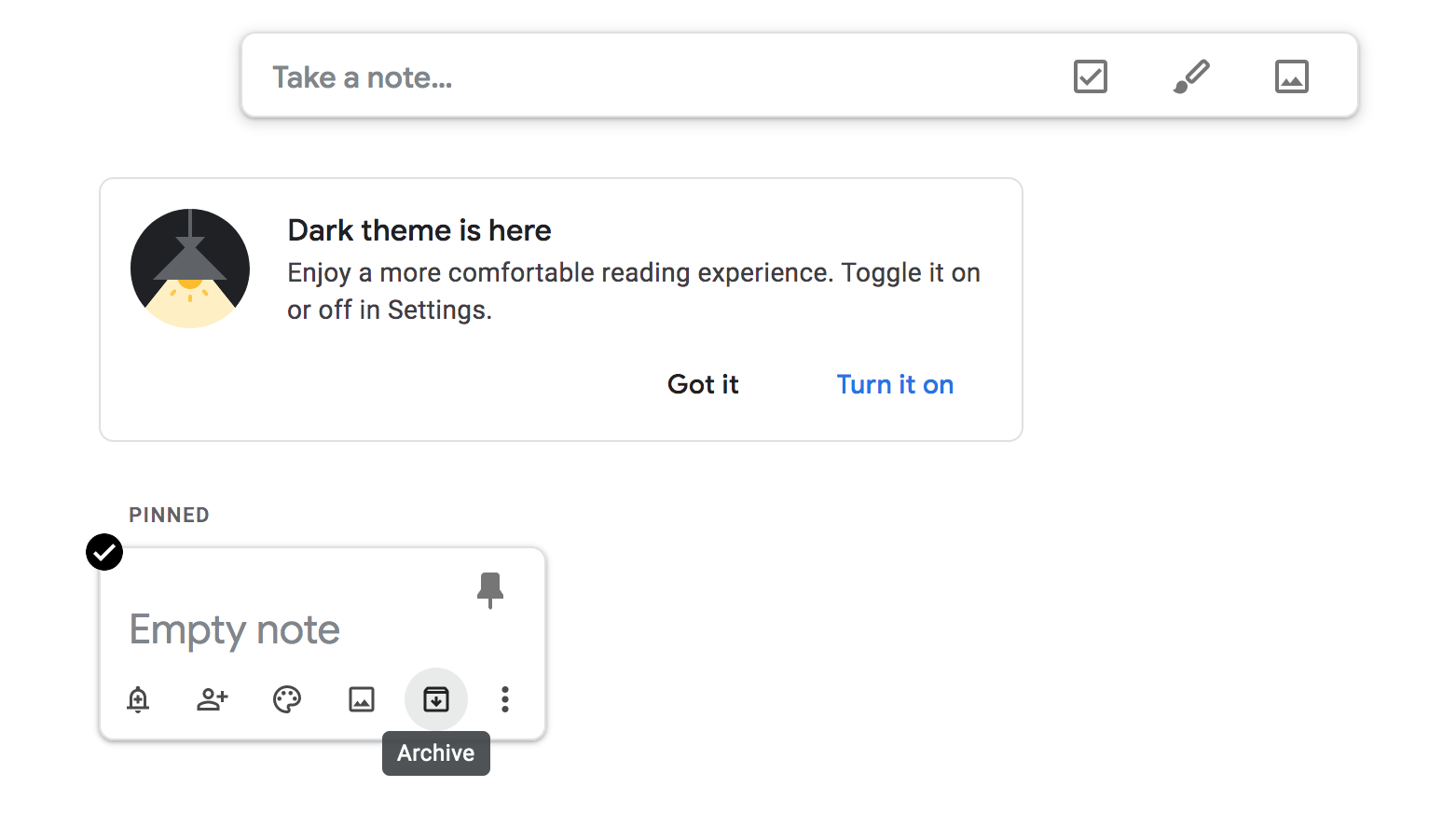
如何创建像 google keep 一样的对话框效果。我尝试调试 css 但没有任何成功。那里有代码示例吗?
我看到他们使用隐藏位置固定模式,在点击时触发,但他们如何计算位置。

如何创建像 google keep 一样的对话框效果。我尝试调试 css 但没有任何成功。那里有代码示例吗?
我看到他们使用隐藏位置固定模式,在点击时触发,但他们如何计算位置。
这就是我可以从您的问题中得出的结论(纯 JS 和 CSS)。
var example_note = document.getElementsByClassName('example_note')[0];
var close_btn = document.getElementById('close_btn');
example_note.onclick = function() {
  document.getElementsByClassName('background_change')[0].style.display = "block";
  document.getElementsByClassName('display_block')[0].style.display = "block";
  example_note.style.display="none";
}

close_btn.onclick = function() {
  document.getElementsByClassName('background_change')[0].style.display = "none";
  document.getElementsByClassName('display_block')[0].style.display = "none";
  example_note.style.display="block";
}
* {
margin: 0px;
padding: 0px;
font-family: 'arial';
}
.example_note {
position: absolute;
width: 250px;
margin-top: 10%;
margin-left: 15%;
box-shadow: -1px 1px 10px 3px rgba(0, 0, 0, 0.2);
-webkit-box-shadow: -1px 1px 10px 3px rgba(0, 0, 0, 0.2);
-moz-box-shadow: -1px 1px 10px 3px rgba(0, 0, 0, 0.2);
padding: 30px;
border-radius: 15px;
background-color: white;
}
.example_note h1 {
font-size: 23px;
}
.display_block {
display: none;
position: absolute;
top: 50%;
left: 50%;
transform: translate(-50%, -50%);
width: 450px;
background-color: white;
padding: 30px;
border-radius: 15px;
transform-origin: 0 25%;
animation: show_block 0.2s 1;
}
@keyframes show_block {
from {
transform: translate(-50%, -50%)scale(0);
}
to {
transform: translate(-50%, -50%)scale(1);
}
}
input[type="text"] {
width: 390px;
padding: 10px;
border: none;
}
input[type="text"]:focus {
outline: none;
}
button {
float: right;
background-color: white;
padding: 10px 20px 10px 20px;
border-radius: 8px;
border: none;
font-size: 17px;
transition: 0.4s;
font-weight: bold;
outline: none;
}
button:hover {
background-color: #E3E3E3;
}
.background_change {
display: none;
height: 100%;
width: 100%;
position: absolute;
background-color: black;
opacity: 0.6;
animation: show_back 0.5s 1;
}
@keyframes show_back {
from {
opacity: 0;
}
to {
opacity: 0.6;
}
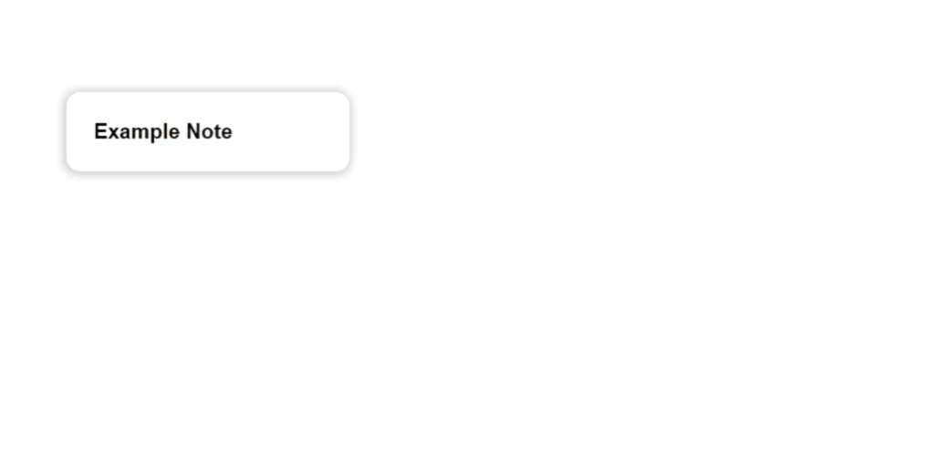
}<div class="example_note">
<h1>Example Note</h1>
</div>
<div class="background_change"></div>
<div class="display_block">
<input type="text" name="title" placeholder="Title" style="font-size: 25px;">
<br>
<input type="text" name="name" value="Example Note" style="font-size: 15px; font-weight: bold;">
<br>
<button id="close_btn">close</button>
</div>这个答案是纯 JavaScript 和 CSS(无库),并产生以下效果:
以下片段中包含一个完整的工作示例(最佳预览全屏):
function openModal(noteEl, modalEl, modalContainerEl) {

        // Compute and apply the transform to deform the modal to cover the note with a transition to make it animate
        const transform = computeTransform(noteEl);
        modalEl.style.transform = transform;
        modalEl.style.transition = 'transform 250ms';

        // Setup the modal background animate in too
        modalContainerEl.style.backgroundColor = 'transparent';
        modalContainerEl.style.transition = 'background-color 250ms';

        // Show the modal
        modalContainerEl.classList.add('modal-container--open');

        // Put the rest in a setTimeout to allow the styles applied above to take
        // affect and render before we overwrite them with new ones below
        setTimeout(function () {
          // Remove the transform to allow the modal to return to it's natural shape and position
          modalEl.style.transform = 'none';
          modalContainerEl.style.backgroundColor = 'rgba(33, 33, 33, 0.5)';
        }, 0)
      }

      function computeTransform(noteEl) {

        // Modal positions here are hardcoded to match styles set in CSS
        const modalTop = 150;
        const modalLeft = (document.body.offsetWidth / 2) - 300;
        const modalWidth = 600;
        const modalHeight = 150;

        // Get note div's position relative to the viewport
        const notePosition = noteEl.getBoundingClientRect();

        // Compute a CSS transform that moves the modal to match the note's position
        const translateX = notePosition.left - modalLeft;
        const translateY = notePosition.top - modalTop;
        const scaleX = notePosition.width / modalWidth;
        const scaleY = notePosition.height / modalHeight;

        return `translateX(${translateX}px) translateY(${translateY}px) scaleX(${scaleX}) scaleY(${scaleY})`;
      }

      // Handle click events using event delegation
      document.addEventListener('click', function (event) {

        // Handle click events on note elements (open modal)
        if (event.target.className === 'note') {

          // Get a reference
          const modalContainerEl = document.querySelector('.modal-container');
          const modalEl = document.querySelector('.modal');
          openModal(event.target, modalEl, modalContainerEl);
        }

        // Handle click event on modal background element (close modal)
        if (event.target.classList.contains('modal-container')) {
          event.target.classList.remove('modal-container--open');
        }
      })
body {
display: flex;
flex-wrap: wrap;
width: 100%;
color: #333;
}
.note {
flex: 0 0 200px;
width: 200px;
height: 200px;
border: 1px solid #CCC;
margin: 12px;
border-radius: 10px;
}
.modal-container {
display: none;
position: fixed;
top: 0;
left: 0;
bottom: 0;
right: 0;
background-color: rgba(33, 33, 33, 0.5);
}
.modal-container--open {
display: block;
}
.modal {
position: absolute;
top: 150px;
left: 50%;
margin-left: -300px;
width: 600px;
height: 150px;
transform-origin: top left;
will-change: transform; /* makes the animation run smoother */
background-color: #EEE;
border-radius: 10px;
}<!DOCTYPE html>
<html>
<head>
<style type="text/css" />
</style>
<script type="text/javascript">
</script>
</head>
<body>
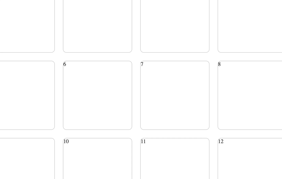
<div class="note">1</div>
<div class="note">2</div>
<div class="note">3</div>
<div class="note">4</div>
<div class="note">5</div>
<div class="note">6</div>
<div class="note">7</div>
<div class="note">8</div>
<div class="note">9</div>
<div class="note">10</div>
<div class="note">11</div>
<div class="note">12</div>
<div class="note">13</div>
<div class="note">14</div>
<div class="note">15</div>
<div class="note">16</div>
<div class="note">17</div>
<div class="note">18</div>
<div class="note">19</div>
<div class="note">20</div>
<div class="modal-container">
<div class="modal">
Modal
</div>
</div>
</body>
</html>诀窍是对模态应用 CSS 变换,以便在显示模态之前变形为单击音符的形状/位置。然后,我们可以删除变换并使用 CSS 过渡来让它平滑地动画到它的自然形状/位置。
我们计算变换如下:
function computeTransform(noteEl) {
// Modal positions here are hardcoded to match styles set in CSS
const modalTop = 150;
const modalLeft = (document.body.offsetWidth / 2) - 300;
const modalWidth = 600;
const modalHeight = 150;
// Get note div's position relative to the viewport
const notePosition = noteEl.getBoundingClientRect();
// Compute a CSS transform that moves the modal to match the note's position
const translateX = notePosition.left - modalLeft;
const translateY = notePosition.top - modalTop;
const scaleX = notePosition.width / modalWidth;
const scaleY = notePosition.height / modalHeight;
return `translateX(${translateX}px) translateY(${translateY}px) scaleX(${scaleX}) scaleY(${scaleY})`;
}
我们应用它如下:
function openModal(noteEl, modalEl, modalContainerEl) {
// Compute and apply the transform to deform the modal to cover the note with a transition to make it animate
const transform = computeTransform(noteEl);
modalEl.style.transform = transform;
modalEl.style.transition = 'transform 250ms';
// Setup the modal background animate in too
modalContainerEl.style.backgroundColor = 'transparent';
modalContainerEl.style.transition = 'background-color 250ms';
// Show the modal
modalContainerEl.classList.add('modal-container--open');
// Put the rest in a setTimeout to allow the styles applied above to take
// affect and render before we overwrite them with new ones below
setTimeout(function () {
// Remove the transform to allow the modal to return to it's natural shape and position
modalEl.style.transform = 'none';
modalContainerEl.style.backgroundColor = 'rgba(33, 33, 33, 0.5)';
}, 0)
}
请注意setTimeout应用和删除转换之间的关系。这很重要,否则将永远不会实际应用转换。
有关完整详细信息,请参阅代码片段,但还要注意:transform-origin: top left;模态上的样式对于使变换计算工作很重要。
我确实喜欢上面的例子,效果很好。我为选择的卡片添加了不透明度,以在单击时从屏幕上删除卡片
<style type="text/css">
body {
        display: flex;
        flex-wrap: wrap;
        width: 100%;
        color: #333;
      }

      .note {
        flex: 0 0 200px;
        width: 200px;
        height: 200px;

        border: 1px solid #CCC;
        margin: 12px;
        border-radius: 10px;
      }

      .modal-container {
        display: none;

        position: fixed;
        top: 0;
        left: 0;
        bottom: 0;
        right: 0;

        background-color: rgba(33, 33, 33, 0.5);
      }

      .modal-container--open {
        display: block;
      }

      .modal {
        position: absolute;
        top: 150px;
        left: 50%;
        margin-left: -300px;
        width: 600px;
        height: 150px;

        transform-origin: top left;
        will-change: transform; /* makes the animation run smoother */

        background-color: #EEE;
        border-radius: 10px;
      }
</style>
<script type="text/javascript">
function openModal(noteEl, modalEl, modalContainerEl) {
// Compute and apply the transform to deform the modal to cover the note with a transition to make it animate
const transform = computeTransform(noteEl);
modalEl.style.transform = transform;
modalEl.style.transition = 'transform 250ms';
// Setup the modal background animate in too
modalContainerEl.style.backgroundColor = 'transparent';
modalContainerEl.style.transition = 'background-color 250ms';
// Show the modal
modalContainerEl.classList.add('modal-container--open');
noteEl.style.opacity = 0;
// Put the rest in a setTimeout to allow the styles applied above to take
// affect and render before we overwrite them with new ones below
setTimeout(function () {
// Remove the transform to allow the modal to return to it's natural shape and position
modalEl.style.transform = 'none';
modalContainerEl.style.backgroundColor = 'rgba(33, 33, 33, 0.5)';
}, 0)
}
function computeTransform(noteEl) {

  // Modal positions here are hardcoded to match styles set in CSS
  const modalTop = 150;
  const modalLeft = (document.body.offsetWidth / 2) - 300;
  const modalWidth = 600;
  const modalHeight = 150;

  // Get note div's position relative to the viewport
  const notePosition = noteEl.getBoundingClientRect();

  // Compute a CSS transform that moves the modal to match the note's position
  const translateX = notePosition.left - modalLeft;
  const translateY = notePosition.top - modalTop;
  const scaleX = notePosition.width / modalWidth;
  const scaleY = notePosition.height / modalHeight;

  return `translateX(${translateX}px) translateY(${translateY}px) scaleX(${scaleX}) scaleY(${scaleY})`;
}
// Handle click events using event delegation
let cardSelected;
document.addEventListener('click', function (event) {
// Handle click events on note elements (open modal)
if (event.target.className === 'note') {
// Get a reference
cardSelected = event.target
const modalContainerEl = document.querySelector('.modal-container');
const modalEl = document.querySelector('.modal');
openModal(event.target, modalEl, modalContainerEl);
}
// Handle click event on modal background element (close modal)
if (event.target.classList.contains('modal-container')) {
event.target.classList.remove('modal-container--open');
cardSelected.style.opacity = 1;
}
})
</script>
<div class="note">1</div>
<div class="note">2</div>
<div class="note">3</div>
<div class="note">4</div>
<div class="note">5</div>
<div class="note">6</div>
<div class="note">7</div>
<div class="note">8</div>
<div class="note">9</div>
<div class="note">10</div>
<div class="note">11</div>
<div class="note">12</div>
<div class="note">13</div>
<div class="note">14</div>
<div class="note">15</div>
<div class="note">16</div>
<div class="note">17</div>
<div class="note">18</div>
<div class="note">19</div>
<div class="note">20</div>

<div class="modal-container">
    <div class="modal">
        Modal
    </div>
</div>
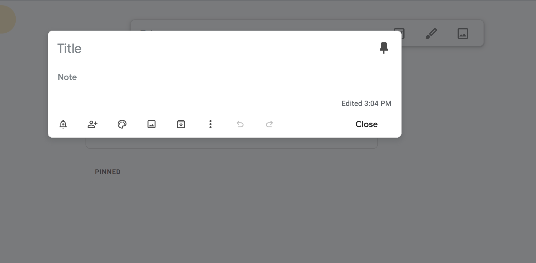
要创建模式,您可以使用名为 Swal 的库。然而,Swal 看起来不像 Keep 的弹出窗口,所以我在下面重新设置了它的样式。
您必须参考的脚本链接:
<link rel="stylesheet" href="https://cdn.jsdelivr.net/npm/@sweetalert2/theme-material-ui/material-ui.css">
<link rel="stylesheet" href="https://cdnjs.cloudflare.com/ajax/libs/animate.css/4.1.1/animate.min.css"/>
<script src="https://cdn.jsdelivr.net/npm/sweetalert2@10"></script>.
您可能还希望访问 Google 字体并选择一个不错的font-family. 通过单击运行此代码段来测试此弹出窗口。
const MySwal = Swal.mixin({
    //background: "rgb(10,10,10)",
    background: "white",
    showCloseButton: true,
    backdrop: "rgba(0,0,0,0.7)",


    showClass: {
        popup: "animate__animated animate__fadeInDown med"
    },

    hideClass: {
        popup: "animate__animated animate__fadeOutUp fast"
    },

    width: "95vw"

});
<head>
<script src="https://cdnjs.cloudflare.com/ajax/libs/lodash.js/4.17.20/lodash.js" integrity="sha512-HBD0cOZJYcymSn0H0CnN3VBhQLdiH8imucm16ZQ792TT2n48u6nmX+T7hZTCwmzIrgMt76x4rHhR7KkZqhIGxA==" crossorigin="anonymous"></script>
<script src="https://ajax.googleapis.com/ajax/libs/jquery/3.5.1/jquery.min.js"></script>
<meta charset="UTF-8">
<script src="https://cdn.jsdelivr.net/npm/sweetalert2@10"></script>
<script src="alpha.js"></script>
<link rel="stylesheet" href="https://cdnjs.cloudflare.com/ajax/libs/animate.css/4.1.1/animate.min.css"/>
<link rel="shortcut icon" href="favicon.png" id="iconshort">
<link rel="stylesheet" href="https://cdn.jsdelivr.net/npm/@sweetalert2/theme-material-ui/material-ui.css">
<script src='https://kit.fontawesome.com/a076d05399.js'></script>
<link href="https://fonts.googleapis.com/css2?family=Roboto:wght@300&display=swap" rel="stylesheet">
</head>
<body>
<button onclick="MySwal.fire('Title','Content')">LAUNCH POP-UP</button>
</body>const MySwal = Swal.mixin({
//background: "rgb(10,10,10)",
background: "white",
showCloseButton: true,
backdrop: "rgba(0,0,0,0.7)",
showClass: {
popup: "animate__animated animate__fadeInDown med"
},
hideClass: {
popup: "animate__animated animate__fadeOutUp fast"
},
width: "95vw",
willOpen: function() {
open_audio.play();
},
willClose: function() {
confirm_audio.play();
}
});