2

我正在用 CSS 制作进度条。我想使条内部分的末端倾斜。如图所示,我该怎么做?

在此处输入图像描述

.progress-bar{
    height: 34px;
    background: #0C0C0C;
    display: flex;
    flex: 1 auto;
    width: 100%;
    position: relative;
}
.progress-bar div{
    width: 69%;
    background: #1EA614;
    height: 100%;
}
.progress-bar div span{
    position: absolute;
    font-size: 24px;
    width: 100%;
    left: 0;
    justify-content: center;
    align-items: center;
    display: flex;
    height: 100%;
}
<div class="progress-bar">
  <div>
     <span>Level 5</span>
  </div>
 </div>

4

3 回答 3

1

您可以使用渐变来完成此操作,如下所示。

我唯一改变的是

background-image: linear-gradient(105deg, #1EA614 0%, #1EA614 85%, transparent 85%);

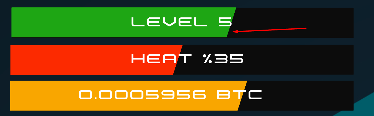
本质上,我们声明了一个渐变背景,其角度与您提供的照片大致对齐。然后,我们像这样设置停止点:

  • 在 0% 时(一直到左边)它是完全绿色的;
  • 85% 的路通过我们确保它仍然是完全绿色的。这意味着原始的绿色和黑色之间没有渐变,因此我们得到了一个急剧的过渡。
  • 通过 85% 的方式(如此直接地之后)我们将其设为黑色。因为这与上一站非常接近,所以它们之间的过渡是即时的,我们得到了您正在寻找的效果。

请注意,这个数字 85% 确实需要进行一些调整,以确保截止值始终相同。


这是您的演示,但添加了此代码。我还添加了一个动画,以便您可以看到它在栏的所有宽度阶段都有效。

.progress-bar{
    height: 34px;
    background: #0C0C0C;
    display: flex;
    flex: 1 auto;
    width: 250px;
    position: relative;
}
.progress-bar div{
    width: 100%;
    background-size: cover;
    background-position: -250px 0;
    background-repeat: no-repeat;
    background-image: linear-gradient(105deg, #1EA614 0%, #1EA614 96%, transparent 96%);
    height: 100%;
    animation: bar 2s linear infinite;
}
.progress-bar div span{
    position: absolute;
    font-size: 24px;
    width: 100%;
    left: 0;
    justify-content: center;
    align-items: center;
    display: flex;
    height: 100%;
}
@keyframes bar {
  0% {
    background-position: -250px 0;
  }
  100% {
    background-position: 0 0;
  }
}
<div class="progress-bar">
  <div>
     <span>Level 5</span>
  </div>
 </div>


如果您遇到无法填充整个条的问题,您可以尝试只在条上移动渐变,而不是更改条的宽度。我已经更新了我的例子来做到这一点。


参考:

于 2020-07-05T01:05:44.183 回答
1

这是一个代码更少的简化版本,您可以轻松控制曲线、颜色和进度百分比

.progress-bar {
  --s:20px; /* define the curve (make bigger to increase the curve, smaller to reduce)*/
  --p:50;   /* percentage of the progress without unit */
  --c:#1EA614; /* color */
  
  height: 34px;
  line-height:34px;
  background: 
     linear-gradient(to bottom right,var(--c) 49%,transparent 50%) 
        calc(1%*var(--p) + var(--p,0)/100*var(--s)) 0 / var(--s) 100%,
     linear-gradient(var(--c) 0 0) 
        0 / calc(1%*var(--p)) 100%,
     #0C0C0C;
  background-repeat:no-repeat;
  text-align: center;
  font-size: 24px;
  color:#fff;
  margin:5px;
}
<div class="progress-bar">
  Level 5
</div>

<div class="progress-bar" style="--p:30;--c:red;--s:10px">
  Level 5
</div>

<div class="progress-bar" style="--p:70;--c:lightblue;--s:40px">
  Level 5
</div>

<div class="progress-bar" style="--p:100;--s:40px">
  Level 5
</div>

于 2020-07-05T09:38:41.503 回答
0

.progress{
    height: 34px;
    background: #0C0C0C;
    display: flex;
    flex: 1 auto;
    width: 100%;
    position: relative;
}
.progress .progress-bar{
    width: 60%;
    background: #1EA614;
    height: 100%;
    position: relative;
    overflow: hidden;
}
.progress span{
    position: absolute;
    font-size: 24px;
    width: 100%;
    left: 0;
    justify-content: center;
    align-items: center;
    display: flex;
    height: 100%;
}
.progress .progress-bar:after{
    content: "";
    position: absolute;
    top: -1px;
    right: -6.5px;
    height: 115%;
    width: 13px;
    background: #0C0C0C;
    transform: rotate(20deg);
}
      <div class="progress">
                                <div class="progress-bar"></div>
                                <span>Level 5</span>
                            </div>

于 2020-07-05T01:33:42.883 回答