2

大家好,我正在尝试使用 CSS 模块自定义 Material-UI单选按钮,但我未能取得太大成功,似乎更简单的方法是使用 Material-UI 中的 makeStyles 函数,但是我应该使用 CSS 模块。

所以这是标准的 Material-UI 单选按钮:

单选按钮

基本上我必须这样做:单选按钮设计

Material-UI 没有可用的复选标记,但我确信我可以用 SVG 以某种方式做到这一点,但我似乎不知道该怎么做。如果有人可以帮助或指出我正确的方向,我将不胜感激。

更新:事实证明,我可以使用我在 Material-UI 图标上找到的 Radio 组件的 checkedIcon 属性将 SVG 作为组件注入,这里是文档

这只满足了我对我需要的已检查“活动”部分的需求,然后我在“悬停”部分苦苦挣扎,同时我认为我必须为此使用 SVG,而我真正需要做的就是使用::before 或 ::after 创建一个伪元素并将其样式化为带有主圆的圆,与“焦点”部分相同。

4

2 回答 2

5

您可以简单地使用Checkbox 组件 ( https://material-ui.com/api/checkbox/#propsicon ) 的和属性,并传入呈现 SVG 的任何类型的组件。checkedIcon

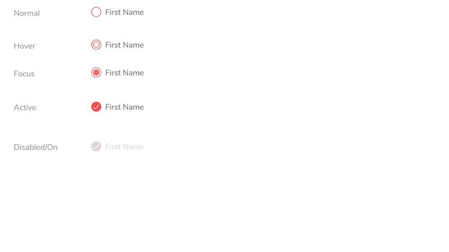
编辑:我用 CSS 模块做了一个小演示(基于 Material-UI 复选框演示),因为最初的答案不符合您的所有要求(例如缺少焦点示例)。它看起来也不是很好,但我认为它应该有助于展示它背后的想法(焦点应该类似于悬停示例)。

零件:

import React from 'react';
// webpack, parcel or else will inject the CSS into the page
import styles from './CssModulesCheckboxes.css';
import Checkbox from '@material-ui/core/Checkbox';

function StyledCheckbox(props) {
  return (
    <Checkbox
      checkedIcon={<span className={styles.checkedIcon} />}
      icon={<span className={styles.icon} />}
      inputProps={{ 'aria-label': 'decorative checkbox' }}
      {...props}
    />
  );
}

export default function CssModulesButton() {
  return (
    <div>
      <StyledCheckbox />
      <StyledCheckbox defaultChecked />
      <StyledCheckbox defaultChecked disabled />
    </div>
  );
}

CSS模块:

.icon {
  border-radius: 3px;
  width: 16px;
  height: 16px;
  box-shadow: inset 0 0 0 1px rgba(16, 22, 26, 0.2), inset 0 -1px 0 rgba(16, 22, 26, 0.1);
  background-color: #f5f8fa;
  background-image: linear-gradient(180deg, hsla(0, 0%, 100%, 0.8), hsla(0, 0%, 100%, 0));
}

input:hover ~ .icon {
  background-color: #137cbd;
  background-image: linear-gradient(180deg, hsla(0, 0%, 100%, 0.1), hsla(0, 0%, 100%, 0));
}

input:hover ~ .icon::before {
  display: block;
  width: 16px;
  height: 16px;
  background-image: url("data:image/svg+xml;charset=utf-8,%3Csvg xmlns='http://www.w3.org/2000/svg' viewBox='0 0 16 16'%3E%3Cpath fill-rule='evenodd' clip-rule='evenodd' d='M12 5c-.28 0-.53.11-.71.29L7 9.59l-2.29-2.3a1.003 1.003 0 00-1.42 1.42l3 3c.18.18.43.29.71.29s.53-.11.71-.29l5-5A1.003 1.003 0 0012 5z' fill='%23aaa'/%3E%3C/svg%3E");
  content: '';
}

.checkedIcon {
  background-color: #137cbd;
  background-image: linear-gradient(180deg, hsla(0, 0%, 100%, 0.1), hsla(0, 0%, 100%, 0));
}

.checkedIcon::before {
  display: block;
  width: 16px;
  height: 16px;
  background-image: url("data:image/svg+xml;charset=utf-8,%3Csvg xmlns='http://www.w3.org/2000/svg' viewBox='0 0 16 16'%3E%3Cpath fill-rule='evenodd' clip-rule='evenodd' d='M12 5c-.28 0-.53.11-.71.29L7 9.59l-2.29-2.3a1.003 1.003 0 00-1.42 1.42l3 3c.18.18.43.29.71.29s.53-.11.71-.29l5-5A1.003 1.003 0 0012 5z' fill='%23fff'/%3E%3C/svg%3E");
  content: '';
}

input:disabled ~ .checkedIcon {
  box-shadow: none;
  background: rgba(206, 217, 224, 0.5);
}

在代码沙箱中运行的示例: https ://codesandbox.io/s/css-modules-vdbi8

于 2020-01-08T14:39:35.727 回答
0

试试下面的代码:

HTML:

<div>
  <input type="radio" name="my-radio" id="radio-option-1"/>
  <label for="radio-option-1"> <span></span> Pick Me </label>
</div>

<div>
  <input type="radio" name="my-radio" id="radio-option-2"/>
  <label for="radio-option-2"> <span></span> Pick Me 2</label>
</div>

<div>
  <input type="radio" name="my-radio" id="radio-option-3" active/>
  <label for="radio-option-3"> <span></span> Pick Me 3 (Active)</label>
</div>

<div>
  <input type="radio" name="my-radio" id="radio-option-4" disabled/>
  <label for="radio-option-4"> <span></span> Pick Me 4 (Inactive)</label>
</div>

CSS:

input[type="radio"] {
    display: none;
}

label {
  cursor:pointer;
  color: #555;
}

input[type="radio"] + label span {
    display: inline-block;
    vertical-align: middle;
    width: 45px;
    height: 45px;
    border: 2px solid #ff0000;
    border-radius: 10px;
    background-color: #ffffff;
    text-align: center;
}

input[type="radio"][disabled] + label span {
  background-color: #ececec;
  border: #ececec;
}

input[type="radio"][active] + label span {
   background-color: #ff0000;
}
input[type="radio"][active] + label span:hover {
  background-color: #ff0000;
  border: 2px solid #ff0000;
}

/* input[type="radio"] + label span:hover {
  text-align: center;
  vertical-align: bottom;
} */

input[type="radio"] + label span:focus {
  background-color: #ffffff;
}
input[type="radio"]:not([active]):not([disabled]):not(:checked) + label span:focus::before {
   content: '';
   display: inline-block;
   width: 70%;
   height: 70%;
   border-radius: 50%;
   background-color: #ff0000;
   border: 2px solid #ff0000;
   margin-top: calc(100% - 76%);
}

input[type="radio"]:not([active]):not([disabled]):not(:checked) + label span:hover::before {
   content: '';
   display: inline-block;
   width: 70%;
   height: 70%;
   border-radius: 50%;
   background-color: #ffffff;
   border: 2px solid #ff0000;
   margin-top: calc(100% - 85%);
}

input[type="radio"] + label span  {
  border-radius: 50%;
}

input[type="radio"][disabled] + label span::before,
input[type="radio"][active] + label span::before,
input[type="radio"]:checked + label span::before {
   content: "✓";
   color: #ffffff;
   text-align: center;
   font-size: 40px;
}

input[type="radio"]:checked + label span {
    background-color: #ff0000;
    text-align: center;
}

演示:https ://jsfiddle.net/40ktw6jv/58/

于 2020-01-08T15:32:21.533 回答