在同一个问题苦苦挣扎了一段时间后,我终于找到了一个满足我所有要求的解决方案:
- 不需要我知道容器的高度。
- 与相对+绝对解决方案不同,内容不浮动在自己的层中(即,它通常嵌入到容器 div 中)。
- 跨浏览器(IE8+)工作。
- 实施简单。
解决方案只需要一个<div>,我称之为“对齐器”:
CSS
.bottom_aligner {
    display: inline-block;
    height: 100%;
    vertical-align: bottom;
    width: 0px;
}
html
<div class="bottom_aligner"></div>
... Your content here ...
这个技巧通过创建一个又高又瘦的 div 来实现,它将文本基线推到容器的底部。
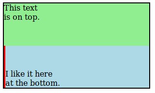
这是一个完整的示例,可以实现 OP 的要求。我将“bottom_aligner”变厚变红,仅用于演示目的。
CSS:
.outer-container {
  border: 2px solid black;
  height: 175px;
  width: 300px;
}

.top-section {
  background: lightgreen;
  height: 50%;
}

.bottom-section {
  background: lightblue;
  height: 50%;
  margin: 8px;
}

.bottom-aligner {
  display: inline-block;
  height: 100%;
  vertical-align: bottom;
  width: 3px;
  background: red;
}

.bottom-content {
  display: inline-block;
}

.top-content {
  padding: 8px;
}
HTML:
<body>
  <div class="outer-container">
    <div class="top-section">
      This text
      <br> is on top.
    </div>
    <div class="bottom-section">
      <div class="bottom-aligner"></div>
      <div class="bottom-content">
        I like it here
        <br> at the bottom.
      </div>
    </div>
  </div>
</body>