更新:见下文
我创建了一个引导切换开关,它应该在两个不同的内容之间切换,它应该通过开关的方向和黑色显示当前内容。 问题:页面加载或重新加载时显示错误的内容,并且开关在错误的一侧,并且所选文本的颜色不是黑色(表示已选中)
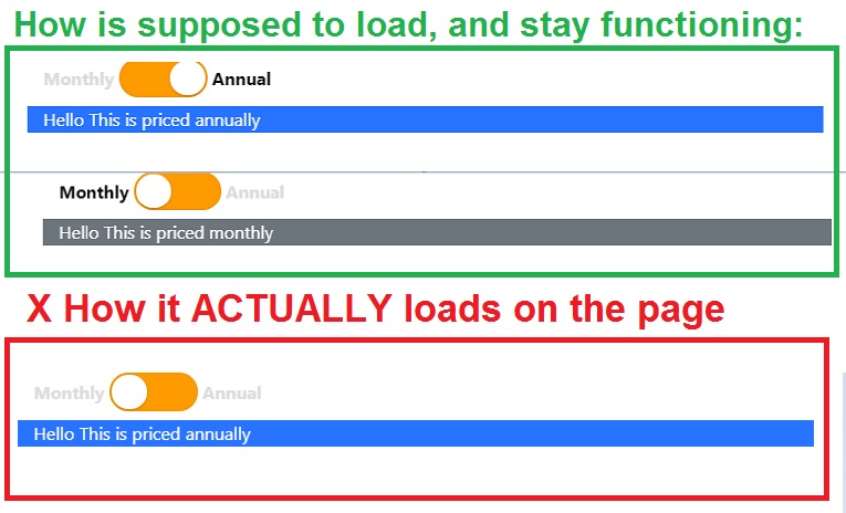
Murad 对此进行了改进,但仍然存在一些问题:

更新小提琴:https ://jsfiddle.net/godsnake/bdqychLw/
如何确保页面以正确的顺序和功能加载内容和切换开关?
请使用这个小提琴: https ://jsfiddle.net/godsnake/jmc798qx/4/
JS:
   var month = document.getElementById("filt-monthly"),
    annual = document.getElementById("filt-annual"),
    swicther = document.getElementById("switcher"),
    montWrapper = document.getElementById("monthly"),
    annualWrapper = document.getElementById("annually");

month.addEventListener("click", function(){
  month.classList.add("toggler--is-active");
  annual.classList.remove("toggler--is-active");
  montWrapper.classList.remove("hide");
  annualWrapper.classList.add("hide");
  document.querySelector("[type='checkbox']").checked = false
});

 annual.addEventListener("click", function(){
  month.classList.remove("toggler--is-active");
  annual.classList.add("toggler--is-active");
  montWrapper.classList.add("hide");
  annualWrapper.classList.remove("hide");
  document.querySelector("[type='checkbox']").checked = true
});

swicther.addEventListener("click", function(event){
  month.classList.toggle("toggler--is-active");
  annual.classList.toggle("toggler--is-active");
  montWrapper.classList.toggle("hide");
  annualWrapper.classList.toggle("hide");
})
HTML:
  <div style="" class="container pb-2" id="signupForm">


<label class="toggler pointer" id="filt-monthly">Monthly</label>
  <div class="toggle">
    <input type="checkbox" id="switcher" class="check"/>
    <b class="b switch"></b>
  </div>
  <label class="toggler pointer" id="filt-annual">Annual</label>

</div>

 <div id="annually" class="hide wrapper-full">
 <div class="container bg-primary">

 <p class="text-white">
Hello This is priced annually
 </p>
 </div>
 </div>

  <div id="monthly" class=" wrapper-full">
   <div class="container bg-secondary">

 <p class="text-white">
Hello This is priced monthly
 </p>
 </div>
 </div>
CSS [引导程序]
.toggle, .toggler {
  display: inline-block;
  vertical-align: middle;
  margin: 0px;
}

.toggler {
  color: #ddd;
  transition: .2s;
  font-weight: bold;
}

.toggler--is-active {
  color: #000000;
}
x-shadow: inset 0 1px rgba(0, 0, 0, 0.02);
}


.b {
  display: block;
}

.toggle {
  position: relative;
  width: 80px;
  height: 35px;
  border-radius: 100px;
  background-color: #ff9900;
  overflow: hidden;
  box-shadow: inset 0 0 2px 1px rgba(0, 0, 0, 0.05);
}

.check {
  position: absolute;
  display: block;
  cursor: pointer;
  top: 0;
  left: 0;
  width: 100%;
  height: 100%;
  opacity: 0;
  z-index: 6;
}

.check:checked ~ .switch {
  right: 2px;
  left: 57.5%;
  transition: 0.25s cubic-bezier(0.785, 0.135, 0.15, 0.86);
  transition-property: left, right;
  transition-delay: .08s, 0s;
}

.switch {
  position: absolute;
  left: 2px;
  top: 2px;
  bottom: 2px;
  right: 57.5%;
  background-color: #fff;
  border-radius: 36px;
  z-index: 1;
  transition: 0.25s cubic-bezier(0.785, 0.135, 0.15, 0.86);
  transition-property: left, right;
  transition-delay: 0s, .08s;
  box-shadow: 0 1px 2px rgba(0, 0, 0, 0.2);
}

.hide{
  display: none;
}