第一种方式
试试这个 你可以创建一个CustomBottomNavigationView
这是一篇好文章CustomBottomNavigationView
如何在 BottomNavigationView 中绘制自定义形状
示例代码
import android.content.Context;
import android.graphics.*;
import android.support.design.widget.BottomNavigationView;
import android.support.v4.content.ContextCompat;
import android.util.AttributeSet;

public class CustomBottomNavigationView extends BottomNavigationView {

    private Path mPath;
    private Paint mPaint;

    /** the CURVE_CIRCLE_RADIUS represent the radius of the fab button */
    private final int CURVE_CIRCLE_RADIUS = 128 / 2;
    // the coordinates of the first curve
    private Point mFirstCurveStartPoint = new Point();
    private Point mFirstCurveEndPoint = new Point();
    private Point mFirstCurveControlPoint1 = new Point();
    private Point mFirstCurveControlPoint2 = new Point();

    //the coordinates of the second curve
    @SuppressWarnings("FieldCanBeLocal")
    private Point mSecondCurveStartPoint = new Point();
    private Point mSecondCurveEndPoint = new Point();
    private Point mSecondCurveControlPoint1 = new Point();
    private Point mSecondCurveControlPoint2 = new Point();
    private int mNavigationBarWidth;
    private int mNavigationBarHeight;

    public CustomBottomNavigationView(Context context) {
        super(context);
        init();
    }

    public CustomBottomNavigationView(Context context, AttributeSet attrs) {
        super(context, attrs);
        init();
    }

    public CustomBottomNavigationView(Context context, AttributeSet attrs, int defStyleAttr) {
        super(context, attrs, defStyleAttr);
        init();
    }

    private void init() {
        mPath = new Path();
        mPaint = new Paint();
        mPaint.setStyle(Paint.Style.FILL_AND_STROKE);
        mPaint.setColor(ContextCompat.getColor(getContext(),R.color.colorAccent));
        setBackgroundColor(Color.TRANSPARENT);
    }

    @Override
    protected void onLayout(boolean changed, int left, int top, int right, int bottom) {
        super.onLayout(changed, left, top, right, bottom);

    }

    @Override
    protected void onSizeChanged(int w, int h, int oldw, int oldh) {
        super.onSizeChanged(w, h, oldw, oldh);
        // get width and height of navigation bar
        // Navigation bar bounds (width & height)
        mNavigationBarWidth = getWidth();
        mNavigationBarHeight = getHeight();
        // the coordinates (x,y) of the start point before curve
        mFirstCurveStartPoint.set((mNavigationBarWidth / 2) - (CURVE_CIRCLE_RADIUS * 2) - (CURVE_CIRCLE_RADIUS / 3), 0);
        // the coordinates (x,y) of the end point after curve
        mFirstCurveEndPoint.set(mNavigationBarWidth / 2, CURVE_CIRCLE_RADIUS + (CURVE_CIRCLE_RADIUS / 4));
        // same thing for the second curve
        mSecondCurveStartPoint = mFirstCurveEndPoint;
        mSecondCurveEndPoint.set((mNavigationBarWidth / 2) + (CURVE_CIRCLE_RADIUS * 2) + (CURVE_CIRCLE_RADIUS / 3), 0);

        // the coordinates (x,y)  of the 1st control point on a cubic curve
        mFirstCurveControlPoint1.set(mFirstCurveStartPoint.x + CURVE_CIRCLE_RADIUS + (CURVE_CIRCLE_RADIUS / 4), mFirstCurveStartPoint.y);
        // the coordinates (x,y)  of the 2nd control point on a cubic curve
        mFirstCurveControlPoint2.set(mFirstCurveEndPoint.x - (CURVE_CIRCLE_RADIUS * 2) + CURVE_CIRCLE_RADIUS, mFirstCurveEndPoint.y);

        mSecondCurveControlPoint1.set(mSecondCurveStartPoint.x + (CURVE_CIRCLE_RADIUS * 2) - CURVE_CIRCLE_RADIUS, mSecondCurveStartPoint.y);
        mSecondCurveControlPoint2.set(mSecondCurveEndPoint.x - (CURVE_CIRCLE_RADIUS + (CURVE_CIRCLE_RADIUS / 4)), mSecondCurveEndPoint.y);

        mPath.reset();
        mPath.moveTo(0, 0);
        mPath.lineTo(mFirstCurveStartPoint.x, mFirstCurveStartPoint.y);

        mPath.cubicTo(mFirstCurveControlPoint1.x, mFirstCurveControlPoint1.y,
                mFirstCurveControlPoint2.x, mFirstCurveControlPoint2.y,
                mFirstCurveEndPoint.x, mFirstCurveEndPoint.y);

        mPath.cubicTo(mSecondCurveControlPoint1.x, mSecondCurveControlPoint1.y,
                mSecondCurveControlPoint2.x, mSecondCurveControlPoint2.y,
                mSecondCurveEndPoint.x, mSecondCurveEndPoint.y);

        mPath.lineTo(mNavigationBarWidth, 0);
        mPath.lineTo(mNavigationBarWidth, mNavigationBarHeight);
        mPath.lineTo(0, mNavigationBarHeight);
        mPath.close();
    }

    @Override
    protected void onDraw(Canvas canvas) {
        super.onDraw(canvas);
        canvas.drawPath(mPath, mPaint);
    }
}
现在像这样使用
<?xml version="1.0" encoding="utf-8"?>
<RelativeLayout xmlns:android="http://schemas.android.com/apk/res/android"
    xmlns:app="http://schemas.android.com/apk/res-auto"
    android:id="@+id/coordinatorlayout"
    android:layout_width="match_parent"
    android:layout_height="match_parent"
    android:orientation="vertical">

    <android.support.design.widget.FloatingActionButton
        android:id="@+id/fab"
        android:layout_width="wrap_content"
        android:layout_height="wrap_content"
        android:layout_alignParentBottom="true"
        android:layout_centerInParent="true"
        android:layout_marginBottom="30dp"
        android:clickable="true"
        android:focusable="true" />

    <neel.com.demo.CustomBottomNavigationView
        android:id="@+id/customBottomBar"
        android:layout_width="match_parent"
        android:layout_height="wrap_content"
        android:layout_alignParentBottom="true"
        android:background="@color/colorAccent"
        app:labelVisibilityMode="labeled" />


</RelativeLayout>
活动
import android.support.v7.app.AppCompatActivity;
import android.os.Bundle;

public class MainActivity extends AppCompatActivity {

    @Override
    protected void onCreate(Bundle savedInstanceState) {
        super.onCreate(savedInstanceState);
        setContentView(R.layout.activity_main);

        CustomBottomNavigationView curvedBottomNavigationView = findViewById(R.id.customBottomBar);
        curvedBottomNavigationView.inflateMenu(R.menu.bottom_menu);
    }
}
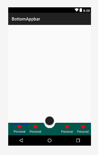
输出
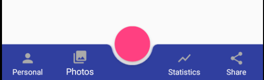
第二种方式
    <androidx.coordinatorlayout.widget.CoordinatorLayout xmlns:android="http://schemas.android.com/apk/res/android"
    xmlns:app="http://schemas.android.com/apk/res-auto"
    android:layout_width="match_parent"
    android:layout_height="120dp"
    android:layout_gravity="bottom">

    <com.google.android.material.floatingactionbutton.FloatingActionButton
        android:id="@+id/fab"
        android:layout_width="wrap_content"
        android:layout_height="wrap_content"
        android:clickable="true"
        android:focusable="true"
        app:layout_anchor="@id/bar" />

    <com.google.android.material.bottomappbar.BottomAppBar
        android:id="@+id/bar"
        android:layout_width="match_parent"
        android:layout_height="58dp"
        android:layout_gravity="bottom"
        android:backgroundTint="@color/colorPrimaryDark">

        <LinearLayout
            android:layout_width="match_parent"
            android:layout_height="wrap_content"
            android:orientation="horizontal">

            <TextView
                style="?android:attr/borderlessButtonStyle"
                android:layout_width="0dp"
                android:layout_height="wrap_content"
                android:layout_weight="1"
                android:background="?android:attr/selectableItemBackground"
                android:drawableTop="@drawable/ic_favorite"
                android:gravity="center"
                android:orientation="vertical"
                android:text="Personal"
                android:textColor="#FFFFFF">

            </TextView>

            <TextView
                style="?android:attr/borderlessButtonStyle"
                android:layout_width="0dp"
                android:layout_height="wrap_content"
                android:layout_weight="1"
                android:background="?android:attr/selectableItemBackground"
                android:drawableTop="@drawable/ic_favorite"
                android:gravity="center"
                android:orientation="vertical"
                android:textColor="#FFFFFF"
                android:visibility="invisible">

            </TextView>

            <TextView
                style="?android:attr/borderlessButtonStyle"
                android:layout_width="0dp"
                android:layout_height="wrap_content"
                android:layout_weight="1"
                android:background="?android:attr/selectableItemBackground"
                android:drawableTop="@drawable/ic_favorite"
                android:gravity="center"
                android:orientation="vertical"
                android:text="Personal"
                android:textColor="#FFFFFF">

            </TextView>

            <TextView
                style="?android:attr/borderlessButtonStyle"
                android:layout_width="0dp"
                android:layout_height="wrap_content"
                android:layout_weight="1"
                android:background="?android:attr/selectableItemBackground"
                android:drawableTop="@drawable/ic_favorite"
                android:gravity="center"
                android:orientation="vertical"
                android:text="Personal"
                android:textColor="#FFFFFF">

            </TextView>

        </LinearLayout>

    </com.google.android.material.bottomappbar.BottomAppBar>

</androidx.coordinatorlayout.widget.CoordinatorLayout>
输出