我需要从 gentelella 模板中设置这些元素的样式: https ://colorlib.com/polygon/gentelella/contacts.html
这是我的实现

<div class="col-md-4 col-sm-4  col-xs-12 profile_details">
    <div class="well profile_view">
        <div class="col-sm-12 col-xs-12">
            <div class="crop col-md-4 col-sm-12 col-xs-12 text-center ">
                <img  src= "https://media-cdn.tripadvisor.com/media/photo-s/0d/bf/07/9b/post-card-view.jpg" alt="" class="img-icon-template img-fluid ">
            </div>
            <div class=" col-md-8 col-sm-8 col-xs-12">
                <div class="">
                    <h4  class="brief titolo_template"><i>TITLE</i></h4>
                    <div><i class="fa fa-user"><strong> user XXX  </i> </div>
                    <p class="descr_p"><i class="fa fa-file-text-o"> <strong> descr: </strong> </i>something</p>
                </div>
            </div>
        </div>
        <div class="col-xs-12 bottom text-center">
            <div class="col-xs-12 col-sm-12 emphasis text-left">
                <p class="">
                    <a>relase date </a><i>dd/mm/aaaaa @endif</i>
                </p>
                <div class="col-md-6  col-sm6">
                    <a class="btn-block btn-success btn-xs text-center"
                       role="button" id="btnT2"
                       href="/templateGraphic/idxxx"
                        <i class="fa fa-sort-amount-asc "></i>view tamplate
                    </a>
                </div>
                <div class="col-md-6  col-sm-6">
                    <a class="btn-block btn-info btn-xs text-center"
                       role="button" id="btnT1"
                       href="alo/oo"
                       class="btn btn-info btn-xs">
                        <i class="fa fa-comments-o"></i> get replies
                    </a>
                </div>
            </div>
        </div>
    </div>
</div>
如您所见,没有固定的高度,如果有很长的描述,例如最后一个盒子,盒子会越来越大。
问题是,如果修复容器的最大高度,那将不起作用,对于内部的东西也是如此,因为它使所有响应规则和媒体查询在之后不起作用。
我找到的唯一解决方案是在里面剪切文本
和
.descr_p{
     max-height: 90px;
     text-overflow: ellipsis;
     /* white-space: nowrap; */
     overflow: hidden;
 }
但是如果取消注释空白: nowrap 会发生这样的混乱:
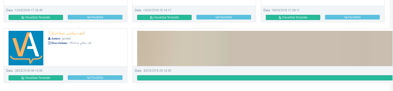
所以问题是 2 :) 其中一个是修复最大尺寸并保持整个事物响应的最佳方法。我怎样才能使“空白:nowrap”工作;
如果我问了一些愚蠢的事情,我深表歉意,但我是 CSS 样式的新手。