我想用自定义形状制作一个垂直分屏,就像我附加的图片一样,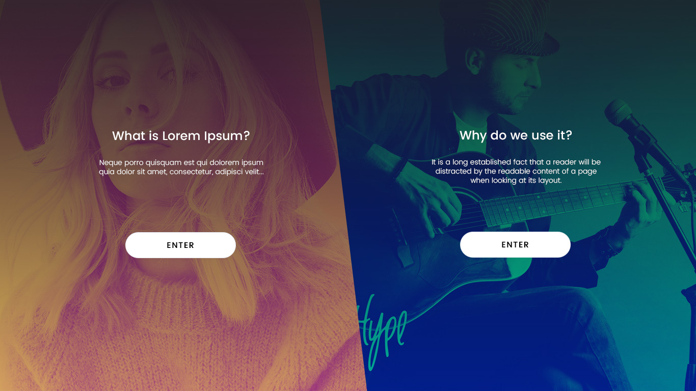 但它必须支持跨浏览器。我尝试使用剪切路径,但 FireFox 不支持,所以我尝试使用
CSS transform,但我的背景也发生了变化,这是我不想要的。另外,我想知道我的做法是否正确,或者是否有更好的方法。请建议。
演示
https://jsfiddle.net/cyber007/8yyrv33q/或
https://codepen.io/pagol/pen/qXqZJM
html
<div class="section hpanel leftpan">
  <div class="background-img">
    <div class="content-area">
      <h2>What is Lorem Ipsum?</h2> Neque porro quisquam est qui dolorem ipsum quia dolor sit amet, consectetur, adipisci velit...
      <div class="btn-area">
        <a href="#">ENTER</a> </div>
    </div>
  </div>
</div>
<div class="section hpanel rightpan">
  <div class="background-img">
    <div class="content-area">
      <h2>Why do we use it?</h2> It is a long established fact that a reader will be distracted by the readable content of a page when looking at its layout.
      <div class="btn-area">
        <a href="#">ENTER</a> </div>
    </div>
  </div>
</div>
CSS
html {
    font-size: 62.5%;
}
.noscroll {
    overflow: hidden
}
body {
    font-size: 1.5em;
    line-height: 1.6;
    font-weight: 400;
    font-family: 'Poppins', sans-serif;
    color: #555555;
    overflow-x: hidden;
}
img {
    height: auto;
}
.hpanel {
    position: absolute;
    top: 0;
    bottom: 0;
    height: 100%;
    background-position: center;
    background-size: cover;
    background-repeat: no-repeat;
    color: #fff
}
.leftpan {
    left: -4%;
    width: 60%;
    -webkit-transform: skew(-8deg);
    -moz-transform: skew(-8deg);
    -o-transform: skew(-8deg);
}
.leftpan .background-img {
    background-image: url(http://d1i3xayf43lpeg.cloudfront.net/58l7lmmaka1i/2jqTg1i70ce8G6yUyIi624/77fcf976d461fd96715da306b0afec34/cover.jpg);
}
.rightpan {
    right: -4%;
    width: 59%;
    -webkit-transform: skew(8deg);
    -moz-transform: skew(8deg);
    -o-transform: skew(8deg);
}
.rightpan .background-img {
    background-image: url(https://www.pixelo.net/wp-content/uploads/2017/07/02_free-duotone-photoshop-effects-pixelo.jpg);
}
.background-img {
    position: absolute;
    top: 0;
    bottom: 0;
    left: 0;
    right: 0;
    background-position: center;
    background-size: cover;
    background-repeat: no-repeat;

}
.leftpan .content-area {
    -webkit-transform: skew(8deg);
    -moz-transform: skew(8deg);
    -o-transform: skew(8deg);

}
.rightpan .content-area {-webkit-transform: skew(-8deg);
    -moz-transform: skew(-8deg);
    -o-transform: skew(-8deg);}
.content-area {
    text-align: center;
    margin: 20vh auto;
    width: 350px
}
.content-area h2 {
    font-size: 2.8rem;
    margin-bottom: 50px
}
.btn-area {
    margin-top: 50px
}
.btn-area a {
    padding: 13px 0;
    width: 70%;
    text-align: center;
    background-color: #fff;
    border-radius: 50px;
    display: inline-block;
    font-size: 18px;
    font-weight: 500;
    text-decoration: none;
    color: #000;
    letter-spacing: 1px;
}