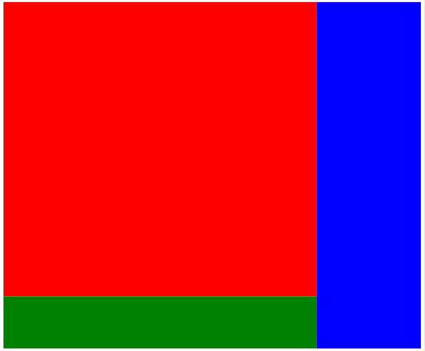
我正在使用 5 个 div:
- Main Div(用作包装器,宽度和高度设置为
auto) - sub div(包含两个div,红色和蓝色,
width:75%和height:auto)- 红色 div (
height:90%width:auto) - 绿色 div (
height:10%width:auto)
- 红色 div (
- 蓝色 div (
width:25%height:auto)
如下所示:
使用当前的宽度和高度设置,div 会按比例相互响应。
但问题是,如果我设置height:89% bottom-margin:1%红色 div,那么它们不会产生相同的输出,包含红色和绿色的子 div,如果 veiwport 很小,则高度会更高,如果视口是大屏幕,它会比蓝色 div 短。
我想以这样一种方式调整它,即无论我使用什么设备,绿色 div 始终保持相应调整,蓝色 div 在底部。
现在不幸的是,我code的似乎不起作用,fiddle也snippet不起作用,但它可以在我的浏览器上工作,在liveweave.com上也是如此。
这是liveweave.com上的工作示例
这是我的完整代码:
HTML:
<body>
  <div class="main">
    <div class="sub">
      <div class="red"></div>
      <div class="green"></div>
    </div>
    <div class="blue"></div>
  </div>
</body>
CSS:
.main{
  width: auto;
  height: auto;
 }
.sub{
  width: 75%;
  height: auto;
  float: left;
}
.red{
  width: 100%;
  height: 85%;
  background-color: red;
}
.green{
  width: 100%;
  height: 15%;
  background-color: green;
}
.blue{
  width: 25%;
  height: 100%;
  background-color: blue;
  float: right;
}