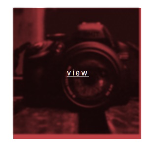
所以我使用混合混合模式:乘法;悬停时在我的图像上创建多层的效果。问题是图层超出了图像边界,如下图所示。我尝试将宽度和高度设置为 .imgcon 和 .imgcon > img(请参见下面的代码),并且该图层适合,但是当在不同的屏幕分辨率上查看时,它会弄乱响应式 Web 功能。所以我尝试将宽度和高度设置为 100% 以保持响应功能,但图层仍然超出图像边框。
这是我的代码:
.imgwrapper {
  position: relative;
}


.imgcon + div {
 position: absolute;
  left: 42%;
  top: 44%;
  color: white;
  text-decoration: underline;
  opacity:0;
  display: block;
  pointer-events: none;
  font-size: 18px;

  letter-spacing: 4px;

}

.imgcon {
 position: relative;
 background: rgba(209, 19, 15, 0);
  transition: ease 0s;
  -webkit-transition: ease 0s;
  -moz-transition: ease 0s;
  -ms-transition: ease 0s;
  -o-transition: ease 0s;
   mix-blend-mode: multiply;
}
.imgcon > img {
 transition: ease 0s;
  -webkit-transition: ease 0s;
  -moz-transition: ease 0s;
  -ms-transition: ease 0s;
  -o-transition: ease 0s;
}
.imgcon:hover {
  background: #b41f24;
    background: rgba(180, 31, 36, 0.85);


}
.imgcon:hover > img {
  z-index: -1;
  -webkit-filter: grayscale(100%) blur(1.5px) contrast(100%);
  filter: grayscale(100%) blur(1.5px) contrast(100%) ;
  mix-blend-mode: multiply;

}

.imgcon:hover + div {
  display: block;
  opacity: 1;
  z-index: 1;
}
<a href="works.html?option=emkoinvite" class="permalink">
<div class="desktop-3 mobile-half columns">
<div class="item first-row">
<h3>EmKO invitation</h3>
<span class="category">Identity, print</span>
<div class="imgwrapper">
<div class="imgcon">
<img src="http://i.imgur.com/XmhcxJS.png" /></div>
<div id="view">view</div></div>
</div><!-- // .item -->
</div><!-- // .desktop-3 -->
</a>