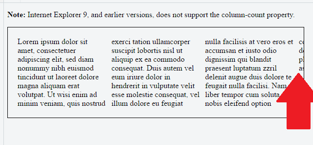
I think the issue here is that you've set a fixed height on your container. With the fixed height, the columns can't grow, so the rendering engine keeps making more columns to fit your content inside the container.
If you turn off overflow: hidden in your fiddle, you'll see that there actually a bunch more columns overflowing out of the side of your box. The padding just allows part of one of them to be visible.
The root cause here is height balancing. From MDN:
The CSS3 Column specification requires that the column heights must be
balanced: that is, the browser automatically sets the maximum column
height so that the heights of the content in each column are
approximately equal. Firefox does this.
However, in some situations it is also useful to set the maximum
height of the columns explicitly, and then lay out content starting at
the first column and creating as many columns as necessary, possibly
overflowing to the right. Therefore, if the height is constrained, by
setting the CSS height or max-height properties on a multi-column
block, each column is allowed to grow to that height and no further
before adding new column. This mode is also much more efficient for
layout.
Since you've set the height, height balancing says that the browser will fix columns to that height, and will create as many columns as it needs to display your content.
You'll need to remove your fixed height if you want your columns to grow and flow correctly and obey your column-count property.