25

我有一个大小和宽度可变的外部容器。假设在这个容器内,我有一个画布,我希望它尽可能地增长,同时保持比例而不是裁剪。为此,我通常会使用object-fit: contain.

现在,假设我不仅有一个画布,还有一个画布,旁边放置了另一个元素。

HTML:

<div class="outerContainer">
  <canvas width="640" height="360"></canvas>
  <div class="beside">
  </div>
</div>

CSS:

.outerContainer {
  display: flex;
  border: 0.5em solid #444;
  margin-bottom: 2em;
  object-fit: contain;
}

.outerContainer canvas {
  flex-grow: 1;
  background: #77a;
}

/* This element has a fixed width, and should be whatever height the <canvas> is */
.outerContainer .beside {
  flex-basis: 3em;
  flex-grow: 0;
  flex-shrink: 0;
  background: #7a7;
}

在这种情况下,我想缩放整个 externalContainer 的大小,就像我对画布所做的那样。问题是它object-fit实际上并没有缩放元素……它缩放了它的内容。这似乎不适用于普通的块元素,导致如果有足够的宽度,内部的画布可能会倾斜。
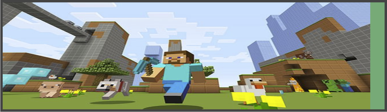
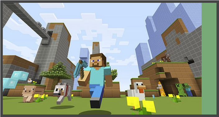
严重歪斜的画布

如果我添加object-fit: containcanvas元素中,它会保持比例但仍使用全宽,这意味着.beside元素一直向右。这通过画布上的紫色背景进行可视化。

不歪斜但不正确

我想要的是outerContainer使用画布内容进行缩放,以便.beside始终具有画布内容的高度。应该在父元素中居中,在.outerContainer不扭曲画布的情况下占用尽可能多的空间。像这样,在任何比例范围内:

所需图像

这对现代 CSS 可行吗?或者我必须使用脚本解决方案吗?

摆弄示例: https ://jsfiddle.net/nufx10zc/

4

2 回答 2

10

我不知道它是否适合你,但我认为如果你允许更多的 HTML,它可以主要在 css 中完成。

考虑以下html

<div class="outerContainer">
  <div class="canvasContainer">  
    <canvas width="640" height="360"></canvas>
  </div>
  <div class="beside">
  </div>
</div>

我只是在画布周围添加了一个小 div。这样我们让画布处理它的东西,我们使用 div 来处理 flex 的东西。

使用以下 CSS:

* {
  box-sizing: border-box;
}

.outerContainer {
  display: flex;
  border: 0.5em solid #444;
  margin-bottom: 2em;
}

.canvasContainer canvas {
  width: 100%;
  background: #777;
  margin-bottom: -4px
}

.canvasContainer {
  flex-grow: 1;
  background: #77a;
}

/* This element has a fixed width, and should be whatever height the <canvas> is */
.outerContainer .beside {
  flex-basis: 3em;
  flex-grow: 0;
  flex-shrink: 0;
  background: #7a7;
}

我们有画布容器占用所有可用空间。然后画布相应地适应其中的图像缩放。但是我不知道为什么,画布底部有一点边距,因此是负边距。

小提琴:https ://jsfiddle.net/L8p6xghb/3/

作为旁注,如果您希望将其用于字幕,则可以使用 html5 元素,例如<figure><figcaption>

于 2016-11-23T13:35:59.697 回答
2

考虑到您需要的解决方案,我认为CSS 解决方案有点牵强 - 这是一个使用脚本的提案,涉及以下步骤:

  1. 找到最适合可用空间的图像的纵横比canvas

  2. 更新widthcanvasflexbox高度。

  3. 现在在画布中绘制图像。

请注意,为了说明,在调整窗口大小时,我重新加载了框架 - 有关详细信息,请参见下面的演示(更多解释在内联给出):

// Document.ready
$(() => {
  putImageOnCanvas();
});

// Window resize event
((() => {
  window.addEventListener("resize", resizeThrottler, false);
  var resizeTimeout;

  function resizeThrottler() {
    if (!resizeTimeout) {
      resizeTimeout = setTimeout(function() {
        resizeTimeout = null;
        actualResizeHandler();
      }, 66);
    }
  }

  function actualResizeHandler() {
    // handle the resize event - reloading page for illustration
    window.location.reload();
  }
})());

function putImageOnCanvas() {

  $('.outerContainer canvas').each((index, canvas) => {
    const ctx = canvas.getContext('2d');
    canvas.width = $(canvas).innerWidth();
    canvas.height = $(canvas).innerHeight();
    const img = new Image;
    img.src = 'https://static1.squarespace.com/static/56a1d17905caa7ee9f27e273/t/56a1d56617e4f1177a27178d/1453446712144/Picture7.png';
    img.onload = (() => {

      // find the aspect ratio that fits the container
      let ratio = Math.min(canvas.width / img.width, canvas.height / img.height);
      let centerShift_x = (canvas.width - img.width * ratio) / 2;
      let centerShift_y = (canvas.height - img.height * ratio) / 2;
      canvas.width -= 2 * centerShift_x;
      canvas.height -= 2 * centerShift_y;

      // reset the flexbox height and canvas flex-basis (adjusting for the 0.5em border too)
      $('.outerContainer').css({
        'height': 'calc(' + canvas.height + 'px + 1em)'
      });
      $('.outerContainer canvas').css({
        'width': 'calc(' + canvas.width + 'px)'
      });

      // draw the image in the canvas now
      ctx.clearRect(0, 0, canvas.width, canvas.height);
      ctx.drawImage(img, 0, 0, img.width, img.height, 0, 0, img.width * ratio, img.height * ratio);
    });
  });
}
* {
  box-sizing: border-box;
}
body {
  margin: 0;
}
.outerContainer {
  display: flex;
  border: 0.5em solid #444;
  margin-bottom: 2em;
  /*max available flexbox height*/
  height: calc(100vh - 2em);
}
.outerContainer canvas {
  background: #77a;
  /*max available canvas width*/
  width: calc(100vw - 4em);
}
.outerContainer .beside {
  flex-basis: 3em;
  flex-grow: 0;
  flex-shrink: 0;
  background: #7a7;
}
<script src="https://ajax.googleapis.com/ajax/libs/jquery/2.1.1/jquery.min.js"></script>

<div class="outerContainer">
  <canvas></canvas>
  <div class="beside">
  </div>
</div>

编辑

  1. 我最初是在设置flex-basis-canvas但 Firefox 表现不佳 - 所以现在我正在使用width

  2. Snippet 在 Firefox 中再次出现屏幕调整大小(页面重新加载)的问题 - 所以也包含了一个小提琴。

UPDATED FIDDLE

于 2016-11-22T08:01:40.847 回答