5

首先,如果我不遵守任何 SO 规则,我想道歉,因为这是我的第一个问题。

我想要完成的是在我的页面中有一个方形的gridLayout。该行为应该等同于拥有一个带有stretch="aspectFit" 的元素。

如果建议的解决方案可以让我强制执行任何给定的纵横比而不仅仅是一个正方形,那将是一个很好的加分,因为它将允许我在未来解决多种情况。或者,如果它可以应用于任何 Layout 元素,那也很好。

该解决方案可以随心所欲,并且可以以任何您需要的方式嵌套 GridLayout 来完成此操作。

我已经尝试过像这样破解它:

 <GridLayout rows="*,auto,*" columns="*,auto,*" backgroundColor="green">
  <Image row="1" col="1" src="~/Images/1px-black.png" stretch="aspectFit" width="100%"></Image>
  <StackLayout row="1" col="1" orientation="vertical" backgroundColor="lightgray">
    <Label text="Label 1" width="100%" height="25%" backgroundColor="red"></Label>
    <Label text="Label 2" width="100%" height="25%" backgroundColor="green"></Label>
    <Label text="Label 3" width="100%" height="25%" backgroundColor="blue"></Label>
    <Label text="Label 4" width="100%" height="25%" backgroundColor="yellow"></Label>
  </StackLayout>
</GridLayout>

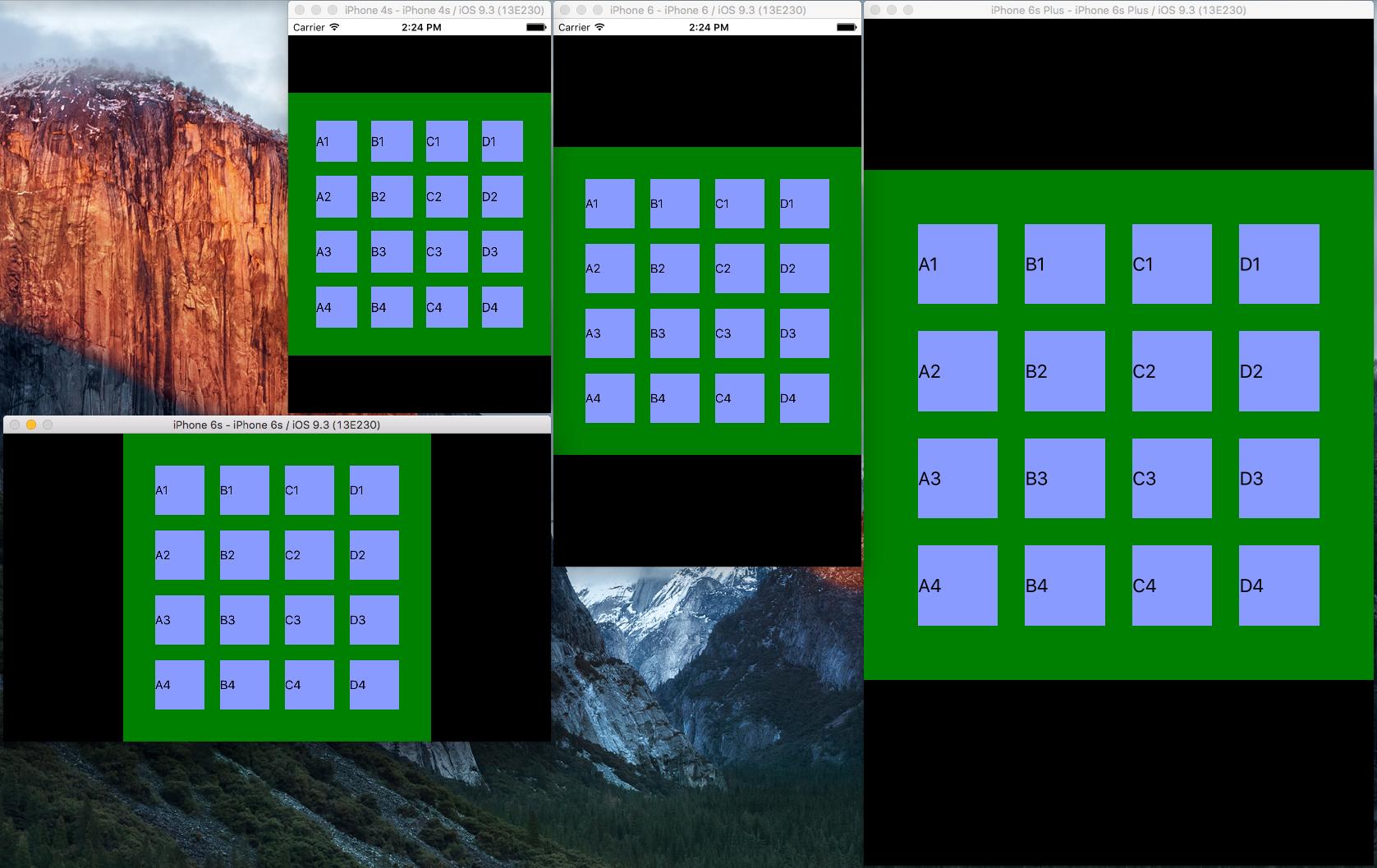
视觉上它似乎工作,但 GridLayout 的内容没有适当地填充它

PS:我刚刚注意到在我选择的示例中,我试图使正方形的布局元素是嵌套的 StackLayout,但这是相同的想法。我需要一种使嵌套布局元素平方的方法。

4

3 回答 3

5

感谢@Nathanael 让我深入了解我可以做什么。

我找到了解决方案,它适用于任何可能需要它的人。

首先,我将使用以下模板:

<GridLayout rows="2*,3*,*,3*,*,3*,*,3*,2*" columns="2*,3*,*,3*,*,3*,*,3*,2*" backgroundColor="green" #refGrid>
    <Label text="A1" col="1" row="1" backgroundColor="#899bfe"></Label>
    <Label text="A2" col="1" row="3" backgroundColor="#899bfe"></Label>
    <Label text="A3" col="1" row="5" backgroundColor="#899bfe"></Label>
    <Label text="A4" col="1" row="7" backgroundColor="#899bfe"></Label>

    <Label text="B1" col="3" row="1" backgroundColor="#899bfe"></Label>
    <Label text="B2" col="3" row="3" backgroundColor="#899bfe"></Label>
    <Label text="B3" col="3" row="5" backgroundColor="#899bfe"></Label>
    <Label text="B4" col="3" row="7" backgroundColor="#899bfe"></Label>

    <Label text="C1" col="5" row="1" backgroundColor="#899bfe"></Label>
    <Label text="C2" col="5" row="3" backgroundColor="#899bfe"></Label>
    <Label text="C3" col="5" row="5" backgroundColor="#899bfe"></Label>
    <Label text="C4" col="5" row="7" backgroundColor="#899bfe"></Label>

    <Label text="D1" col="7" row="1" backgroundColor="#899bfe"></Label>
    <Label text="D2" col="7" row="3" backgroundColor="#899bfe"></Label>
    <Label text="D3" col="7" row="5" backgroundColor="#899bfe"></Label>
    <Label text="D4" col="7" row="7" backgroundColor="#899bfe"></Label>
</GridLayout>

我的目标是让 GridLayout 看起来是方形的并且在屏幕上居中,无论设备或屏幕纵横比如何。为了做到这一点,我在组件定义中的 JavaScript(或在本例中为 TypeScript,因为我正在使用 Angular2 + Nativescript)中执行了以下操作

ngAfterViewInit() {
    let grid: GridLayout = <GridLayout>this.refGrid.nativeElement;
    var x = grid.getActualSize();

    function wait() {
        if (x.width <= 0) {
            x = grid.getActualSize();
            setTimeout(wait, 10);
        } else {
            grid.width=Math.min(x.width, x.height);
            grid.height=Math.min(x.width, x.height);          
        }
    }
    wait();
}

结果是这样的:

多种屏幕分辨率和纵横比的方形 GridLayout

于 2016-07-10T18:57:27.127 回答
2

您可以使用网格布局的本机属性。您需要确保您的网格填满整个屏幕(可以通过使用 css 类定位它来完成)。然后你可以在行和列中创建你需要的分辨率,注意使用x*定义相对宽度,我选择的演示有10,所以*代表10%。

然后,您可以根据需要在网格单元格中嵌套其他布局。

<GridLayout rows="*,*,*,*" columns="*,2*,3*,4*">
  <Label row="0" col="0" [colSpan]="4" backgroundColor="lightgray"> // Will be 100% width, height will be 10%
  </Label>
  <Label row="1" col="0" [colSpan]="4" backgroundColor="blue"> // Will be 100% width, height will be 20%
  </Label>
  <Label row="2" col="0" [colSpan]="4" backgroundColor="green"> // Will be 100% width, height will be 30%
  </Label>
  <Label row="3" col="0" [colSpan]="4" backgroundColor="red"> // Will be 100% width, height will be 40%
  </Label>
</GridLayout>

希望有帮助。

于 2016-07-10T17:49:10.110 回答
0

下面的代码对我有用 - 它占用了屏幕的所有空间。不过,对于更大的屏幕,您可能想要一些不同的东西。

<FlexboxLayout flexDirection="row" flexWrap="wrap">
    <GridLayout flexGrow="1" row="*" columns="*" *ngFor="let tile of tiles" [width]="len" [height]="len">
        <StackLayout horizontalAlignment="center" verticalAlignment="center">
            <Label [text]="tile.line"></Label>
        </StackLayout>
    </GridLayout>
</FlexboxLayout>

该值len计算如下:

import {isAndroid, isIOS, screen} from "tns-core-modules/platform";
...
ngAfterViewInit() { 
    this.len = screen.mainScreen.widthDIPs / 2;
}
于 2020-01-06T22:06:51.973 回答