我正在尝试创建一个具有整页背景图片的网站。我已经让它在桌面版本上工作,但是当我将它推送到github手机上并在手机上查看它时,背景图像只是顶部的一个长图像。我background-size: cover在我的css. 下面的屏幕截图。我怎样才能让它在移动设备上占据整个空间?谢谢 :)
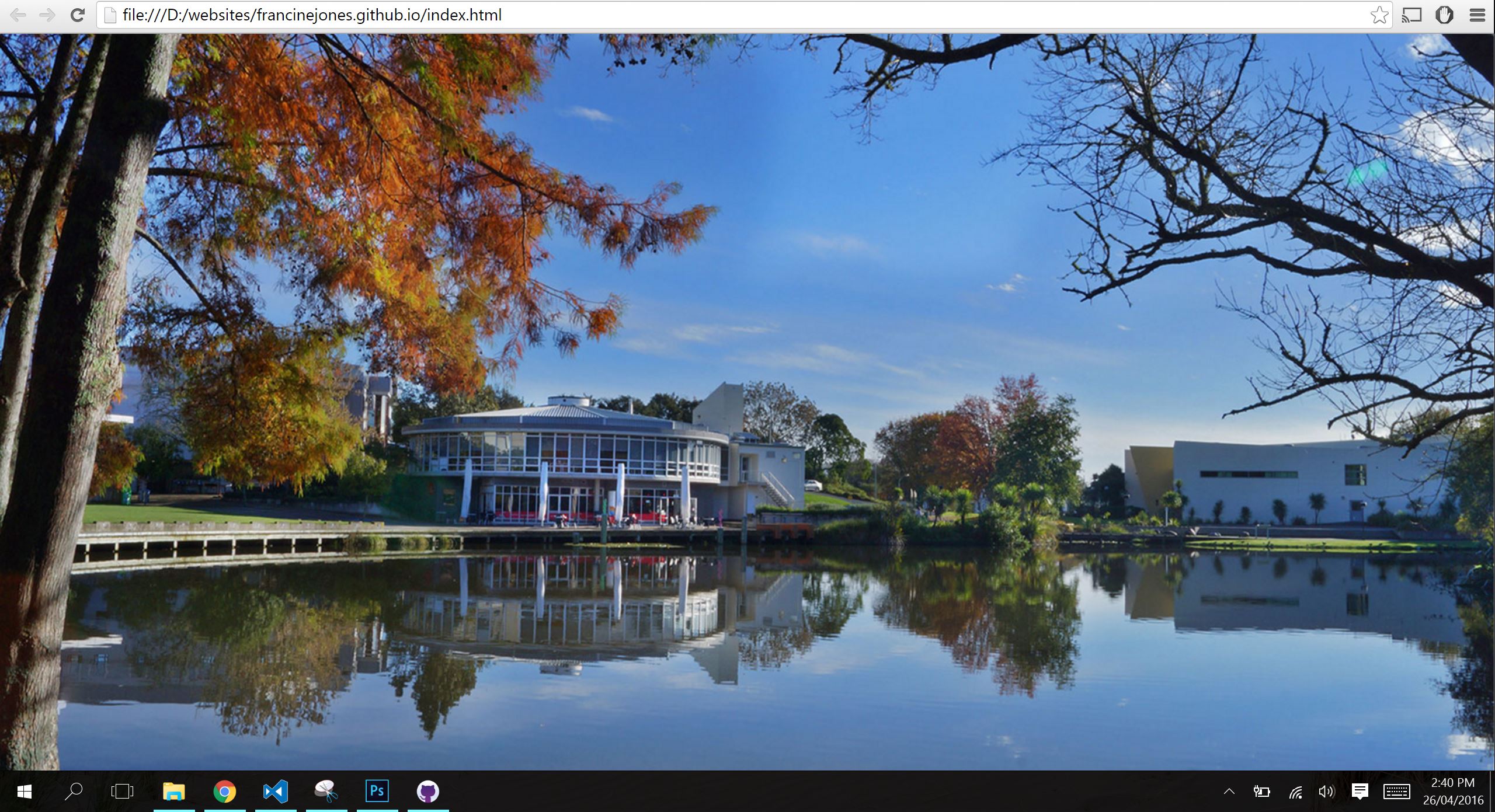
桌面版:
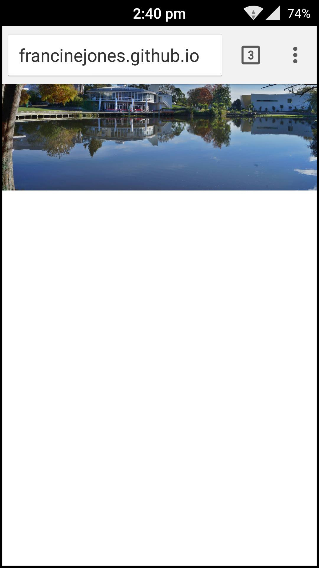
手机版:
.background1
 {
 /* Location of the image */
 background-image: url(images/background-photo.jpg);

 /* Image is centered vertically and horizontally at all times */
 background-position: center center;

 /* Image doesn't repeat */
 background-repeat: no-repeat;

 /* Makes the image fixed in the viewpoint so that it doesn't move when
 the content height is greater than the image height */
 background-attachment: fixed;

 /* This is what makes the background image
 rescale based on itscontainer's size */
 background-size: cover;

/* Pick a solid background color that will
be displayed while the background image is loading */
background-color:#464646;
}
html如下
<head>
<script src="https:
//ajax.googleapis.com/ajax/libs/jquery/1.12.0/jquery.min.js"</script>
<script
src="https://cdn.jsdelivr.net/lodash/4.11.2/lodash.min.js"></script>
</head>
<meta charset="utf-8">
<title>Color</title>
<link rel="stylesheet" href="style.css">
<link href="animate.css" rel="stylesheet">
</header>

<body id="bodyID" class="background1">
</body>

<script src="javascript.js"></script>