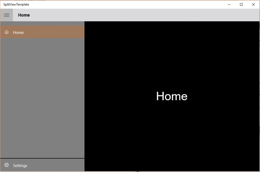
我目前正在使用 SplitView.Pane 为我的 UWP 应用程序构建一个汉堡菜单。“按钮”是列表框中的列表框项目。有没有办法让设置图标位于 SplitView.Pane 的底部,就像在本机 Windows 新应用程序中一样...谢谢
问问题
4180 次
5 回答
2
于 2016-04-14T13:59:42.393 回答
0
我有一个带有火腿菜单的应用程序,我使用单选按钮。在单选按钮的组属性中,我使用相同的组名。这样你就可以使用任何你喜欢的布局,例如网格,堆栈面板,你的按钮可以在任何地方。当您点击任何按钮时,它将像列表视图一样选择,点击另一个按钮将取消选择并选择新的。
嗡嗡声菜单
<SplitView.Pane>
<Grid>
<StackPanel>
<ToggleButton x:Name="HamburgerButton" FontFamily="Segoe MDL2 Assets" Content=""
Width="50" Height="50" Background="Transparent" Tapped="HamburgerButton_Tapped" Foreground="White"
FontSize="16" FontWeight="Bold" Style="{StaticResource HamburgerToggleButtonStyle}" />
<RadioButton Content="Top 1" x:Name="btn1" HorizontalAlignment="Stretch" VerticalAlignment="Stretch" IsChecked="False" Foreground="White" GroupName="HamMenu"/>
<RadioButton Content="Top 2" x:Name="btn2" HorizontalAlignment="Stretch" VerticalAlignment="Stretch" IsChecked="True" Foreground="White" GroupName="HamMenu"/>
<RadioButton Content="Top 3" x:Name="btn3" HorizontalAlignment="Stretch" VerticalAlignment="Stretch" IsChecked="False" Foreground="White" GroupName="HamMenu"/>
</StackPanel>
<StackPanel VerticalAlignment="Bottom">
<RadioButton Tag="" Content="Bottom 1" x:Name="btn4" HorizontalAlignment="Stretch" VerticalAlignment="Bottom" Style="{StaticResource RadioButtonStyle1}" IsChecked="False" Foreground="White" GroupName="HamMenu"/>
<RadioButton Tag="" Content="Bottom 2" x:Name="btn5" HorizontalAlignment="Stretch" VerticalAlignment="Bottom" Style="{StaticResource RadioButtonStyle1}" IsChecked="False" Foreground="White" GroupName="HamMenu"/>
</StackPanel>
</Grid>
</SplitView.Pane>
单选按钮样式
    <Style x:Key="RadioButtonStyle1" TargetType="RadioButton">
    <Setter Property="Background" Value="Transparent"/>
    <Setter Property="Foreground" Value="{ThemeResource SystemControlForegroundBaseHighBrush}"/>
    <Setter Property="Padding" Value="8,6,0,0"/>
    <Setter Property="HorizontalAlignment" Value="Left"/>
    <Setter Property="VerticalAlignment" Value="Center"/>
    <Setter Property="HorizontalContentAlignment" Value="Left"/>
    <Setter Property="VerticalContentAlignment" Value="Top"/>
    <Setter Property="FontFamily" Value="{ThemeResource ContentControlThemeFontFamily}"/>
    <Setter Property="FontSize" Value="{ThemeResource ControlContentThemeFontSize}"/>
    <Setter Property="MinWidth" Value="120"/>
    <Setter Property="UseSystemFocusVisuals" Value="True"/>
    <Setter Property="Template">
        <Setter.Value>
            <ControlTemplate TargetType="RadioButton">
                <Grid x:Name="MainRadioGrid">
                    <VisualStateManager.VisualStateGroups>
                        <VisualStateGroup x:Name="CommonStates">
                            <VisualState x:Name="Normal"/>
                            <VisualState x:Name="PointerOver">
                                <Storyboard>
                                    <ColorAnimation Duration="0" To="#7FFFFFFF" Storyboard.TargetProperty="(Panel.Background).(SolidColorBrush.Color)" Storyboard.TargetName="SecondaryRadioGrid" d:IsOptimized="True"/>
                                </Storyboard>
                            </VisualState>
                        </VisualStateGroup>
                        <VisualStateGroup x:Name="CheckStates">
                            <VisualState x:Name="Checked">
                                <VisualState.Setters>
                                    <Setter Target="MainRadioGrid.(Panel.Background)">
                                        <Setter.Value>
                                            <SolidColorBrush Color="White"/>
                                        </Setter.Value>
                                    </Setter>
                                    <Setter Target="IconTextHum.(TextBlock.Foreground).(SolidColorBrush.Color)">
                                        <Setter.Value>
                                            <Color>Black</Color>
                                        </Setter.Value>
                                    </Setter>
                                    <Setter Target="ContentPresenter.(ContentPresenter.Foreground).(SolidColorBrush.Color)">
                                        <Setter.Value>
                                            <Color>Black</Color>
                                        </Setter.Value>
                                    </Setter>
                                </VisualState.Setters>
                            </VisualState>
                            <VisualState x:Name="Unchecked"/>
                            <VisualState x:Name="Indeterminate">
                                <VisualState.Setters>
                                    <Setter Target="ContentPresenter.(ContentPresenter.Foreground).(SolidColorBrush.Color)">
                                        <Setter.Value>
                                            <Color>Black</Color>
                                        </Setter.Value>
                                    </Setter>
                                    <Setter Target="IconTextHum.(TextBlock.Foreground).(SolidColorBrush.Color)">
                                        <Setter.Value>
                                            <Color>Black</Color>
                                        </Setter.Value>
                                    </Setter>
                                    <Setter Target="SecondaryRadioGrid.(Panel.Background).(SolidColorBrush.Color)">
                                        <Setter.Value>
                                            <Color>#02000000</Color>
                                        </Setter.Value>
                                    </Setter>
                                    <Setter Target="MainRadioGrid.(Panel.Background)">
                                        <Setter.Value>
                                            <SolidColorBrush Color="White"/>
                                        </Setter.Value>
                                    </Setter>
                                </VisualState.Setters>
                            </VisualState>
                        </VisualStateGroup>
                    </VisualStateManager.VisualStateGroups>
                    <Grid x:Name="SecondaryRadioGrid" BorderBrush="{TemplateBinding BorderBrush}" BorderThickness="{TemplateBinding BorderThickness}" Background="#02000000">
                        <Grid.ColumnDefinitions>
                            <ColumnDefinition Width="50"/>
                            <ColumnDefinition Width="*"/>
                        </Grid.ColumnDefinitions>
                        <Grid x:Name="grid1" Height="50" VerticalAlignment="Top" Width="50">
                            <TextBlock x:Name="IconTextHum" TextWrapping="Wrap" Text="{TemplateBinding Tag}" d:LayoutOverrides="Width, Height" FontFamily="Segoe MDL2 Assets" HorizontalAlignment="Center" VerticalAlignment="Center" FontSize="21.333"/>
                        </Grid>
                        <ContentPresenter x:Name="ContentPresenter" AutomationProperties.AccessibilityView="Raw" ContentTemplate="{TemplateBinding ContentTemplate}" ContentTransitions="{TemplateBinding ContentTransitions}" Content="{TemplateBinding Content}" Grid.Column="1" TextWrapping="Wrap" VerticalAlignment="Center" Margin="10,0,0,0"/>
                    </Grid>
                </Grid>
            </ControlTemplate>
        </Setter.Value>
    </Setter>
</Style>
于 2016-04-10T16:19:37.253 回答
0
你应该使用一个RelativePanel元素:
<SplitView.Pane>
    <RelativePanel>
        <StackPanel RelativePanel.AlignTopWithPanel="True">
            ...
        </StackPanel>
        <StackPanel RelativePanel.AlignBottomWithPanel="True">
            ...
        </StackPanel>
    </RelativePanel>
</SplitView.Pane>
于 2017-01-26T22:08:56.417 回答
0
没有简单的(如果有的话)方法来对齐顶部的 ListBox 项目的一部分和底部的另一部分,因此答案非常简单 - 不要使用 ListBox 并手动构建必要的布局。例如,像这样:
<Grid>
    <Grid.RowDefinitions>
        <RowDefinition Height="Auto"/>
        <RowDefinition Height="Auto"/>
        <RowDefinition Height="Auto"/>
        <RowDefinition Height="*"/>
        <RowDefinition Height="Auto"/>
    </Grid.RowDefinitions>

    <Button x:Name="TopButton1" Grid.Row="0" Content="TopButton" />
    <Button x:Name="TopButton2" Grid.Row="1" Content="TopButton" />
    <Button x:Name="TopButton3" Grid.Row="2" Content="TopButton" />

    <Button x:Name="BottomButton" Grid.Row="4" Content="BottomButton" />
</Grid>
顺便说一句,建议在 UWP 应用中使用 ListView 而不是 ListBox。
于 2016-04-10T06:57:13.883 回答
0
在 RelativePanel 中使用 2 ListBox。在下拉列表框中设置 RelativePanel.AlignBottomWithPanel="True" 并且当从第一个列表框中选择项目时为另一个列表框设置 selectedIndex=-1
<SplitView.Pane>
<RelativePanel>
  <ListBox x:Name="UpperListBox">
     <ListBoxItem .....
  </ListBox>
  <ListBox x:Name="DownListBox" RelativePanel.AlignBottomWithPanel="True">
      <ListBoxItem .....
  </ListBox>
</RelativePanel>
于 2018-01-27T14:27:06.883 回答