您确实添加了:
.fullscreen
到滑块,这可以工作,如文档中所示。耐心阅读人,这就是它所需要的:)
https://materializecss.com/fullscreen-slider-demo.html
Codepen 显示标记和初始化:
https://codepen.io/doughballs/pen/YzXqdPO
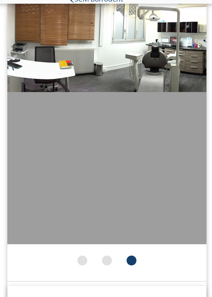
<div class="slider fullscreen">
<ul class="slides">
<li class="active" style="opacity: 1; transform: translateX(0px) translateY(0px);">
<img src="data:image/gif;base64,R0lGODlhAQABAIABAP///wAAACH5BAEKAAEALAAAAAABAAEAAAICTAEAOw==" style="background-image: url("https://images.unsplash.com/photo-1464817739973-0128fe77aaa1?dpr=1&auto=compress,format&fit=crop&w=1199&h=799&q=80&cs=tinysrgb&crop=");"> <!-- random image -->
<div class="caption center-align" style="opacity: 1; transform: translateX(0px) translateY(0px);">
<h3>This is our big Tagline!</h3>
<h5 class="light grey-text text-lighten-3">Here's our small slogan.</h5>
</div>
</li>
<li class="" style="opacity: 0; transform: translateX(0px) translateY(0px);">
<img src="data:image/gif;base64,R0lGODlhAQABAIABAP///wAAACH5BAEKAAEALAAAAAABAAEAAAICTAEAOw==" style="background-image: url("https://ununsplash.imgix.net/photo-1414849424631-8b18529a81ca?q=75&fm=jpg&s=0e993004a2f3704e8f2ad5469315ccb7");"> <!-- random image -->
<div class="caption left-align" style="opacity: 0; transform: translateX(-100px);">
<h3>Left Aligned Caption</h3>
<h5 class="light grey-text text-lighten-3">Here's our small slogan.</h5>
</div>
</li>
<li class="" style="opacity: 0; transform: translateX(0px) translateY(0px);">
<img src="data:image/gif;base64,R0lGODlhAQABAIABAP///wAAACH5BAEKAAEALAAAAAABAAEAAAICTAEAOw==" style="background-image: url("https://ununsplash.imgix.net/uploads/1413259835094dcdeb9d3/6e609595?q=75&fm=jpg&s=6a4fc66161293fc4a43a6ca6f073d1c5");"> <!-- random image -->
<div class="caption right-align" style="opacity: 0; transform: translateX(100px);">
<h3>Right Aligned Caption</h3>
<h5 class="light grey-text text-lighten-3">Here's our small slogan.</h5>
</div>
</li>
</ul>
<ul class="indicators"><li class="indicator-item active"></li><li class="indicator-item"></li><li class="indicator-item"></li></ul></div>