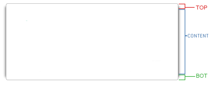
形状周围的阴影:
所提供的图像(与片段一起查看时)对于您是否仅在侧面(或)寻找整个形状的阴影有点令人困惑。
如果您希望为整个形状添加阴影,那么一种选择是向容器元素添加一个伪元素,使其等于容器的高度 + 顶部 + 底部元素。这个伪元素也应该被给定border-radius并以相同的编号定位在容器上方。像素作为顶部元素的高度(反转)。将 required 添加box-shadow到此伪元素将产生预期的输出。
body {
margin-top: 30px;
}
div#content {
position: relative;
height: 100px;
width: 240px;
padding: 20px 30px 20px 30px;
margin-right: auto;
margin-left: auto;
color: #515348;
font-size: 76%;
line-height: 1.6em;
background: #FFF;
border-left: 1px solid grey;
border-right: 1px solid grey;
}
div#content:before {
position: absolute;
content: '';
left: 0px;
top: -10px; /* positioning above makes shadow extend above */
height: calc(100% + 20px); /* to offset for top and bottom */
width: 100%;
border-radius: 8px;
z-index: -1; /* to send the elements and their shadow behind */
box-shadow: 6px 0px 6px 0px rgba(33, 33, 33, 0.25), -6px 0px 6px 0px rgba(33, 33, 33, 0.25), 0px 6px 6px 0px rgba(33, 33, 33, 0.25), 0px -6px 6px 0px rgba(33, 33, 33, 0.25);
}
#top {
position: relative;
height: 10px;
width: 300px;
margin: 0 auto;
background: #0F0;
border-radius: 8px 8px 0px 0px;
border: 1px solid grey;
border-width: 1px 1px 0px 1px;
}
#bot {
position: relative;
height: 10px;
width: 300px;
margin: 0 auto;
background: #00F;
border-radius: 0px 0px 8px 8px;
border: 1px solid grey;
border-width: 0px 1px 1px 1px;
}
<div id="top"></div>
<div id="content"></div>
<div id="bot"></div>
阴影环绕形状,但向顶部和底部逐渐消失:
在这种方法中,阴影被应用在整个形状周围,但它逐渐向顶部和底部逐渐消失。这些都是基于描述、相关图像和片段的所有可能变体。您可以选择最适合您的一种。
body {
margin-top: 30px;
}
div#content {
position: relative;
height: 100px;
width: 240px;
padding: 20px 30px 20px 30px;
margin-right: auto;
margin-left: auto;
color: #515348;
font-size: 76%;
line-height: 1.6em;
background: #FFF;
border-left: 1px solid grey;
border-right: 1px solid grey;
}
div#content:before {
position: absolute;
content: '';
left: 0px;
top: -8px; /* positioning above makes shadow extend above */
height: calc(100% + 16px); /* to offset for top and bottom */
width: 100%;
border-radius: 8px;
z-index: -1; /* to send the elements and their shadow behind */
box-shadow: 6px 0px 6px 0px rgba(33, 33, 33, 0.25), -6px 0px 6px 0px rgba(33, 33, 33, 0.25), 0px 0px 6px 0px rgba(33, 33, 33, 0.25), 0px 0px 6px 0px rgba(33, 33, 33, 0.25);
}
#top {
position: relative;
height: 10px;
width: 300px;
margin: 0 auto;
background: #0F0;
border-radius: 8px 8px 0px 0px;
border: 1px solid grey;
border-width: 1px 1px 0px 1px;
}
#bot {
position: relative;
height: 10px;
width: 300px;
margin: 0 auto;
background: #00F;
border-radius: 0px 0px 8px 8px;
border: 1px solid grey;
border-width: 0px 1px 1px 1px;
}
<div id="top"></div>
<div id="content"></div>
<div id="bot"></div>
仅在侧面有阴影:
仔细查看问题中提供的原始图像,我可以看到的一件事是您实际上不需要box-shadow顶部和底部元素。你只需要容器上的阴影,它在它的上方和下方延伸一点。这可以通过仅使用容器元素以非常hacky的方式实现,但这太复杂和丑陋了。
因此,另一种选择是向容器元素添加一个伪元素并将其放置在容器上方一点点。一旦box-shadow添加到这个伪元素,就会达到预期的外观。
注意:在下面的代码片段中,我添加了一个红色阴影, 并对顶部和底部 div进行了着色,以说明阴影如何在#content. 我还删除了不再需要的额外属性并缩短了其他一些属性。
我还强烈建议将三者div合二为一,因为这会使整个事情变得更加简单。
body {
margin-top: 30px;
}
div#content {
position: relative;
height: 100px;
width: 240px;
padding: 20px 30px 20px 30px;
margin-right: auto;
margin-left: auto;
color: #515348;
font-size: 76%;
line-height: 1.6em;
background: #FFF;
border-left: 1px solid grey;
border-right: 1px solid grey;
}
div#content:before {
position: absolute;
content: '';
left: -1px;
top: -7px; /* positioning above makes shadow extend above */
height: calc(100% + 14px); /* to cover top and bottom */
width: 100%;
z-index: -1; /* to send the elements and their shadow behind */
box-shadow: 6px 0px 12px -6px rgba(255, 0, 0, 0.75), -6px 0px 12px -6px rgba(255, 0, 0, 0.75);
}
#top {
position: relative;
height: 10px;
width: 300px;
margin: 0 auto;
background: #0F0;
border-radius: 8px 8px 0px 0px;
border: 1px solid grey;
border-width: 1px 1px 0px 1px;
}
#bot {
position: relative;
height: 10px;
width: 300px;
margin: 0 auto;
background: #00F;
border-radius: 0px 0px 8px 8px;
border: 1px solid grey;
border-width: 0px 1px 1px 1px;
}
<div id="top"></div>
<div id="content"></div>
<div id="bot"></div>