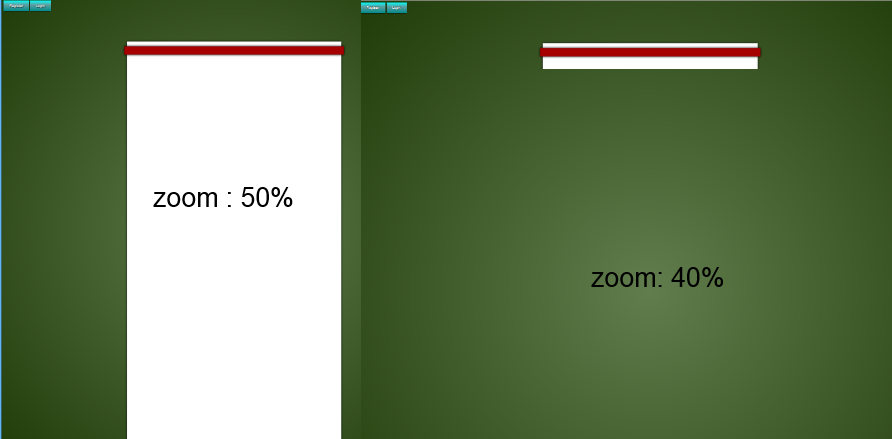
在 Firefox 上缩小到 40% 时,图像会消失。直到缩放 50%,这都很好。然而,在放大 40% 时,它就消失了:
而在 Chrome 中,图像仍然可见但略微未对齐,这发生在不同的缩放级别:
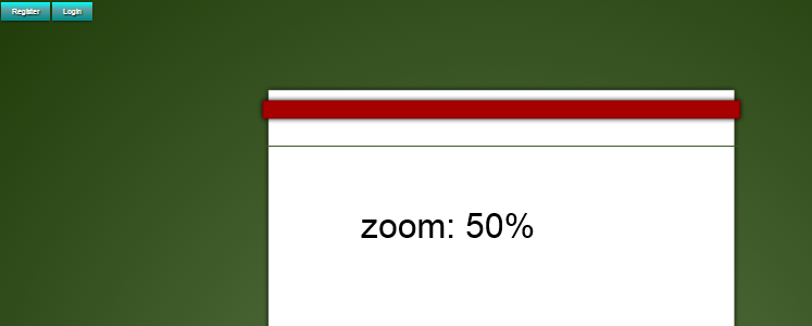
这一次 Internet Explorer 实际上显示了预期的结果,无论缩放如何!
trident 与 webkit 和 gecko 有什么不同,我该如何修补它?
以下是所有相关代码:
body {
  background-color: rgba(31, 59, 8, 1);
}
#main {
  z-index: 1;
  position: absolute;
  top: 113px;
  left: 50%;
  width: 900px;
  height: 100%;
  margin-top: 160px;
  background-image: url('http://i.stack.imgur.com/zZCB2.png');
  background-repeat: repeat-y;
  margin-right: -50%;
  text-align: center;
  transform: translateX(-50%);
}
#main:before {
  content: " ";
  position: absolute;
  left: 0px;
  top: -113px;
  background-image: url('http://i.stack.imgur.com/7DE7i.png');
  background-repeat: no-repeat;
  width: 900px;
  height: 113px;
}
#main:after {
  content: " ";
  position: absolute;
  left: 0px;
  bottom: -200px;
  background-image: url('http://i.stack.imgur.com/DVJAq.png');
  background-repeat: no-repeat;
  width: 900px;
  height: 200px;
}
<div id="main"></div>