我正在使用 android 设计库的TextinputLayout. 但是无法自定义EditTextinside的提示颜色、标签颜色和下划线颜色TextinputLayout。请帮忙。
175144 次
14 回答
277
更改底线颜色:
<item name="colorControlNormal">#c5c5c5</item>
<item name="colorControlActivated">@color/accent</item>
<item name="colorControlHighlight">@color/accent</item>
有关更多信息,请查看此线程。
浮动时更改提示颜色
<style name="MyHintStyle" parent="@android:style/TextAppearance">
    <item name="android:textColor">@color/main_color</item>
</style>
并像这样使用它:
<android.support.design.widget.TextInputLayout
    ...
    app:hintTextAppearance="@style/MyHintStyle">
当它不是浮动标签时更改提示颜色:
<android.support.design.widget.TextInputLayout
    ...
    app:hintTextAppearance="@style/MyHintStyle"
    android:textColorHint="#c1c2c4">
感谢@AlbAtNf
于 2015-07-30T11:54:57.740 回答
38
借助材料组件库,您可以使用com.google.android.material.textfield.TextInputLayout.
您可以应用自定义样式来更改颜色。
要更改提示颜色,您必须使用以下属性:
hintTextColor和android:textColorHint.
<style name="Custom_textinputlayout_filledbox" parent="@style/Widget.MaterialComponents.TextInputLayout.FilledBox">
    <!-- The color of the label when it is collapsed and the text field is active -->
    <item name="hintTextColor">?attr/colorPrimary</item>

    <!-- The color of the label in all other text field states (such as resting and disabled) -->
    <item name="android:textColorHint">@color/selector_hint_text_color</item>
</style>
您应该为android:textColorHint. 就像是:
<selector xmlns:android="http://schemas.android.com/apk/res/android">
  <item android:alpha="0.38" android:color="?attr/colorOnSurface" android:state_enabled="false"/>
  <item android:alpha="0.6" android:color="?attr/colorOnSurface"/>
</selector>
要更改底线颜色,您必须使用属性:boxStrokeColor。
<style name="Custom_textinputlayout_filledbox" parent="@style/Widget.MaterialComponents.TextInputLayout.FilledBox">
    ....
    <item name="boxStrokeColor">@color/selector_stroke_color</item>
</style>
同样在这种情况下,您应该使用选择器。就像是:
<selector xmlns:android="http://schemas.android.com/apk/res/android">
  <item android:color="?attr/colorPrimary" android:state_focused="true"/>
  <item android:alpha="0.87" android:color="?attr/colorOnSurface" android:state_hovered="true"/>
  <item android:alpha="0.12" android:color="?attr/colorOnSurface" android:state_enabled="false"/>
  <item android:alpha="0.38" android:color="?attr/colorOnSurface"/>
</selector>
您还可以在布局中应用这些属性:
<com.google.android.material.textfield.TextInputLayout
    style="@style/Widget.MaterialComponents.TextInputLayout.FilledBox"
    app:boxStrokeColor="@color/selector_stroke_color"
    app:hintTextColor="?attr/colorPrimary"
    android:textColorHint="@color/selector_hint_text_color"
    ...>
于 2019-09-18T05:59:05.340 回答
36
根据Fedor Kazakov和其他人的回答,我创建了一个默认配置。
样式.xml
<resources>

    <!-- Base application theme. -->
    <style name="AppTheme" parent="Theme.AppCompat.Light">
        <!-- Customize your theme here. -->
        <item name="colorPrimary">@color/colorPrimary</item>
        <item name="colorPrimaryDark">@color/colorPrimaryDark</item>
        <item name="colorAccent">@color/colorAccent</item>
    </style>

    <style name="Widget.Design.TextInputLayout" parent="AppTheme">
        <item name="hintTextAppearance">@style/AppTheme.TextFloatLabelAppearance</item>
        <item name="errorTextAppearance">@style/AppTheme.TextErrorAppearance</item>
        <item name="counterTextAppearance">@style/TextAppearance.Design.Counter</item>
        <item name="counterOverflowTextAppearance">@style/TextAppearance.Design.Counter.Overflow</item>
    </style>

    <style name="AppTheme.TextFloatLabelAppearance" parent="TextAppearance.Design.Hint">
        <!-- Floating label appearance here -->
        <item name="android:textColor">@color/colorAccent</item>
        <item name="android:textSize">20sp</item>
    </style>

    <style name="AppTheme.TextErrorAppearance" parent="TextAppearance.Design.Error">
        <!-- Error message appearance here -->
        <item name="android:textColor">#ff0000</item>
        <item name="android:textSize">20sp</item>
    </style>

</resources>
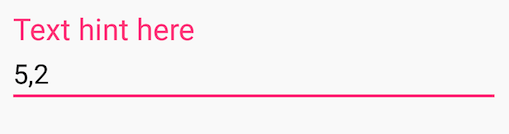
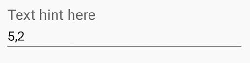
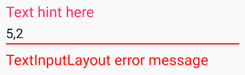
活动布局.xml
<android.support.design.widget.TextInputLayout
    android:layout_width="match_parent"
    android:layout_height="wrap_content">

    <android.support.v7.widget.AppCompatEditText
        android:layout_width="match_parent"
        android:layout_height="wrap_content"
        android:hint="Text hint here"
        android:text="5,2" />

</android.support.design.widget.TextInputLayout>
重点:
没有焦点:
错误信息:
于 2016-06-29T18:07:16.223 回答
27
在 Edittext 标签中添加此属性并享受:
android:backgroundTint="@color/colorWhite"
于 2017-04-30T05:42:07.350 回答
19
这篇博EditText文描述AutoCompleteTextView了TextInputLayout.
对于AppCompat lib 22.1.0+EditText,您可以使用一些与主题相关的设置来设置主题属性:
<style name="StyledTilEditTextTheme">
   <item name="android:imeOptions">actionNext</item>
   <item name="android:singleLine">true</item>
   <item name="colorControlNormal">@color/greyLight</item>
   <item name="colorControlActivated">@color/blue</item>
   <item name="android:textColorPrimary">@color/blue</item>
   <item name="android:textSize">@dimen/styledtil_edit_text_size</item>
</style>

<style name="StyledTilEditText">
    <item name="android:theme">@style/StyledTilEditTextTheme</item>
    <item name="android:paddingTop">4dp</item>
</style>
并将它们应用于EditText:
<EditText
    android:id="@+id/etEditText"
    style="@style/StyledTilEditText"
因为AutoCompleteTextView事情更复杂,因为包装它TextInputLayout并应用这个主题会破坏浮动标签的行为。您需要在代码中解决此问题:
private void setStyleForTextForAutoComplete(int color) {
    Drawable wrappedDrawable =     DrawableCompat.wrap(autoCompleteTextView.getBackground());
    DrawableCompat.setTint(wrappedDrawable, color);
    autoCompleteTextView.setBackgroundDrawable(wrappedDrawable);
}
并在Activity.onCreate:
setStyleForTextForAutoComplete(getResources().getColor(R.color.greyLight));
autoCompleteTextView.setOnFocusChangeListener((v, hasFocus) -> {
    if(hasFocus) {
        setStyleForTextForAutoComplete(getResources().getColor(R.color.blue));
    } else {
        if(autoCompleteTextView.getText().length() == 0) {
              setStyleForTextForAutoComplete(getResources().getColor(R.color.greyLight));
        }
    }
});
于 2015-11-25T06:28:54.990 回答
10
如果要更改条形/线条颜色和提示文本颜色(TextInputLayout通常是强调色),则只需创建以下样式:
<style name="MyStyle">
    <item name="colorAccent">@color/your_color</item>
</style>
然后将其TextInputLayout作为主题应用到您的:
<android.support.design.widget.TextInputLayout
    ...
    app:theme="@style/MyStyle" />
这基本上为一个视图(而不是整个活动)设置了一个主题(不是样式)。
于 2017-04-20T21:24:00.973 回答
10
ATextinputLayout不是一个视图,而是一个,正如Dimitrios Tsigouris在他的博客文章Layout中很好地描述的那样。因此,您不需要 a ,它仅用于,而是使用 a 。在博客文章之后,我最终得到了以下解决方案:StyleViewsTheme
从你styles.xml开始
<style name="TextInputLayoutAppearance" parent="Widget.Design.TextInputLayout">
        <!-- reference our hint & error styles -->
        <item name="android:textColor">@color/your_colour_here</item>
        <item name="android:textColorHint">@color/your_colour_here</item>
        <item name="colorControlNormal">@color/your_colour_here</item>
        <item name="colorControlActivated">@color/your_colour_here</item>
        <item name="colorControlHighlight">@color/your_colour_here</item>
</style>
并在您的布局中添加
<com.google.android.material.textfield.TextInputLayout
                android:theme="@style/TextInputLayoutAppearance"
...
于 2019-05-27T13:49:11.867 回答
7
<style name="Widget.Design.TextInputLayout" parent="android:Widget">
    <item name="hintTextAppearance">@style/TextAppearance.Design.Hint</item>
    <item name="errorTextAppearance">@style/TextAppearance.Design.Error</item>
</style>
您可以覆盖此样式进行布局
您也可以更改内部 EditText-item 样式。
于 2015-07-30T11:16:38.583 回答
7
<style name="EditScreenTextInputLayoutStyle" parent="Theme.AppCompat.Light.NoActionBar">
    <item name="colorControlNormal">@color/actionBar_background</item>
    <item name="colorControlActivated">@color/actionBar_background</item>
    <item name="colorControlHighlight">@color/actionBar_background</item>
    <item name="colorAccent">@color/actionBar_background</item>
    <item name="android:textColorHint">@color/actionBar_background</item>
</style>
将此样式应用于 TextInputLayout
于 2015-12-05T06:35:31.820 回答
4
我使用了上述所有答案,但都没有奏效。这个答案适用于API 21+。当文本字段获得焦点时使用app:hintTextColor属性,而在其他状态时使用app:textColorHint属性。要更改底线颜色,请使用此属性app:boxStrokeColor,如下所示:
<com.google.android.material.textfield.TextInputLayout
            app:boxStrokeColor="@color/colorAccent"
            app:hintTextColor="@color/colorAccent"
            android:textColorHint="@android:color/darker_gray"

       <com.google.android.material.textfield.TextInputEditText
                android:layout_width="match_parent"
                android:layout_height="wrap_content" />
</com.google.android.material.textfield.TextInputLayout>
它也适用于AutoCompleteTextView。希望这对你有用:)
于 2021-02-02T20:52:39.773 回答
4
为我工作。如果您尝试使用带有标签的 EditText 并尝试更改下划线颜色,请使用此选项。更改为 TextInputEditText 而不是 EditText。
           <com.google.android.material.textfield.TextInputLayout
                android:id="@+id/editTextTextPersonName3"
                android:layout_width="0dp"
                android:layout_height="wrap_content"
                android:layout_marginStart="@dimen/_16sdp"
                android:layout_marginLeft="@dimen/_16sdp"
                android:layout_marginTop="@dimen/_16sdp"
                android:layout_marginEnd="@dimen/_8sdp"
                android:layout_marginRight="@dimen/_8sdp"
                android:textColorHint="@color/white"
                app:layout_constraintEnd_toStartOf="@+id/guideline3"
                app:layout_constraintStart_toStartOf="parent"
                app:layout_constraintTop_toTopOf="parent">

                <EditText
                    android:layout_width="match_parent"
                    android:layout_height="match_parent"
                    android:backgroundTint="@color/white"
                    android:hint="Lastname"
                    android:textSize="@dimen/_14sdp"
                    android:inputType="textPersonName"
                    android:textColor="@color/white"
                    android:textColorHint="@color/white" />
            </com.google.android.material.textfield.TextInputLayout>
于 2021-02-10T15:39:40.207 回答
2
更改 TextInputLayout + TextInputEditText 的线条颜色
颜色.xml
<color name="mtrl_textinput_default_box_stroke_color" tools:override="true">@color/lineColor</color>
样式.xml
<style name="TextInputLayout" parent="Widget.MaterialComponents.TextInputLayout.FilledBox.Dense">
    <item name="boxStrokeColor">@color/lineColor</item>
    <item name="android:textColorHint">@color/hintColor</item>
    <item name="boxStrokeWidth">1dp</item>
    <item name="boxBackgroundColor">@color/backgroundColor</item>
</style>

<style name="TextInputEditText" parent="ThemeOverlay.MaterialComponents.TextInputEditText.FilledBox.Dense">
    <item name="android:textColor">@color/black</item>
</style>
布局.xml
<com.google.android.material.textfield.TextInputLayout
            style="@style/TextInputLayout"
            android:layout_height="wrap_content"
            android:layout_width="match_parent">

            <com.google.android.material.textfield.TextInputEditText
                style="@style/TextInputEditText"
                android:layout_width="match_parent"
                android:layout_height="wrap_content"
                android:inputType="text" />
</com.google.android.material.textfield.TextInputLayout>
于 2021-05-19T14:07:31.987 回答
2
您可以使用 中的属性更改标签颜色。TextInputLayoutapp:hintTextAppearanceTextInputLayout
<android.support.design.widget.TextInputLayout
    android:id="@+id/inputlayout"
    android:layout_width="match_parent"
    android:layout_height="wrap_content"
    app:hintTextAppearance="@style/TextAppearance.App.TextInputLayout">

    <EditText
        android:id="@+id/mail"
        android:layout_width="match_parent"
        android:layout_height="wrap_content"
        android:layout_marginTop="10dp"
        android:hint="@string/email"
        android:inputType="textEmailAddress"
        android:maxLines="1"
        android:paddingStart="5dp"
        android:singleLine="true"/>

</android.support.design.widget.TextInputLayout>
风格:
 <style name="TextAppearance.App.TextInputLayout"
 parent="@android:style/TextAppearance">
        <item name="android:textColor">@android:color/black</item>
        <item name="android:textSize">20sp</item>
    </style>
要更改edittext下划线颜色,您可以使用android:backgroundTint
<EditText
        android:layout_width="match_parent"
        android:layout_height="wrap_content"
        android:hint="Underline color change"
        android:backgroundTint="@android:color/holo_red_light" />
于 2021-05-19T14:28:09.860 回答
0
我需要在 TextInputLayout 中更改 TextInputEditText 的底线颜色,然后其他答案没有奏效。我终于通过为 TextInputLayouts 主题设置 colorOnSurface 来解决它。我会把我的代码留在这里,以防它帮助别人。
XML:
<com.google.android.material.textfield.TextInputLayout
    android:layout_width="match_parent"
    android:layout_height="wrap_content"
    app:theme=""@style/TextInputLayoutStyle"">

    <com.google.android.material.textfield.TextInputEditText
        android:layout_width="match_parent"
        android:layout_height="wrap_content"/>

</com.google.android.material.te`tfield.TextInputLayout>
风格:
<style name="TextInputLayoutStyle">
    <item name="colorOnSurface">#0ff</item>
</style>
于 2022-02-24T09:33:52.173 回答