我想要这个特定的设计:
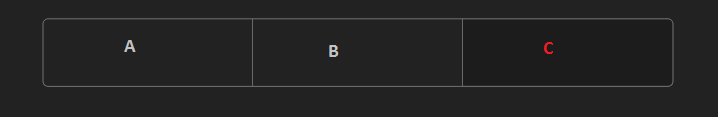
文本“A”、“B”和“C”居中。
如果您将在 xml 中提出解决方案,我将提供 200 分。它必须由 3 个按钮组成。我不需要java中的逻辑。这我可以自己制作,但我需要 xml 可绘制对象和布局。
编辑
请考虑向后兼容性和android 5。
我想要这个特定的设计:
文本“A”、“B”和“C”居中。
如果您将在 xml 中提出解决方案,我将提供 200 分。它必须由 3 个按钮组成。我不需要java中的逻辑。这我可以自己制作,但我需要 xml 可绘制对象和布局。
编辑
请考虑向后兼容性和android 5。
起初,我误读了你的问题。对我来说,您似乎需要一个布局,如您发布的图片所示。但是,在查看了android-segmented-control库之后,很明显您正在寻找一个允许在A、B、C... 等之间切换的控件。库使用RadioGroup的确实是最好的选择。
我注意到该库使用了我读过的负边距,这会导致某些设备出现问题。也缺少对 API 21 的支持。
xml 方法将如何工作:RadioGroup基于LinearLayout. 一个鲜为人知的特性(可能是因为它大部分时间不适合)LinearLayout是它的divider属性。如果android:showDividers="..."使用,aLinearLayout将显示分隔符及其子项。这些分频器的显示位置取决于给定的值showDivider=".."。三个值是可能的:middle, beginning& end。我们将用于显示&和&middle之间的分隔符。ABBC
对于有线框架,我们不需要多个可绘制对象(至少,现在不需要)。我们可以做以下事情:
<?xml version="1.0" encoding="utf-8"?>
<shape xmlns:android="http://schemas.android.com/apk/res/android" android:shape="rectangle">
    <stroke android:color="@color/stroke_color" android:width="@dimen/stroke_width"/>
    <corners android:radius="@dimen/corner_radius"/>
</shape>
上面的 drawable 将被设置为RadioGroup 的背景。并且会处理, &showDividers之间的垂直划分。因此,我们的布局现在看起来与您发布的图片相同。好吧,我们还需要提供一个drawable:ABCshowDividersdivider
<?xml version="1.0" encoding="utf-8"?>
<shape xmlns:android="http://schemas.android.com/apk/res/android" android:shape="rectangle">
    <solid android:color="@color/stroke_color"/>
    <size android:width="@dimen/stroke_width"/>
</shape>
现在,我们需要处理RadioButtons. 给定圆角,我们需要编写 3 个不同的可绘制对象:一个用于第一个孩子,一个用于中间,一个用于最后一个。这种方法是可扩展的——第一个和最后一个可绘制对象保持不变,而第一个和最后一个之间的每个孩子都获得中间可绘制对象。我创建了几个可以添加到项目中的要点:
API < 21 - 将这些放在res/drawable:
API >= 21 - 将它们放在res/drawable-v21:
资源- 包含已定义的颜色、尺寸和样式 - 您可以将此文件放入res/values或将每种资源类型复制粘贴到其各自的文件中:
最后,这是一个示例 xml 布局,显示了定义的样式如何实现这一点:
在 API 级别 < 21 的操作中:
在 API 21 上运行:
你需要两种不同的形状,一种是左边的圆角
<?xml version="1.0" encoding="utf-8"?>
<shape xmlns:android="http://schemas.android.com/apk/res/android"
android:shape="rectangle" >
 <solid android:color="@color/your_color"/>
    <corners
     android:topLeftRadius="0dp"
     android:bottomLeftRadius="0dp"
  android:topLeftRadius="15dp"
  android:topRightRadius="15dp"/>
</shape>
和一个在右边有圆角的
 <?xml version="1.0" encoding="utf-8"?>
<shape xmlns:android="http://schemas.android.com/apk/res/android"
android:shape="rectangle" >
 <solid android:color="@color/your_color"/>
    <corners
     android:topRightRadius="0dp"
    android:bottomRightRadius
  android:topLeftRadius="15dp"
  android:topRightRadius="15dp"/>
</shape>
作为按钮的背景。您可以将三个按钮排列在一个水平线上LinearLayout。为了给三个相同的宽度,放layout_width="0dp"和layout_weight="1"。
您需要创建三个 xml drawables
shape_left.xml:
<?xml version="1.0" encoding="utf-8"?>
<shape xmlns:android="http://schemas.android.com/apk/res/android"
    android:shape="rectangle">

    <corners
        android:bottomLeftRadius="5dp"
        android:topLeftRadius="5dp"/>

    <stroke
        android:color="@android:color/darker_gray"
        android:width="1dp"/>

    <solid
        android:color="@android:color/transparent"/>

</shape>
shape_middle.xml:
<?xml version="1.0" encoding="utf-8"?>
<shape xmlns:android="http://schemas.android.com/apk/res/android"
       android:shape="rectangle">

    <stroke
        android:color="@android:color/darker_gray"
        android:width="1dp"/>

    <solid
        android:color="@android:color/transparent"/>

</shape>
shape_right.xml:
<?xml version="1.0" encoding="utf-8"?>
<shape xmlns:android="http://schemas.android.com/apk/res/android"
       android:shape="rectangle">

    <corners
        android:bottomRightRadius="5dp"
        android:topRightRadius="5dp"/>

    <stroke
        android:color="@android:color/darker_gray"
        android:width="1dp"/>

    <solid
        android:color="@android:color/transparent"/>

</shape>
在布局中:
<LinearLayout xmlns:android="http://schemas.android.com/apk/res/android"
                xmlns:tools="http://schemas.android.com/tools"
                android:layout_width="match_parent"
                android:layout_height="match_parent"
                android:paddingLeft="@dimen/activity_horizontal_margin"
                android:paddingRight="@dimen/activity_horizontal_margin"
                android:paddingTop="@dimen/activity_vertical_margin"
                android:paddingBottom="@dimen/activity_vertical_margin"
                android:orientation="horizontal"
                tools:context=".MainActivity">

    <Button
        android:layout_width="0dp"
        android:layout_height="wrap_content"
        android:layout_weight="1"
        android:background="@drawable/drawable_left"/>

    <Button
        android:layout_width="0dp"
        android:layout_height="wrap_content"
        android:layout_weight="1"
        android:background="@drawable/shape_middle"/>

    <Button
        android:layout_width="0dp"
        android:layout_height="wrap_content"
        android:layout_weight="1"
        android:background="@drawable/shape_right"/>

</LinearLayout>
但请注意 Android 5.0 中的按钮,它可能会带来一些问题。但是您可以将其作为任何视图的背景。
我在 Android 5.0 上对其进行了测试,并且可以正常工作。添加透明颜色(可以是任何颜色)以支持旧版本。对于 Android 4.0 以下的版本,您需要创建一个文件夹 drawable-v14 并将这些形状放在那里。在正常的可绘制文件夹中,您应该放置相同的形状,但您应该使用bottomRightRadius而不是bottomLeftRadius。shape_right 也是如此。这是因为一个错误将底角转向错误的方向。