35

I've had this issue for a while and it seems to be a Chrome redraw bug that hasn't been fixed. So I'm looking for any stop-gap fixes.

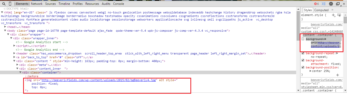
The main issue is that when an element on the page has a background image that uses:

background-attachment: fixed;

If another element is fixed and has a child video element it causes the element with the background image to disappear.

Now it works fine in Safari (and Firefox and IE) so it's not exactly a webkit issue. I've applied several properties that have been suggested to no avail.

-webkit-backface-visibility: hidden;
-webkit-transform: translate3d(0, 0, 0);

Initial Demo

Currently my solution is just to target the elements with a fixed bg image via a media query and just turn off the fixed background property.

@media screen and (-webkit-min-device-pixel-ratio:0) {
background-attachment: scroll;
}

Any ideas?

Update

Working Demo thanks to Daniel.

Update 2

Better demo!

Shoutout to somesayinice and FourKitchens blog post

4

8 回答 8

34

由于在 Chrome 中固定定位的背景似乎无缘无故中断,您可以尝试使用clipandposition:fixed属性。它不是很为人所知,但是当在绝对定位元素上设置 clip 属性时,实际上甚至会裁剪固定定位的子元素。

然而,也有一些缺点。最重要的是,遗憾的是,由于某种原因,这个技巧在 iOS 上无法完美运行,而浏览器在用户滚动时渲染整个图像时遇到了麻烦(你有点得到弹出效果)。这不是什么过于重要的事情,但也许是你应该考虑的事情。当然,您仍然可以通过使用一些巧妙的 javascript 来解决这个问题,这些 JavaScript 会退回到固定的背景。另一个 iOS 解决方法是仅使用-webkit-mask-image: -webkit-linear-gradient(top, #ffffff 0%,#ffffff 100%)它基本上是特定于 webkit 的替代方案clip: rect(auto,auto,auto,auto)(即裁剪容器外的所有内容)。

我制作了一个JSFiddle(codepen 不想和我一起玩)实现示例,说明如何做到这一点。具体看一下.moment.moment-image和新的.moment-clipper

我希望这会有所帮助!

更新: Clip 现在被弃用,取而代之的是 clip-path,但在所有浏览器中仍然支持。但是,可以通过以下方式实现相同的效果:

-webkit-clip-path: polygon(0 0, 100% 0, 100% 100%, 0 100%);
clip-path: polygon(0 0, 100% 0, 100% 100%, 0 100%);
overflow: hidden;

position: absolute容器上不再需要。对 clip-path 的支持似乎相对有限,目前只有 Chrome 和 Safari 支持它的前缀。最安全的选择可能是同时包含剪辑和剪辑路径,因为它们似乎不会相互干扰。

我已经更新了上面的小提琴也包括剪辑路径。

于 2014-05-22T00:05:30.673 回答
8

在以下位置找到此解决方案:https ://fourword.fourkitchens.com/article/fix-scrolling-performance-css-will-change-property

在我看来,这是一种巧妙的使用 :before 伪元素的方法。限制固定宽度元素的宽度,但适用于全宽页面。基本上看起来像这样:

.background_fill {
  overflow: hidden;
  position: relative;
    color: red;
}
.background_fill:before {
  background-color: white;
  background: url('http://www.lausanneworldpulse.com/pdfs/brierley_map_0507.jpg') no-repeat center center;
  background-size: cover;
  z-index: -3;
  content: " ";
  position: fixed;
  will-change: transform;
  width: 100%;
  height: 100%;
}
<div class="background_fill">
  <div>this is on a background / this is on a background / this is on a background / this is on a background / this is on a background / this is on a background</div>
  <div>this is on a background / this is on a background / this is on a background / this is on a background / this is on a background / this is on a background</div>
  <div>this is on a background / this is on a background / this is on a background / this is on a background / this is on a background / this is on a background</div>
  <div>this is on a background / this is on a background / this is on a background / this is on a background / this is on a background / this is on a background</div>
  <div>this is on a background / this is on a background / this is on a background / this is on a background / this is on a background / this is on a background</div>
  <div>this is on a background / this is on a background / this is on a background / this is on a background / this is on a background / this is on a background</div>
  <div>this is on a background / this is on a background / this is on a background / this is on a background / this is on a background / this is on a background</div>
  <div>this is on a background / this is on a background / this is on a background / this is on a background / this is on a background / this is on a background</div>
  <div>this is on a background / this is on a background / this is on a background / this is on a background / this is on a background / this is on a background</div>
  <div>this is on a background / this is on a background / this is on a background / this is on a background / this is on a background / this is on a background</div>
  <div>this is on a background / this is on a background / this is on a background / this is on a background / this is on a background / this is on a background</div>
  <div>this is on a background / this is on a background / this is on a background / this is on a background / this is on a background / this is on a background</div>
  <div>this is on a background / this is on a background / this is on a background / this is on a background / this is on a background / this is on a background</div>
  <div>this is on a background / this is on a background / this is on a background / this is on a background / this is on a background / this is on a background</div>
  <div>this is on a background / this is on a background / this is on a background / this is on a background / this is on a background / this is on a background</div>
  <div>this is on a background / this is on a background / this is on a background / this is on a background / this is on a background / this is on a background</div>
</div>

作为解决这个非常烦人的错误的一种方式,对我来说非常有用。

于 2015-07-24T15:46:43.100 回答
2

一个迟到的答案,但我想到了这个,不知何故我为这个做了一个破解。

这个想法是创建一个内部元素,它将保存背景图像并充当background-attachment:fixed属性。

由于这个属性使背景图像的位置相对于窗口,我们必须在它的容器内移动内部元素,这样我们就会得到这种效果。

var parallax_container = $(".parallax_container");
/*Create the background image holder*/
parallax_container.prepend("<div class='px_bg_holder'></div>");
$(".px_bg_holder").css({
    "background-image" : parallax_container.css("background-image"), /*Get the background image from parent*/
    "background-position" : "center center",
    "background-repeat" : "no-repeat",
    "background-size" : "cover",
    "position" : "absolute",
    "height" : $(window).height(), /*Make the element size same as window*/
    "width" : $(window).width()
});
/*We will remove the background at all*/
parallax_container.css("background","none");
parallax_container.css("overflow","hidden");/*Don't display the inner element out of it's parent*/
$(window).scroll(function(){
    var bg_pos = $(window).scrollTop() - $(".parallax_container").offset().top; /*Calculate the scrollTop of the inner element*/
    $(".px_bg_holder").css({
        "margin-top" : bg_pos+"px"
    });
});
$(window).resize(function(){
    $(".px_bg_holder").css({
        "height" : $(window).height(),
        "width" : $(window).width()
    });
});
于 2014-07-04T13:37:25.983 回答
2

正如Raphael Rychetsky在这支伟大的笔上看到的那样,可能是麻烦制造者。translate3d

如果您使用transform: translate3d(0,0,0),请尝试将其替换为transform: translate(0,0),它应该可以解决问题。至少它对我有用。

于 2015-03-10T15:19:10.057 回答
1

嗨,这很简单,无需添加任何 webkit 和媒体标签,只需按照下面

  1. 步骤我删除了下面容器中的背景 Url 标签

.content .container { /* 背景: url( http://beeverlyfields.com/wp-content/uploads/2015/02/bgBeeverly4.jpg ); */

  1. 我在 class="container" 中添加了 img src 标签并定位为固定和 top=0

在此处输入图像描述 现在它在 chrome-40 和 IE 中工作

于 2015-02-25T13:21:39.877 回答
0

我的问题是我在文档中有动画 3d 变换悬停 div

.anim-y360:hover {
    -webkit-transform: rotateY(360deg);
    ...
}

每次我运行动画时,固定图像都会消失。

解决方案很简单:

.anim-y360 {   
   z-index: XX;
   ...
}

其中XX高于固定位置图像的 z-index。

于 2014-07-10T15:03:43.863 回答
0

由于 HTML5 视频,通常会出现此问题。只需使用样式规则将其包装在 dom 元素中 position: relative; 和溢出:隐藏;这将修复所有浏览器中的所有问题!

于 2015-09-04T09:17:53.427 回答
0

我从https://www.fourkitchens.com/blog/article/fix-scrolling-performance-css-will-change-property/找到了解决方案

就我而言,只需将此属性放入固定背景的 div 中。

will-change : transform;
于 2017-07-12T02:22:43.053 回答