70

想知道是否可以像使用按钮一样更改复选框的大小。我希望它更大,所以它很容易按下。现在它看起来像这样:

在此处输入图像描述

代码:

 <div class="form-group">
    <label  class="col-md-7 control-label">Kalsiumklorid: </label>
    <div class="col-md-5" >
      {{ Form::checkbox('O_Kals_Klor', 1 , array('class' => 'form-control' ))  }}  
    </div>
  </div>
4

9 回答 9

54

或者您可以使用像素设置样式。

 .big-checkbox {width: 30px; height: 30px;}
于 2015-07-30T19:10:46.020 回答
43
input[type=checkbox]
{
  /* Double-sized Checkboxes */
  -ms-transform: scale(2); /* IE */
  -moz-transform: scale(2); /* FF */
  -webkit-transform: scale(2); /* Safari and Chrome */
  -o-transform: scale(2); /* Opera */
  padding: 10px;
}
于 2018-02-14T13:24:33.520 回答
14

在 css 中是可能的,但不适用于所有浏览器。

对所有浏览器的影响:

http://www.456bereastreet.com/lab/form_controls/checkboxes/

一种可能性是带有 javascript 的自定义复选框:

http://ryanfait.com/resources/custom-checkboxes-and-radio-buttons/

于 2014-03-30T11:34:39.677 回答
10

可以为当今最流行的浏览器实现自定义引导复选框。

您可以在 GitHub 中查看我的Bootstrap-Checkbox项目,其中包含简单的.less 文件。MDN 中有一篇很好的文章描述了一些技术,其中两个主要是:

  1. 标签重定向点击事件。

    for如果标签具有类似 in 的属性 <label for="target_id">Text</label> <input id="target_id" type="checkbox" />,或者如果它包含 Bootstrap case: 中的输入,则标签可以将点击事件重定向到其目标<label><input type="checkbox" />Text</label>

    这意味着可以在浏览器的一个角落放置一个标签,点击它,然后标签会将点击事件重定向到位于另一个角落的复选框,从而为复选框产生选中/取消选中动作。

    我们可以在视觉上隐藏原始复选框,但让它仍然工作并从标签中获取点击事件。在标签本身中,我们可以使用标签或伪元素来模拟复选框:before :after

  2. 旧浏览器的一般不支持标签

    一些旧浏览器不支持一些 CSS 功能,例如选择同级p+p或特定搜索input[type=checkbox]。根据 MDN 文章,支持这些功能的浏览器也支持:rootCSS 选择器,而其他的则不支持。选择:root器只选择文档的根元素,它html位于 HTML 页面中。因此,可以使用:root回退到旧浏览器和原始复选框。

    最终代码片段:

:root {
  /* larger checkbox */
}
:root label.checkbox-bootstrap input[type=checkbox] {
  /* hide original check box */
  opacity: 0;
  position: absolute;
  /* find the nearest span with checkbox-placeholder class and draw custom checkbox */
  /* draw checkmark before the span placeholder when original hidden input is checked */
  /* disabled checkbox style */
  /* disabled and checked checkbox style */
  /* when the checkbox is focused with tab key show dots arround */
}
:root label.checkbox-bootstrap input[type=checkbox] + span.checkbox-placeholder {
  width: 14px;
  height: 14px;
  border: 1px solid;
  border-radius: 3px;
  /*checkbox border color*/
  border-color: #737373;
  display: inline-block;
  cursor: pointer;
  margin: 0 7px 0 -20px;
  vertical-align: middle;
  text-align: center;
}
:root label.checkbox-bootstrap input[type=checkbox]:checked + span.checkbox-placeholder {
  background: #0ccce4;
}
:root label.checkbox-bootstrap input[type=checkbox]:checked + span.checkbox-placeholder:before {
  display: inline-block;
  position: relative;
  vertical-align: text-top;
  width: 5px;
  height: 9px;
  /*checkmark arrow color*/
  border: solid white;
  border-width: 0 2px 2px 0;
  /*can be done with post css autoprefixer*/
  -webkit-transform: rotate(45deg);
  -moz-transform: rotate(45deg);
  -ms-transform: rotate(45deg);
  -o-transform: rotate(45deg);
  transform: rotate(45deg);
  content: "";
}
:root label.checkbox-bootstrap input[type=checkbox]:disabled + span.checkbox-placeholder {
  background: #ececec;
  border-color: #c3c2c2;
}
:root label.checkbox-bootstrap input[type=checkbox]:checked:disabled + span.checkbox-placeholder {
  background: #d6d6d6;
  border-color: #bdbdbd;
}
:root label.checkbox-bootstrap input[type=checkbox]:focus:not(:hover) + span.checkbox-placeholder {
  outline: 1px dotted black;
}
:root label.checkbox-bootstrap.checkbox-lg input[type=checkbox] + span.checkbox-placeholder {
  width: 26px;
  height: 26px;
  border: 2px solid;
  border-radius: 5px;
  /*checkbox border color*/
  border-color: #737373;
}
:root label.checkbox-bootstrap.checkbox-lg input[type=checkbox]:checked + span.checkbox-placeholder:before {
  width: 9px;
  height: 15px;
  /*checkmark arrow color*/
  border: solid white;
  border-width: 0 3px 3px 0;
}
<link href="https://maxcdn.bootstrapcdn.com/bootstrap/3.3.7/css/bootstrap.min.css" rel="stylesheet"/>
<p>
 Original checkboxes:
</p>
<div class="checkbox">
      <label class="checkbox-bootstrap">                                        
          <input type="checkbox">             
          <span class="checkbox-placeholder"></span>           
          Original checkbox
      </label>
 </div>
 <div class="checkbox">
      <label class="checkbox-bootstrap">                                        
          <input type="checkbox" disabled>             
          <span class="checkbox-placeholder"></span>           
          Original checkbox disabled
      </label>
 </div>
 <div class="checkbox">
      <label class="checkbox-bootstrap">                                        
          <input type="checkbox" checked>             
          <span class="checkbox-placeholder"></span>           
          Original checkbox checked
      </label>
 </div>
  <div class="checkbox">
      <label class="checkbox-bootstrap">                                        
          <input type="checkbox" checked disabled>             
          <span class="checkbox-placeholder"></span>           
          Original checkbox checked and disabled
      </label>
 </div>
 <div class="checkbox">
      <label class="checkbox-bootstrap checkbox-lg">                           
          <input type="checkbox">             
          <span class="checkbox-placeholder"></span>           
          Large checkbox unchecked
      </label>
 </div>
  <br/>
<p>
 Inline checkboxes:
</p>
<label class="checkbox-inline checkbox-bootstrap">
  <input type="checkbox">
  <span class="checkbox-placeholder"></span>
  Inline 
</label>
<label class="checkbox-inline checkbox-bootstrap">
  <input type="checkbox" disabled>
  <span class="checkbox-placeholder"></span>
  Inline disabled
</label>
<label class="checkbox-inline checkbox-bootstrap">
  <input type="checkbox" checked disabled>
  <span class="checkbox-placeholder"></span>
  Inline checked and disabled
</label>
<label class="checkbox-inline checkbox-bootstrap checkbox-lg">
  <input type="checkbox" checked>
  <span class="checkbox-placeholder"></span>
  Large inline checked
</label>

于 2016-10-05T12:52:40.147 回答
5

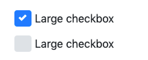
以下在 bootstrap 4 中有效,在 CSS、移动设备中显示良好,并且标签间距没有问题。

在此处输入图像描述

CSS

.checkbox-lg .custom-control-label::before, 
.checkbox-lg .custom-control-label::after {
  top: .8rem;
  width: 1.55rem;
  height: 1.55rem;
}

.checkbox-lg .custom-control-label {
  padding-top: 13px;
  padding-left: 6px;
}


.checkbox-xl .custom-control-label::before, 
.checkbox-xl .custom-control-label::after {
  top: 1.2rem;
  width: 1.85rem;
  height: 1.85rem;
}

.checkbox-xl .custom-control-label {
  padding-top: 23px;
  padding-left: 10px;
}

HTML

<div class="custom-control custom-checkbox checkbox-lg">
      <input type="checkbox" class="custom-control-input" id="checkbox-3">
      <label class="custom-control-label" for="checkbox-3">Large checkbox</label>
    </div>

您还可以通过声明使其变得更大checkbox-xl

如果 BS 团队的任何人正在阅读这篇文章,那么如果你开箱即用,那就太好了,我在 BS 5 中也看不到任何东西

资源

于 2021-01-23T02:22:33.140 回答
3

我只使用了“保存缩放”,例如:

.my_checkbox {
    width:5vw;
    height:5vh;
}
于 2017-03-16T09:31:06.133 回答
2

我已经成功使用了这个库

http://plugins.krajee.com/checkbox-x

它需要 jQuery 和 bootstrap 3.x

在此处下载 zip:https ://github.com/kartik-v/bootstrap-checkbox-x/zipball/master

将 zip 的内容放在项目中的文件夹中

在标题中弹出所需的库

<link href="http://netdna.bootstrapcdn.com/bootstrap/3.3.6/css/bootstrap.min.css" rel="stylesheet">
<link href="path/to/css/checkbox-x.min.css" media="all" rel="stylesheet" type="text/css" />
<script src="//ajax.googleapis.com/ajax/libs/jquery/1.12.3/jquery.min.js"></script>
<script src="path/to/js/checkbox-x.min.js" type="text/javascript"></script>

使用 data-size="xl" 将数据控件添加到元素以更改大小,如下所示http://plugins.krajee.com/cbx-sizes-demo

<label for="element_id">CheckME</label>
<input type="checkbox" name="my_element" id="element_id" value="1" data-toggle="checkbox-x" data-three-state="false" data-size="xl"/>

如果您浏览插件站点,还有许多其他功能。

于 2016-04-22T18:02:25.297 回答
1
<div id="rr-element">
   <label for="rr-1">
      <input type="checkbox" value="1" id="rr-1" name="rr[]">
      Value 1
   </label>
</div>
//do this on the css
div label input { margin-right:100px; }
于 2018-03-15T13:00:39.663 回答
0

just use simple css

.big-checkbox {width: 1.5rem; height: 1.5rem;top:0.5rem}
于 2021-02-01T11:37:55.160 回答