50

我有一个带有段落和标题的文本容器。在页面底部,我想将图像浮动到页面右侧,而文本环绕图像。图像的底部应与最后一段的底部齐平。

页面宽度是可变的(响应式),但图像尺寸是固定的。是否可以在 HTML 和 CSS 中实现这一点(CSS3 很好)?如果没有,可以用最少的 Javascript 完成吗?

这是我想要完成的示意性示例:

右下角浮动图片

HTML 当前看起来像这样,但可以根据需要进行更改。我并不特别关心图像在文档中的位置。使用背景图像也可以。

<section>
  <h2>...</h2>
  <p>... ...</p>
  <p>... ...</p>
  ...
  <img src="...">
</section>

当我float: right在图像上设置时,它会向右浮动,但我无法让它与页面底部对齐。建议?

编辑:我得到的最接近的是这个...... :-)

4

10 回答 10

58

创建一个间隔元素,float: right该元素height的高度等于内容的高度减去图像的高度。然后在图像上使用float: rightclear: right

<div class="spacer"></div>
<img class="bottomRight" src="" />
<div class="content"></div>
.spacer {
    height: calc(100% - 200px);
    width: 0px;
    float: right;
}
.bottomRight {
    height: 200px;
    float: right;
    clear: right;
}

http://cssdesk.com/bLNWs

我的演示在容器元素中使用了固定尺寸。由于这很少是现实的情况,因此使用 JavaScript 来调整分隔符的大小可能更有意义。调用此函数,在文档准备好和事件期间传递对 spacer 元素的引用window.onresize

function sizeSpacer(spacer) {
    spacer.style.height = 0;
    var container = spacer.parentNode;
    var img = spacer.nextElementSibling || spacer.nextSibling;
    var lastContentNode = container.children[container.children.length - 1];
    var h = Math.max(0, container.clientHeight - img.clientHeight);
    spacer.style.height = h + "px";
    while (h > 0 && img.getBoundingClientRect().bottom > lastContentNode.getBoundingClientRect().bottom) {
        spacer.style.height = --h + "px";
    }
    if (lastContentNode.getBoundingClientRect().bottom > img.getBoundingClientRect().bottom) {
        spacer.style.height = ++h + "px";
    }
}

此函数有效(参见演示),并且可以针对 jQuery 或您选择的库进行重新设计。它并不意味着是插件质量代码,而是用来说明这个概念。

jsfiddle.net/gilly3/xLr7eacp

编辑:我创建了一个支持浮动左下角右下角的 jQuery 插件版本( github | jsFiddle demo )。它还支持指定与底部对齐的元素。

顺便说一句,我没有费心去支持 IE7。

于 2013-11-06T19:06:09.213 回答
7

我认为解决这个问题的未来方法将是使用CSS Exclusions

CSS 排除扩展了以前仅限于浮动的内容包装的概念。...元素在其内容区域中布局其内联内容,并在其关联的包装上下文中环绕排除区域(--摘自规范

这篇msdn 文章还解释了排除项

...网络作者现在可以包装文本,使其完全包围元素,从而避免浮动的传统限制。CSS Exclusions 可以定位在距包含块的顶部、底部、左侧或右侧指定距离的位置,而不是将元素限制为相对于它们在文档流中的位置向左或向右浮动,而其余部分文档流。

具有讽刺意味的是,到目前为止,这只适用于 IE10(查找 wrap-flow:both here

在 IE10+ 中查看这个小提琴

这是代码的样子:

 <div class="container">
    <div class="exclusion">
        Exclusion positioned at bottom right hand side of text.
    </div>
    <div class="dummy_text">
        <p>text here</p>
    </div>
</div> 

CSS

.container {
    font-size: small;
    background: aqua;
    position: relative;
}

.exclusion {

    -ms-wrap-flow: both;
    -ms-wrap-margin: 10px;
    z-index: 1;
    position:absolute;
    right:0;
    bottom:0; /* try fiddling with this. For some reason bottom: -10px (or the like) works better here */
    width: 150px;
    height: 100px;
    background: url(http://placehold.it/150x100) no-repeat;
}

所以你可以看到——即使排除是绝对定位的——它仍然像一个浮点数——在这种情况下:右下角浮点数。

关于浏览器支持:

查看此站点,该站点显示了浏览器支持哪些属性(迄今为止:仅 IE10+ 支持wrap-flow:both

PS:有关 CSS 排除项(以及其他类似模块,如 CSS 区域和 CSS 形状)的最新更新可以在 Adob​​e Web 平台团队博客中找到

于 2013-11-10T21:46:49.960 回答
3

可能的 CSS 解决方案:(在 chrome 中测试

看起来这可能使用 CSS3 的弹性框属性background-image属性组合来工作。我只使用 CSS 就可以让它非常接近。(它可以工作,但需要稍作调整)另外,这可能不是理想的,因为我确实必须稍微更改标记才能使其工作。但如果您正在寻找纯 CSS 解决方案,它可能值得一试。

这是一个演示-> http://jsfiddle.net/ADSH2/

新标记:(差别不大

<section >
  <h2>Some Heading:</h2>
  <p>...</p>
  <p class="last">
     <span class="image"></span>
  </p>
</section>

CSS:

.last {
    display:inline-flex;
    flex-direction:row;
}
.image {
    padding:5px 0 0 5px;
    width:100%;
    background-image:url("http://dribbble.s3.amazonaws.com/users/200359/screenshots/758731/stackoverflow_logo.png");
    background-size:100%;
    background-repeat:no-repeat;
    background-position:bottom right;
}

资源:

  1. http://css-tricks.com/snippets/css/a-guide-to-flexbox/
  2. http://dev.w3.org/csswg/css-flexbox-1/
于 2013-11-06T19:43:35.940 回答
2

我想它已经解决了。有用!

使用一点 JavaScript 和 CSS,我做到了:

http://jsfiddle.net/stichoza/aSScx/

一个简单的floatify()功能。

  • 反应灵敏。
  • 调整窗口大小不会破坏它。
  • 任何图像宽度/高度。
  • 放尽可能多的文字。

灵感来自:http ://www.csstextwrap.com/

于 2013-11-13T00:58:05.027 回答
2

我研究过一个基于 jQuery 的解决方案——虽然可能不如 gilly3 发布的那么优雅;)而且它也更慢而且有点臃肿......

我的技巧是将两个 s 附加<div>到该部分,该部分向左浮动,隐藏宽度为 0。其中一个 div 是一个指定的与图像具有相同尺寸的幽灵元素,将位于另一个 div 下方那是指定的高度垫片。该脚本使用while 循环来确定ghost 元素是否已到达父节元素的底部。如果这没有发生,它会将高度垫片的高度增加 1,直到满足条件。

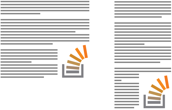
我使用的标记如下。我正在使用 HTML5 属性data-bottom-image来识别您将图像浮动到底部的部分。当然它是可有可无的,这取决于您要如何选择正确的部分元素。

<section id="c1" data-bottom-image>
    <h2>...</h2>
    <p>...</p>
    <img src="http://placehold.it/250x100" />
</section>

和 jQuery 脚本:

$(function () {
    $("section > img:last-child").each(function () {
        // Offset image based on the bottom and right padding of parent
        var $par = $(this).parent();
        $(this).css({
            bottom: $par.css('padding-bottom'),
            right: $par.css('padding-right')
        });
    });

    // Function: adjust height of height-spacer, pixel by pixel
    function adjustHeightSpacer($par, $hs, $is) {
        // Stretch height spacer
        $hs.height(0);
        $hs.css({
            height: $par.find("img").position().top - parseInt($par.css('padding-top'))
        });

        // Adjust height spacer
        while($par.height() - $is.height() > $is.position().top - parseInt($par.css('padding-top'))) {
            $hs.height("+=1");
        }

        while($par.height() - $is.height() < $is.position().top - parseInt($par.css('padding-top'))) {
            $hs.height("-=1");
        }        
    };

    $("section[data-bottom-image]").each(function() {
        // Append two spacers:
        $(this).prepend('<div class="ghost height-spacer" /><div class="ghost image-spacer" />')

        var $hs = $(this).find(".height-spacer"),
            $is = $(this).find(".image-spacer");

        // Adjust image spacer dimension
        $is.css({
            height: $(this).find("img").height(),
            width: $(this).find("img").width()
        });

        // Adjust height spacer
        adjustHeightSpacer($(this), $hs, $is);
    });

    $(window).resize($.debounce(250,function() {
        $("section[data-bottom-image]").each(function() {
            // Adjust height spacer
            adjustHeightSpacer($(this), $(this).find(".height-spacer"), $(this).find(".image-spacer"));
        });
    }));
});

这里是工作小提琴:http: //jsfiddle.net/teddyrised/xmkAP/5/

于 2013-11-06T19:54:06.557 回答
1

仅 CSS 解决方案。

使用媒体查询可以完成这种布局。

HTML

<section>
  <h2>...</h2>
  <p>... ...</p>
  <p>... ...</p>
  <img src="..." class="show-medium">
  ...
  <img src="..." class="show-small">
</section>

CSS

html, body {
  height: 100%;
  width: 100%;
}

img {
  display: none;
  float: right;
  clear: right;
}

@media (max-width: Xpx), (max-height: Xpx) {
  /* show img for small screens */
  .show-small { display:block; }
}
@media (min-width: Xpx) and (max-width: Xpx) and (min-height:Xpx) and (max-height: Xpx) { 
 /* show img for medium screens */
 .show-medium { display:block; }
}

@media (min-width: Xpx) and (min-height: Xpx) {
  /* show img as body background for large screens */
  body {
    background: url("http://placehold.it/200x300") no-repeat fixed right bottom transparent;
  }
}

它在不同的屏幕分辨率下都能正常播放。见演示

必须播放/调整 CSS 媒体查询以及图像在标记中的位置才能使其正常工作。

Firefox 3.5+、Opera 7+、Safari 3+、Chrome 和 IE9+ 支持 CSS 媒体查询。对于较旧的 IE 版本,可以使用此修复:http ://code.google.com/p/css3-mediaqueries-js/

于 2013-11-13T07:35:03.737 回答
1

2020 年的响应式解决方案,灵感来自 @gilly3 的解决方案,直到CSS Exclusions到来。

  1. 包含元素上的 Flexbox 以避免需要固定高度的容器,同时仍确保 100% 的高度有效
  2. :before元素而不是垫片div
  3. 视口单位而不是固定值以按比例调整图像(和“间隔”)的大小
  4. 要在更宽的屏幕上最大化图像宽度,请在图像和间隔中引入具有固定宽度的断点
  5. 减去所需的任何垂直边距calc()

.container {
  display: flex;
}

img {
  float: right;
  clear: right;
  margin: 20px 0 0 20px;
  height: 30vw;
  
  @media (min-width: 1200px) {
    height: 400px;
  }
}

.container-inner:before {
  content: "";  
  float: right;
  height: calc(100% - 30vw - 20px);
  
  @media (min-width: 1200px) {
    height: calc(100% - 400px - 20px);
  }
}
<div class="container">
  <div class="container-inner">
    <img src="https://picsum.photos/200" />
    <p>Lorem ipsum dolor sit, amet consectetur adipisicing elit. Doloribus ab, doloremque quasi, obcaecati aspernatur nam possimus harum architecto odit molestiae pariatur aliquid necessitatibus, corrupti mollitia provident quis quam eligendi qui.</p>
    <p>Lorem ipsum dolor sit, amet consectetur adipisicing elit. Doloribus ab, doloremque quasi, obcaecati aspernatur nam possimus harum architecto odit molestiae pariatur aliquid necessitatibus, corrupti mollitia provident quis quam eligendi qui.</p>
    <p>Lorem ipsum dolor sit, amet consectetur adipisicing elit. Doloribus ab, doloremque quasi, obcaecati aspernatur nam possimus harum architecto odit molestiae pariatur aliquid necessitatibus, corrupti mollitia provident quis quam eligendi qui.</p>
    <p>Lorem ipsum dolor sit, amet consectetur adipisicing elit. Doloribus ab, doloremque quasi, obcaecati aspernatur nam possimus harum architecto odit molestiae pariatur aliquid necessitatibus, corrupti mollitia provident quis quam eligendi qui.</p>
  </div>
</div>

于 2020-12-08T20:04:34.777 回答
0

这是一个带有一些 jQuery 的轻量级解决方案:

http://jsfiddle.net/isherwood/6BvC2/

<section class="flagpole">
    <div class="pole"></div>
    <img class="flag" src="..." />
    <p>Paragraphs...</p>
</section>

.pole, .flag {
    float: right;
    clear: right;
}
.pole {
    width: 0.1px
}


function setFlag() {
    $('section.flagpole').each(function () {
        var poleHeight = $(this).height() - $(this).find('.flag').height();
        $(this).find('.pole').height(poleHeight);
    });
}

setFlag();

$(window).on('resize', function () {
    setFlag();
});

为了消除对抄袭的任何担忧,此解决方案基于我不久前提供的另一个类似答案

于 2013-11-12T15:16:07.883 回答
0

用这个 :

<section class="post">
  <h2>...</h2>
  <p>... ...</p>
  <p>... ...</p>
  ...
  <img src="...">
</section>

<style>
.post img {float:right;margin-top:80%}

</style>

更改80%以获得最佳结果。

祝你好运。

于 2013-11-12T08:08:07.713 回答
0

仅 CSS 且响应迅速的解决方案,无需复杂代码即可工作。调整浏览器的大小,看看它的神奇之处:

.wrapper {
  display: flex;
  border: 1px solid;
}

.box {
  text-align: justify;
  font-size: 20px;
}

.float {
  float: right;
  height: 100%;
  margin-left: 15px;
  display: flex;
  align-items: flex-end;
  shape-outside: inset(calc(100% - 100px) 0 0);
}
<div class="wrapper">
  <div class="box">
    <div class="float"><img src="https://picsum.photos/id/1/100/100"></div>
    Lorem ipsum dolor sit amet, consectetur adipiscing elit. Aliquam in dui quis orci ultricies aliquet nec sed enim. Mauris id rutrum nulla, et ornare leo. Donec aliquet malesuada tellus, eu laoreet lectus tincidunt ut. Quisque lacus magna, interdum eu urna
    ac, aliquet gravida orci. Pellentesque gravida urna sit amet nulla suscipit, at venenatis lorem dignissim. Morbi quis nunc eu velit condimentum ornare. Curabitur finibus tincidunt ullamcorper. Pellentesque tincidunt et odio vitae tempus. Praesent
    ac erat ut eros venenatis pulvinar. Pellentesque eu dapibus dui. Ut semper sed enim ut vestibulum. Lorem ipsum dolor sit amet, consectetur adipiscing elit. Fusce vitae elit eget velit porttitor consequat nec sed turpis. Proin libero nisl, egestas
    hendrerit vulputate et, lobortis non nulla. Aenean dui libero, dictum vel nibh eget, tristique egestas enim.
  </div>
</div>

更多细节:https ://css-tricks.com/float-an-element-to-the-bottom-corner/

PS:我是以上文章的作者

于 2021-04-20T14:15:11.683 回答