@kalhartt 是对的,请参阅:http ://bootply.com/91310 。您应该为 10 列网格定义一些网格类,以解决这个 2-2-2-4-2。
附加CSS:
@media (min-width: 992px) {
.col-md10-1, .col-md10-2, .col-md10-3, .col-md10-4, .col-md10-5, .col-md10-6, .col-md10-7, .col-md10-8, .col-md10-9, .col-md10-10
{
  position: relative;
  min-height: 1px;
  padding-left: 15px;
  padding-right: 15px;
}


  .col-md10-1, .col-md10-2, .col-md10-3, .col-md10-4, .col-md10-5, .col-md10-6, .col-md10-7, .col-md10-8, .col-md10-9 {
    float: left;
  }
  .col-md10-10 {
    width: 100%;
  }
  .col-md10-9 {
    width: 90%;
  }
  .col-md10-8 {
    width: 80%;
  }
  .col-md10-7 {
    width: 70%;
  }
  .col-md10-6 {
    width: 60%;
  }
  .col-md10-5 {
    width: 50%;
  }
  .col-md10-4 {
    width: 40%;
  }
  .col-md10-3 {
    width: 30%;
  }
  .col-md10-2 {
    width: 20%;
  }
  .col-md10-1 {
    width: 10%;
  }
  .col-md10-pull-10 {
    right: 100%;
  }
  .col-md10-pull-9 {
    right: 90%;
  }
  .col-md10-pull-8 {
    right: 80%;
  }
  .col-md10-pull-7 {
    right: 70%;
  }
  .col-md10-pull-6 {
    right: 60%;
  }
  .col-md10-pull-5 {
    right: 50%;
  }
  .col-md10-pull-4 {
    right: 40%;
  }
  .col-md10-pull-3 {
    right: 30%;
  }
  .col-md10-pull-2 {
    right: 20%;
  }
  .col-md10-pull-1 {
    right: 10%;
  }
  .col-md10-push-10 {
    left: 100%;
  }
  .col-md10-push-9 {
    left: 90%;
  }
  .col-md10-push-8 {
    left: 80%;
  }
  .col-md10-push-7 {
    left: 70%;
  }
  .col-md10-push-6 {
    left: 60%;
  }
  .col-md10-push-5 {
    left: 50%;
  }
  .col-md10-push-4 {
    left: 40%;
  }
  .col-md10-push-3 {
    left: 30%;
  }
  .col-md10-push-2 {
    left: 20%;
  }
  .col-md10-push-1 {
    left: 10%;
  }
  .col-md10-offset-10 {
    margin-left: 100%;
  }
  .col-md10-offset-9 {
    margin-left: 90%;
  }
  .col-md10-offset-8 {
    margin-left: 80%;
  }
  .col-md10-offset-7 {
    margin-left: 70%;
  }
  .col-md10-offset-6 {
    margin-left: 60%;
  }
  .col-md10-offset-5 {
    margin-left: 50%;
  }
  .col-md10-offset-4 {
    margin-left: 40%;
  }
  .col-md10-offset-3 {
    margin-left: 30%;
  }
  .col-md10-offset-2 {
    margin-left: 20%;
  }
  .col-md10-offset-1 {
    margin-left: 10%;
  }
}
html:
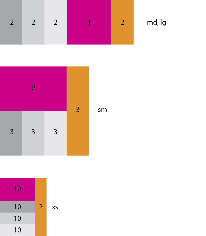
<div class="container">
    <div class="row">
    <div class="col-md-10 col-sm-9 col-xs-10">
        <div class="row">
            <div class="col-md10-4 col-md10-push-6 col-xs-12" style="height:50px;background-color:#CA0088"></div>
            <div class="col-md10-6 col-md10-pull-4 col-xs-12">

                <div class="row">
                    <div class="col-sm-4 col-xs-12" style="height:50px;background-color:#A7A8AA"></div>
                    <div class="col-sm-4 col-xs-12" style="height:50px;background-color:#D0D1D3"></div>
                    <div class="col-sm-4 col-xs-12" style="height:50px;background-color:#E7E7E9"></div>
                </div>
            </div>
        </div>
    </div>
    <div class="col-md-2 col-sm-3 col-xs-2" style="height:50px;background-color:#E0922E"></div>
    </div>
</div>
请注意,目前您不能仅使用 Less 构造额外的 CSS。
第一部分的列名.col-md10-1, .col-md10-2, .col-md10-3, .col-md10-4, .col-md10-5, .col-md10-6, .col-md10-7, .col-md10-8, .col-md10-9, .col-md10-10
{
position: relative;
min-height: 1px;
padding-left: 15px;
padding-right: 15px;
}是 mixins.less 中的硬代码(参见:https ://github.com/twbs/bootstrap/issues/11321 )
第二部分可以通过以下方式构建:
// Core variables and mixins
@import "variables.less";
@import "mixins.less";

@grid-columns: 10;
@media (min-width: @screen-md-min) {
  .make-grid-columns-float(md10);
  .make-grid(@grid-columns, md10, width);
  .make-grid(@grid-columns, md10, pull);
  .make-grid(@grid-columns, md10, push);
  .make-grid(@grid-columns, md10, offset);
}
导致@grid-columns在 make-grid() 中使用了这个集合,make-grid-columns-float你不能一次编译两个网格。另见:https ://github.com/twbs/bootstrap/issues/11322