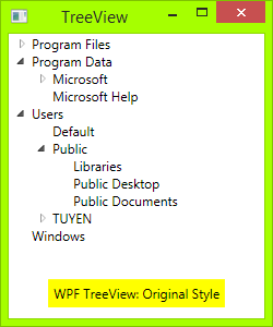
WPF default TreeView is very good, I still want it have lines joint each its child element, like Windows Forms TreeView. I have searched on internet and have some example, but it did not designed well enough.
How can I achieve it with WPF?
让我回答我自己的问题。
代码
您需要做的只是一个 XAML 文件和一个代码:
首先您需要绘制切换按钮:从三角形按钮到加减按钮:绘制一个带有深色边框的矩形,然后绘制两条线,一条垂直线和一条水平线。当 TreeViewItem 展开时,垂直线会隐藏:
<!-- Toggle Button -->
<Style x:Key="ExpandCollapseToggleStyle" TargetType="ToggleButton">
    <Setter Property="Focusable" Value="False"/>
    <Setter Property="Template">
        <Setter.Value>
            <ControlTemplate TargetType="ToggleButton">
                <Grid Width="15" Height="13" SnapsToDevicePixels="True">
<!-- Rectangle 9x9 pixels -->
                    <Rectangle Width="9" Height="9" Stroke="#919191" SnapsToDevicePixels="true">
                        <Rectangle.Fill>
                            <LinearGradientBrush EndPoint="0.5,2" StartPoint="0.5,0">
                                <GradientStop Color="White" Offset="0"/>
                                <GradientStop Color="Silver" Offset="0.5"/>
                                <GradientStop Color="LightGray" Offset="1"/>
                            </LinearGradientBrush>
                        </Rectangle.Fill>
                    </Rectangle>
<!-- Vertical line inside rectangle -->
                    <Rectangle x:Name="ExpandPath" Width="1" Height="5" Stroke="Black" SnapsToDevicePixels="true"/>
<!-- Horizontal line inside rectangle -->
                    <Rectangle Width="5" Height="1" Stroke="Black" SnapsToDevicePixels="true"/>
                </Grid>
                <ControlTemplate.Triggers>
                    <Trigger Property="IsChecked" Value="True">
                        <Setter Property="Visibility"  TargetName="ExpandPath" Value="Collapsed"/>
                    </Trigger>
                </ControlTemplate.Triggers>
            </ControlTemplate>
        </Setter.Value>
    </Setter>
</Style>
在上面的代码中,您可以看到一个触发器,如果项目展开,它将使切换按钮内的垂直线隐藏,或者如果其子项折叠则显示。
然后,您需要在节点之间绘制垂直和水平连接线:您需要重新设计 TreeViewItem 控件。添加这些连接线:
<!-- Horizontal line -->
<Rectangle x:Name="HorLn" Margin="9,1,0,0" Height="1" Stroke="#DCDCDC" SnapsToDevicePixels="True"/>
<!-- Vertical line -->
<Rectangle x:Name="VerLn" Width="1" Stroke="#DCDCDC" Margin="0,0,1,0" Grid.RowSpan="2" SnapsToDevicePixels="true" Fill="White"/>
像这样到您的 TreeViewItem 模板:
<!-- TreeViewItem -->
<Style x:Key="{x:Type TreeViewItem}" TargetType="{x:Type TreeViewItem}">
    <Setter Property="Template">
        <Setter.Value>
            <ControlTemplate TargetType="{x:Type TreeViewItem}">
                <Grid>
                    <Grid.ColumnDefinitions>
                        <ColumnDefinition MinWidth="19" Width="Auto"/>
                        <ColumnDefinition Width="Auto"/>
                        <ColumnDefinition Width="*"/>
                    </Grid.ColumnDefinitions>
                    <Grid.RowDefinitions>
                        <RowDefinition Height="Auto"/>
                        <RowDefinition/>
                    </Grid.RowDefinitions>

                    <!-- Connecting Lines -->
                    <!-- Horizontal line -->
                    <Rectangle x:Name="HorLn" Margin="9,1,0,0" Height="1" Stroke="#DCDCDC" SnapsToDevicePixels="True"/>
                    <!-- Vertical line -->
                    <Rectangle x:Name="VerLn" Width="1" Stroke="#DCDCDC" Margin="0,0,1,0" Grid.RowSpan="2" SnapsToDevicePixels="true" Fill="White"/>
                    <!-- Insert Toggle Button -->
                    <ToggleButton Margin="-1,0,0,0" x:Name="Expander" Style="{StaticResource ExpandCollapseToggleStyle}" IsChecked="{Binding Path=IsExpanded, RelativeSource={RelativeSource TemplatedParent}}" ClickMode="Press"/>
                    <Border Name="Bd" Grid.Column="1" Background="{TemplateBinding Background}" BorderBrush="{TemplateBinding BorderBrush}" BorderThickness="{TemplateBinding BorderThickness}" Padding="{TemplateBinding Padding}" SnapsToDevicePixels="True">
                        <ContentPresenter x:Name="PART_Header" ContentSource="Header" HorizontalAlignment="{TemplateBinding HorizontalContentAlignment}" MinWidth="20"/>
                    </Border>
                    <ItemsPresenter x:Name="ItemsHost" Grid.Row="1" Grid.Column="1" Grid.ColumnSpan="2"/>
                </Grid>
            </ControlTemplate>
        </Setter.Value>
    </Setter>
</Style>
然后,您需要将类 TreeViewLineConverter 放入您的命名空间。如果项目是列表中的最后一项,则此类将更改连接线:
using System;
using System.Windows;
using System.Windows.Controls;
using System.Windows.Data;

namespace TreeViewEx
{
    public partial class MainWindow : Window
    {
        public MainWindow()
        {
            InitializeComponent();
        }
    }

    class TreeViewLineConverter : IValueConverter
    {
        public object Convert(object value, Type targetType, object parameter, System.Globalization.CultureInfo culture)
        {
            TreeViewItem item = (TreeViewItem)value;
            ItemsControl ic = ItemsControl.ItemsControlFromItemContainer(item);
            return ic.ItemContainerGenerator.IndexFromContainer(item) == ic.Items.Count - 1;
        }

        public object ConvertBack(object value, Type targetType, object parameter, System.Globalization.CultureInfo culture)
        {
            return false;
        }
    }

}
将您的命名空间插入您的 XAML,即:
<Window x:Class="TreeViewEx.MainWindow"
        xmlns="http://schemas.microsoft.com/winfx/2006/xaml/presentation"
        xmlns:x="http://schemas.microsoft.com/winfx/2006/xaml"
        xmlns:local="clr-namespace:TreeViewEx"/>
将此行添加到 Window.Resources:
<local:TreeViewLineConverter x:Key="LineConverter"/>
将触发器添加到 TreeViewItem 模板,如果项目是列表中的最后一个,则此触发器会更改连接线:
<!-- This trigger changes the connecting lines if the item is the last in the list -->
<DataTrigger Binding="{Binding RelativeSource={RelativeSource Self}, Converter={StaticResource LineConverter}}" Value="true">
    <Setter TargetName="VerLn" Property="Height" Value="9"/>
    <Setter TargetName="VerLn" Property="VerticalAlignment" Value="Top"/>
</DataTrigger>
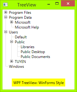
TreeView 现在将具有 WinForms 样式。如果需要,您可以添加更多触发器来控制 TreeView 的行为。完整的触发器可以在附件中找到。
去做
在 WinForms TreeView 中,连接线是虚线。要使这些线条虚线化,请更改:
<!-- Connecting Lines -->
<Rectangle x:Name="HorLn" Margin="9,1,0,0" Height="1" Stroke="#DCDCDC" SnapsToDevicePixels="True"/>
<Rectangle x:Name="VerLn" Width="1" Stroke="#DCDCDC" Margin="0,0,1,0" Grid.RowSpan="2" SnapsToDevicePixels="true" Fill="White"/>
至:
<!-- Connecting Lines -->
<Rectangle x:Name="HorLn" Margin="9,1,0,0" Height="1" Stroke="Blue" StrokeDashCap="Square" StrokeDashArray="0,2" StrokeDashOffset="1" SnapsToDevicePixels="True"/>
<Rectangle x:Name="VerLn" Width="1"  Stroke="Blue" StrokeDashCap="Square" StrokeDashArray="0,2" Margin="0,0,1,0" Grid.RowSpan="2" SnapsToDevicePixels="true" Fill="White"/>
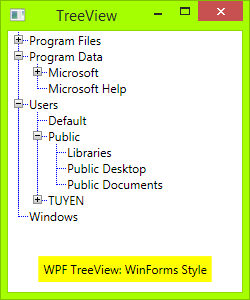
但它并不漂亮,如你所见。由于我是 WPF 的新手,我不知道如何完美地设置这些线条的样式。
问题!
在TreeView中添加TreeViewItem时出现竖线问题:
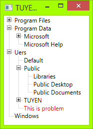
您可能会建议我更改垂直线大小,但如果您也更改字体大小,它将不起作用。
源代码
你可以在这里下载我的源代码:
https ://www.codeproject.com/Tips/673071/WPF-TreeView-with-WinForms-Style-Fomat
参考
这是我在编写自己的代码之前引用的代码:Social MSDN: Show TreeView nodes connected with dotted lines
很好的例子。虚线解决方案中的问题是您使用矩形作为宽度或高度设置为 1 的线。如果这样做,则左右边框位于同一像素上。如果这些线是实心的,这很好,但如果它们是点状的,它们不必在相同的地方有点(即左边框从像素 0 的点开始,右边框从像素 1 开始),这种行为使你的线条不漂亮。
解决方案是创建与矩形不同的虚线。您可以使用例如Border. 我从这里得到了解决方案。
将连接线更改为:
<!-- Connecting Lines -->
<Border x:Name="HorLn" Margin="9,0,0,0" HorizontalAlignment="Stretch" Height="1" BorderThickness="0,0,0,1">
    <Border.BorderBrush>
        <LinearGradientBrush StartPoint="0,0" EndPoint="2,0" SpreadMethod="Repeat" MappingMode="Absolute">
            <GradientStop Color="Transparent" Offset="0" />
            <GradientStop Color="Transparent" Offset="0.499" />
            <GradientStop Color="#999" Offset="0.5" />
        </LinearGradientBrush>
    </Border.BorderBrush>
</Border>
<Border x:Name="VerLn" Margin="0,0,1,0" Grid.RowSpan="2" VerticalAlignment="Stretch" Width="1" BorderThickness="0,0,1,0">
    <Border.BorderBrush>
        <LinearGradientBrush StartPoint="0,0" EndPoint="0,2" SpreadMethod="Repeat" MappingMode="Absolute">
            <GradientStop Color="Transparent" Offset="0" />
            <GradientStop Color="Transparent" Offset="0.499" />
            <GradientStop Color="#999" Offset="0.5" />
        </LinearGradientBrush>
    </Border.BorderBrush>
</Border>
答案修改了一下。垂直线大小与项目高度动态相关,矩形替换为边框
<Style x:Key="ExpandCollapseToggleStyle" TargetType="ToggleButton">
    <Setter Property="Focusable" Value="False"/>
    <Setter Property="Template">
        <Setter.Value>
            <ControlTemplate TargetType="ToggleButton">
                <Grid Width="15" Height="13" SnapsToDevicePixels="True">
                    <Rectangle Width="9" Height="9" Stroke="#919191" SnapsToDevicePixels="true" Fill="White"/>
                    <Rectangle x:Name="ExpandPath" Width="1" Height="5" Stroke="Black" SnapsToDevicePixels="true"/>
                    <Rectangle Width="5" Height="1" Stroke="Black" SnapsToDevicePixels="true"/>
                </Grid>
                <ControlTemplate.Triggers>
                    <Trigger Property="IsChecked" Value="True">
                        <Setter Property="Visibility"  TargetName="ExpandPath" Value="Collapsed"/>
                    </Trigger>
                </ControlTemplate.Triggers>
            </ControlTemplate>
        </Setter.Value>
    </Setter>
</Style>

<Style x:Key="TreeViewStyle" TargetType="{x:Type TreeViewItem}">
    <Setter Property="Background" Value="Transparent"/>
    <Setter Property="Padding" Value="0,0,0,0"/>
    <Setter Property="Template">
        <Setter.Value>
            <ControlTemplate TargetType="{x:Type TreeViewItem}">
                <Grid Name="ItemRoot">
                    <Grid.ColumnDefinitions>
                        <ColumnDefinition Width="20"/>
                        <ColumnDefinition Width="Auto"/>
                    </Grid.ColumnDefinitions>
                    <Grid.RowDefinitions>
                        <RowDefinition/>
                        <RowDefinition/>
                    </Grid.RowDefinitions>

                    <Grid Name="Lines" Grid.Column="0" Grid.Row="0">
                       <Grid.RowDefinitions>
                           <RowDefinition/>
                           <RowDefinition/>
                       </Grid.RowDefinitions>
                       <Grid.ColumnDefinitions>
                           <ColumnDefinition/>
                           <ColumnDefinition/>
                       </Grid.ColumnDefinitions>

                        <Border Grid.Row="0" Grid.Column="1" BorderThickness="1 0 0 1" SnapsToDevicePixels="True" BorderBrush="{TemplateBinding BorderBrush}"/>
                        <Border Grid.Row="1" Grid.Column="1" BorderThickness="1 0 0 0" SnapsToDevicePixels="True" BorderBrush="{TemplateBinding BorderBrush}" Name="LineToNextItem"
                                Visibility="{Binding RelativeSource={RelativeSource Mode=FindAncestor, AncestorType={x:Type TreeViewItem}},
                                             Converter={StaticResource LineConverter}}"/>
                    </Grid>

                    <ToggleButton x:Name="Expander" Grid.Column="0" Grid.Row="0"
                                  Style="{StaticResource ExpandCollapseToggleStyle}"
                                  IsChecked="{Binding Path=IsExpanded, RelativeSource={RelativeSource TemplatedParent}}"
                                  ClickMode="Press"/>

                    <Border Name="Bd" Grid.Column="1" Grid.Row="0"
                            HorizontalAlignment="Left"
                            Background="{TemplateBinding Background}"
                            BorderBrush="{TemplateBinding BorderBrush}"
                            BorderThickness="{TemplateBinding BorderThickness}"
                            Padding="{TemplateBinding Padding}"
                            SnapsToDevicePixels="True">
                        <ContentPresenter x:Name="PART_Header" ContentSource="Header" HorizontalAlignment="{TemplateBinding HorizontalContentAlignment}" MinWidth="20"/>
                    </Border>

                    <Grid Grid.Column="0" Grid.Row="1">
                        <Grid.ColumnDefinitions>
                            <ColumnDefinition/>
                            <ColumnDefinition/>
                        </Grid.ColumnDefinitions>

                        <Border Grid.Column="1" BorderThickness="1 0 0 0" SnapsToDevicePixels="True" BorderBrush="{TemplateBinding BorderBrush}"
                                Visibility="{Binding ElementName=LineToNextItem, Path=Visibility}"/>
                    </Grid>

                    <ItemsPresenter x:Name="ItemsHost" Grid.Column="1" Grid.Row="1" />
                </Grid>

                <ControlTemplate.Triggers>
                    <Trigger Property="HasItems" Value="false">
                        <Setter TargetName="Expander" Property="Visibility" Value="Hidden"/>
                    </Trigger>
                    <Trigger Property="IsExpanded" Value="false">
                        <Setter TargetName="ItemsHost" Property="Visibility" Value="Collapsed"/>
                    </Trigger>
                    <Trigger Property="IsSelected" Value="true">
                        <Setter TargetName="Bd" Property="Background" Value="{DynamicResource {x:Static SystemColors.HighlightBrushKey}}"/>
                        <Setter Property="Foreground" Value="{DynamicResource {x:Static SystemColors.HighlightTextBrushKey}}"/>
                    </Trigger>
                </ControlTemplate.Triggers>
            </ControlTemplate>
        </Setter.Value>
    </Setter>
</Style>
最好的答案有问题,我有一个简单的解决方案来解决它。代码如下:
<Rectangle x:Name="VerLn" Width="1" Stroke="#DCDCDC" Margin="0,0,1,0" Grid.RowSpan="2" SnapsToDevicePixels="true" Fill="White">
                 <Rectangle.Height>
                       <MultiBinding Converter="{StaticResource LineConverter}">
                             <MultiBinding.Bindings>
                                   <Binding  RelativeSource="{RelativeSource AncestorType=TreeView}" Path="ActualHeight" ></Binding>
                                   <Binding  RelativeSource="{RelativeSource AncestorType=TreeView}" Path="ActualWidth"></Binding>
                                   <Binding  RelativeSource="{RelativeSource TemplatedParent}"></Binding>
                                   <Binding  RelativeSource="{RelativeSource Self}"></Binding>
                                   <Binding  ElementName="Expander" Path="IsChecked"></Binding>
                              </MultiBinding.Bindings>
                        </MultiBinding>
                   </Rectangle.Height>
</Rectangle>
LineConver 是 IMultiValueConverter,代码如下:
class TreeViewLineConverter : IMultiValueConverter
{
    public object Convert(object[] values, Type targetType, object parameter, CultureInfo culture)
    {
        double height = (double) values[0];

        TreeViewItem item = values[2] as TreeViewItem;
        ItemsControl ic = ItemsControl.ItemsControlFromItemContainer(item);
        bool isLastOne = ic.ItemContainerGenerator.IndexFromContainer(item) == ic.Items.Count - 1;

        Rectangle rectangle = values[3] as Rectangle;
        if (isLastOne)
        {
            rectangle.VerticalAlignment = VerticalAlignment.Top;
            return 9.0;
        }
        else
        {
            rectangle.VerticalAlignment = VerticalAlignment.Stretch;
            return double.NaN;
        }
    }

    public object[] ConvertBack(object value, Type[] targetTypes, object parameter, CultureInfo culture)
    {
        throw new NotImplementedException();
    }
演示:https ://files.cnblogs.com/files/iDream2018/%E4%BC%98%E5%8C%96%E5%90%8ETreeViewEx.zip
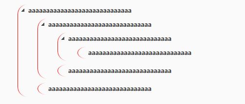
 <TreeView Name="TreeView" Margin="24">
                <Border CornerRadius="20" BorderBrush="Red" BorderThickness="1 0 0 0">
                    <TreeViewItem Header="aaaaaaaaaaaaaaaaaaaaaaaaaaaaa" IsExpanded="True">
                        <Border CornerRadius="20" BorderBrush="Red" BorderThickness="1 0 0 0">
                            <TreeViewItem Header="aaaaaaaaaaaaaaaaaaaaaaaaaaaaa" IsExpanded="True">
                                <Border CornerRadius="20" BorderBrush="Red" BorderThickness="1 0 0 0">
                                    <TreeViewItem Header="aaaaaaaaaaaaaaaaaaaaaaaaaaaaa" IsExpanded="True">
                                        <Border CornerRadius="20" BorderBrush="Red" BorderThickness="1 0 0 0">
                                            <TreeViewItem Header="aaaaaaaaaaaaaaaaaaaaaaaaaaaaa" IsExpanded="True">

                                            </TreeViewItem>
                                        </Border>
                                    </TreeViewItem>

                                </Border>
                                <Border CornerRadius="20" BorderBrush="Red" BorderThickness="1 0 0 0">
                                    <TreeViewItem Header="aaaaaaaaaaaaaaaaaaaaaaaaaaaaa" IsExpanded="True">

                                    </TreeViewItem>
                                </Border>
                            </TreeViewItem>
                        </Border>
                        <Border CornerRadius="20" BorderBrush="Red" BorderThickness="1 0 0 0">
                            <TreeViewItem Header="aaaaaaaaaaaaaaaaaaaaaaaaaaaaa" IsExpanded="True">

                            </TreeViewItem>
                        </Border>
                    </TreeViewItem>
                </Border>

            </TreeView>