4

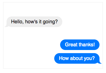
我试图创建一个看起来类似于消息(线程视图)的 html 页面,就像在我们的 android 和 iphone 设备中一样。

这是我编码的内容

CSS样式:

<style type='text/css'>
.triangle-right 
 {  
        position:relative;   
        padding:15px;   
        color:#fff;   
        background:#075698;   
        background:-webkit-gradient(linear, 0 0, 0 100%, from(#2e88c4), to(#075698));   background:-moz-linear-gradient(#2e88c4, #075698);   
        background:-o-linear-gradient(#2e88c4, #075698);   
        background:linear-gradient(#2e88c4, #075698);   
        -webkit-border-radius:10px;   
        -moz-border-radius:10px;   
        border-radius:10px;   
 }   
 .triangle-right.top   
 {     
    background:-webkit-gradient(linear, 0 0, 0 100%, from(#075698), to(#2e88c4));   
    background:-moz-linear-gradient(#075698, #2e88c4);   
    background:-o-linear-gradient(#075698, #2e88c4);   
    background:linear-gradient(#075698, #2e88c4);   
 }   
 .triangle-right.left   
     {   
            margin-left:10px;background:#075698;   
     }   
     .triangle-right.right   
     {   
        margin-right:10px;  background:#075698;   
     }   
     .triangle-right:after    
     {   
     content:'';   
         position:absolute;   
         bottom:-20px;left:50px;border-width:20px 0 0 20px;border-style:solid;border-color:#075698 transparent; display:block;width:0;   
     }   
     .triangle-right.top:after    
     {   
        top:-20px;right:50px;bottom:auto;left:auto;border-width:20px 20px 0 0;border-color:transparent #075698;    
     }   
 .triangle-right.left:after    
     {   
        top:16px;left:-15px;    bottom:auto;border-width:0 15px 15px 0;border-color:transparent #E8E177;   
     }   
     .triangle-right.right:after   
     {   
        top:16px;right:-15px;bottom:auto;left:auto;border-width:0 0 15px 15px; border-color:transparent #8EC3E2 ;   
 }  
.triangle 
{
width: 0;
height: 0;
    border-left: 50px solid transparent;
    border-right: 100px solid transparent;
    border-bottom: 50px solid #fc2e5a;
}

我尝试更改一些值

     .triangle-right.left:after    
     {   
        top:16px;left:-15px;    bottom:auto;border-width:0 15px 15px 0;border-color:transparent #E8E177;   
     }   
     .triangle-right.right:after   
     {   
        top:16px;right:-15px;bottom:auto;left:auto;border-width:0 0 15px 15px; border-color:transparent #8EC3E2 ;   
 } 

但没有得到所需的确切形状。我需要按以下方式构建气泡

谁能帮我

4

4 回答 4

16

CSS ios messenger 消息气泡

的HTML

<div class="chat">
  <div class="yours messages">
    <div class="message last">
      Hello, how's it going?
    </div>
  </div>
  <div class="mine messages">
    <div class="message">
      Great thanks!
    </div> 
    <div class="message last">
      How about you?
     </div>
  </div>
</div>

CSS

body {
  font-family: helvetica;
  display: flex ;
  flex-direction: column;
  align-items: center;
}

.chat {
  width: 300px;
  border: solid 1px #EEE;
  display: flex;
  flex-direction: column;
  padding: 10px;
}

.messages {
  margin-top: 30px;
  display: flex;
  flex-direction: column;
}

.message {
  border-radius: 20px;
  padding: 8px 15px;
  margin-top: 5px;
  margin-bottom: 5px;
  display: inline-block;
}

.yours {
  align-items: flex-start;
}

.yours .message {
  margin-right: 25%;
  background-color: #EEE;
  position: relative;
}

.yours .message.last:before {
  content: "";
  position: absolute;
  z-index: 0;
  bottom: 0;
  left: -7px;
  height: 20px;
  width: 20px;
  background: #EEE;
  border-bottom-right-radius: 15px;
}
.yours .message.last:after {
  content: "";
  position: absolute;
  z-index: 1;
  bottom: 0;
  left: -10px;
  width: 10px;
  height: 20px;
  background: white;
  border-bottom-right-radius: 10px;
}

.mine {
  align-items: flex-end;
}

.mine .message {
  color: white;
  margin-left: 25%;
  background: rgb(0, 120, 254);
  position: relative;
}

.mine .message.last:before {
  content: "";
  position: absolute;
  z-index: 0;
  bottom: 0;
  right: -8px;
  height: 20px;
  width: 20px;
  background: rgb(0, 120, 254);
  border-bottom-left-radius: 15px;
}

.mine .message.last:after {
  content: "";
  position: absolute;
  z-index: 1;
  bottom: 0;
  right: -10px;
  width: 10px;
  height: 20px;
  background: white;
  border-bottom-left-radius: 10px;
}

https://codepen.io/swards/pen/gxQmbj

于 2017-08-29T17:12:59.803 回答
4

我知道这个答案很旧,但对于任何寻找新 iOS iMessage 风格的人来说,请检查这个。

body {
  font-family: "Helvetica Neue";
  font-size: 20px;
  font-weight: normal;
}

section {
  max-width: 450px;
  margin: 50px auto;
}
section div {
  max-width: 255px;
  word-wrap: break-word;
  margin-bottom: 20px;
  line-height: 24px;
}

.clear {
  clear: both;
}

.from-me {
  position: relative;
  padding: 10px 20px;
  color: white;
  background: #0B93F6;
  border-radius: 25px;
  float: right;
}
.from-me:before {
  content: "";
  position: absolute;
  z-index: -1;
  bottom: -2px;
  right: -7px;
  height: 20px;
  border-right: 20px solid #0B93F6;
  border-bottom-left-radius: 16px 14px;
  -webkit-transform: translate(0, -2px);
}
.from-me:after {
  content: "";
  position: absolute;
  z-index: 1;
  bottom: -2px;
  right: -56px;
  width: 26px;
  height: 20px;
  background: white;
  border-bottom-left-radius: 10px;
  -webkit-transform: translate(-30px, -2px);
}

.from-them {
  position: relative;
  padding: 10px 20px;
  background: #E5E5EA;
  border-radius: 25px;
  color: black;
  float: left;
}
.from-them:before {
  content: "";
  position: absolute;
  z-index: 2;
  bottom: -2px;
  left: -7px;
  height: 20px;
  border-left: 20px solid #E5E5EA;
  border-bottom-right-radius: 16px 14px;
  -webkit-transform: translate(0, -2px);
}
.from-them:after {
  content: "";
  position: absolute;
  z-index: 3;
  bottom: -2px;
  left: 4px;
  width: 26px;
  height: 20px;
  background: white;
  border-bottom-right-radius: 10px;
  -webkit-transform: translate(-30px, -2px);
}
<section>
    <div class="from-me">
      <p>Hey there! What's up?</p>
    </div>
  <div class="clear"></div>
    <div class="from-them">
      <p>Checking out iOS7 you know..</p>
    </div>
  <div class="clear"></div>
    <div class="from-me">
      <p>Check out this bubble!</p>
    </div>
  <div class="clear"></div>
    <div class="from-them">
      <p>It's pretty cool!</p>
    </div>
  <div class="clear"></div>
    <div class="from-me">
      <p>Yeah it's pure CSS &amp; HTML</p>
    </div>
  <div class="clear"></div>
    <div class="from-them">
      <p>Wow that's impressive. But what's even more impressive is that this bubble is really high.</p>
    </div>
  </section>

资源

于 2016-06-21T10:53:19.450 回答
3

试试这个代码线程视图消息。

   <div class="messages scroll">
           <div class="item blue">
              <div class="arrow"></div>
              <div class="text">
                     Lorem ipsum dolor sit amet, consectetur adipiscing elit. Phasellus ut diam quis dolor mollis tristique. Suspendisse vestibulum convallis felis vitae facilisis. Praesent eu nisi vestibulum erat.
                </div>
                <div class="date">09.02.2013, 21:04</div>
            </div>
        <div>

CSS 样式

/* 消息 */

.body .content .block .messages{position: relative;}
.body .content .block .messages .item{width: 90%; padding: 5px; position: relative; margin: 10px 0px 0px; float: left;}
.body .content .block .messages .item.out{float: right; margin: 10px 0px 10px;}
.body .content .block .messages .item .arrow{border-color: transparent transparent #009AD7 #009AD7; border-style: solid; border-width: 5px;width: 0px; height: 0px; position:absolute; left: 10px; top: -10px;}
.body .content .block .messages .item.out .arrow{left: auto; top: auto; right: 10px; bottom: -10px; border-color: #005683 #005683 transparent transparent;}
.body .content .block .messages .item .text{font-size: 12px; color: #FFF; line-height: 13px;}
.body .content .block .messages .item .date{font-size: 12px; color: #FFF; text-align: right; opacity: 0.6; filter: alpha(opacity=60); line-height: 13px;}

/* eof 消息 */

谢谢,

卡马拉坎南

于 2013-10-16T10:38:46.697 回答
1

这是一个简单的纯 css3 解决方案,用于创建与 iOS 非常相似的聊天气泡。我会选择这种更干净的外观......这不使用任何图像,并且它对不同的设备尺寸有响应。这是工作代码。偶然发现了这个网站并即兴创作了一点点css来创建没有图像的指针....

HTML

<div class="commentArea">
<div class="bubbledRight">
    Error dicunt theophrastus cu qui. Ad eos simul possit option, adipisci principes sed at. Detracto adolescens pro ea, duo no
</div>
<div class="bubbledLeft">
    Lorem ipsum dolor sit amet, ea oblique constituam signiferumque eam. Pri adipisci maluisset te.
</div>

CSS

.commentArea {
font: 14px Arial;
padding: 0 10px;
margin-top: 20px;    
}

.bubbledLeft,.bubbledRight {
    margin-top: 20px;
    padding: 5px 9px;
    max-width: 50%;
    clear: both;
    position: relative;
}

.bubbledLeft{
    float: left;
    margin-right: auto;
    -webkit-border-radius: 8px 8px 8px 0px;
    -moz-border-radius: 8px 8px 8px 0px;
    -o-border-radius: 8px 8px 8px 0px;
    -ms-border-radius: 8px 8px 8px 0px;
    border-radius: 8px 8px 8px 0px;
    background-color: #65B045;
    color: #ffffff;
}

.bubbledLeft:before {
    border-bottom: 10px solid #65B045;
    border-left: 9px solid rgba(0, 0, 0, 0);
    position: absolute;
    bottom: 0;
    left: -8px;
    content: "";
}

.bubbledRight{
    float: right;
    margin-left: auto;
    text-align: right;
    -webkit-border-radius: 8px 8px 0px 8px;
    -moz-border-radius: 8px 8px 0px 8px;
    -o-border-radius: 8px 8px 0px 8px;
    -ms-border-radius: 8px 8px 0px 8px;
    border-radius: 8px 8px 0px 8px;
    background-color: #07D;
    color: white;
}

.bubbledRight:before {
    border-bottom: 9px solid #07D;
    border-right: 9px solid rgba(0, 0, 0, 0);
    position: absolute;
    bottom: 0;
    right: -8px;
    content: "";
}
于 2014-06-29T08:55:58.960 回答