5

我正在使用 bootstrap 3,并尝试为桌面上的文章设置特定的网格对齐方式。
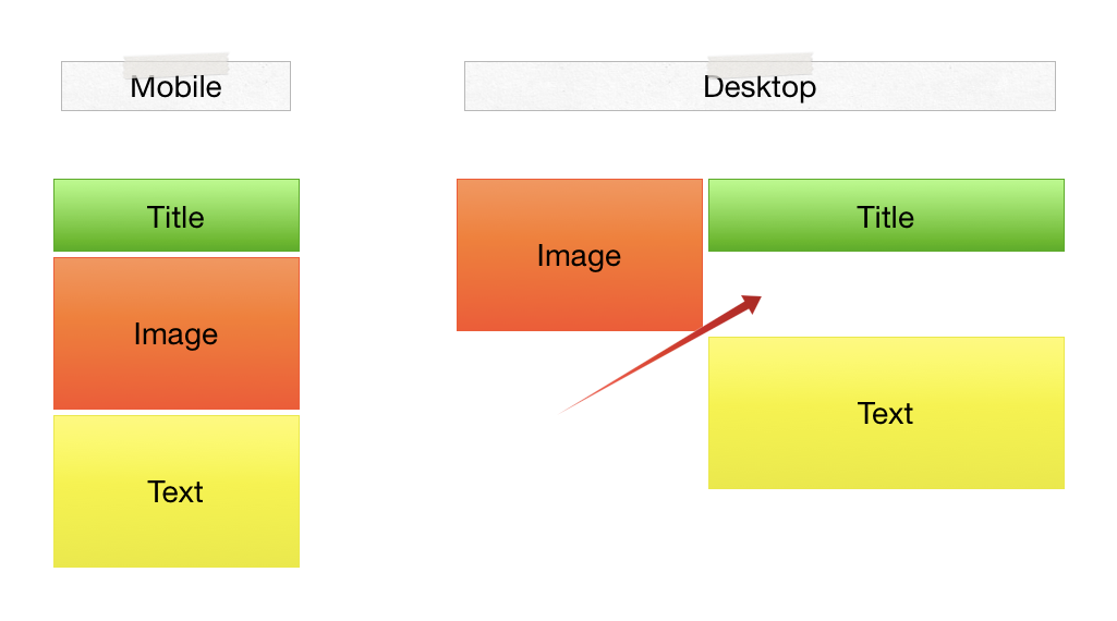
在移动设备上,我想订购这样的文章内容:

  1. 标题
  2. 图片
  3. 内容

在桌面上,我想要左边的图像和右边的标题和内容。

我想要的对齐方式

这是我的代码

<article class="row">
    <header class="col-md-8 col-md-push-4">
        <a href="#">
            <h2>Title</h2>
        </a>
    </header>
    <div class="col-md-4 col-md-pull-8">
        <figure>
            <a class="thumbnail" href="#">
        <img src="..." alt="4x3 Image" class="img-responsive">
                <figcaption>Caption</figcaption>
            </a>
        </figure>
    </div>
    <div class="col-md-8 col-md-push-4">
        <p>Content</p>
    </div>
</article>

但是使用此代码,内容在右侧但在图像下方。

有没有一种简单的方法可以得到我想要的?

4

4 回答 4

5

基于可能使用 Bootstrap 实现此移动/桌面布局?(或其他网格)

CSS:

.floatright{float:right;}
@media (max-width: 768px)
{    
    .floatright{float:none;}
}  

html:

<div class="container" style="background-color:green">
<article class="row">
    <header class="col-md-8 floatright">
        <a href="#">
            <h2>Title</h2>
        </a>
    </header>
    <div class="col-md-4">
        <figure>
            <a class="thumbnail" href="#">
        <img src="..." alt="4x3 Image" class="img-responsive">
                <figcaption>Caption</figcaption>
            </a>
        </figure>
    </div>
    <div class="col-md-8 floatright">
        <p>Content</p>
    </div>
</article>
</div>
于 2013-09-27T10:31:22.760 回答
1

这是你的列类:

md:4(图像)-8(标题)=> 第一行(最多 12 列)
8(内容)=> 新行

这将创建一个新行,第二行位于图像/标题列下方,
因此您必须使用此列设置(使用隐藏类),如下所示:

md:2(图片)- 5(标题)- 5(hidden-xs hidden-sm)
5(内容)

试试这个代码:

CSS:

<style>
        .col-md-2{
            height: 300px;
            background-color: blue;
            color: white;
            border: 2px solid red;
        }
        .col-md-4{
            height: 100px;
        }
        .col-md-5{
            height: 100px;
            background-color: red;
            color: white;
            border: 2px solid black;
        }
</style>

HTML:

    <article class="row">
        <header class="col-md-5 col-md-push-2">
            <a href="#">
                <h2>Title</h2>
            </a>
        </header>
        <div class="col-md-2 col-md-pull-5">
            <figure>
                <a class="thumbnail" href="#">
                    <img src="" alt="4x3 Image" class="img-responsive">
                    <figcaption>Caption</figcaption>
                </a>
            </figure>
        </div>
        <div class="hidden-xs hidden-sm">
            <div class="col-md-4"></div>
        </div>
        <div class="col-md-5 col-md-pull-5">
            <p>Content</p>
        </div>
    </article>

也许它不能解决问题。但你可以使用这个技巧。
对不起,我的英语不好

于 2014-01-29T14:25:20.180 回答
0

使用带有 col-md-8 类的更大 div 并在其中放置标题和文本,并在两者上使用引导程序的 col-md-12 类以相互堆叠

于 2013-09-27T09:22:54.943 回答
0

这是解决问题的方法

<article class="row">
    <header class="col-md-8 pull-right">
        <a href="#">
            <h2>Title</h2>
        </a>
    </header>
    <div class="col-md-4 pull-left">
        <figure>
            <a class="thumbnail" href="#">
        <img src="..." alt="4x3 Image" class="img-responsive">
                <figcaption>...</figcaption>
            </a>
        </figure>    </div>
    <div class="col-md-8 pull-right">
        <p>content</p>
    </div>
</article>
于 2013-09-27T10:19:31.987 回答